
Designing Responsive Websites in Webflow
A responsive website in Webflow is a must. It's the key to great user experience in design. Users expect websites to work seamlessly across devices, from desktops to smartphones.
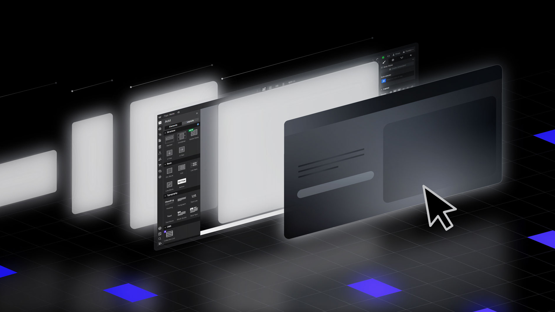
Webflow has, and is, solving designers' top issue. It makes it easy to build responsive websites. It has tools like breakpoints, grids, and Flexbox. With Webflow, you can now build stunning websites. They will adapt to different screen sizes.
This article explains key concepts and best practices.
They will help you create fully responsive websites with Webflow.
Why Responsive Design Matters
No one want to open a website that has a broken layouts or tiny, unreadable text. Neglecting responsive design can increase bounce rates, and make it difficult for user to navigate.
More than 60% of all web traffic these days is coming from mobile devices. It's because most people browse websites on their phones or tablets, not desktops.
So, responsive websites:
- Improve usability: Better readability and navigation for users.
- Boost SEO: Mobile-friendly sites rank higher on search engines like Google.
- Increase conversions: A smooth experience makes people more likely to take action, like buying or subscribing to a newsletter.
Key Concepts of Responsive Web Design
Starting with the Desktop Breakpoint
Responsive design begins by creating a strong foundation at the desktop breakpoint. In Webflow, you define your layout, hierarchy, and content here. By establishing these elements first, you ensure that the core of your design is clear and functional.
Once your desktop layout is done, Webflow makes it easy to adjust for smaller screens like tablets and smartphones.
Cascading Changes with Breakpoints
Webflow’s breakpoints feature is central to its responsive design process. Changes made at one breakpoint cascade downward to smaller breakpoints unless specifically overridden. This approach saves time and ensures consistency across your design.
For instance, a desktop nav menu can adapt to mobile with a few tweaks. There's no need to rebuild it from scratch.
Leveraging Grid Systems for Layout Flexibility
Grids are a secret weapon for designers. They help create flexible, responsive layouts. They help you keep things organized, regardless of screen size.
Webflow’s grid system makes this super easy. It lets you build layouts that automatically adjust for different devices. It keeps your content visually pleasing and easy to navigate on all devices: desktops, tablets, and phones.
Flexbox for Precise Element Alignment
Flexbox provides flexibility in how elements align, stack, and distribute within containers. In Webflow, Flexbox simplifies complex layouts that need to adjust dynamically across devices. You can control whether to wrap, stack, or center-align elements based on the screen size.
This level of control ensures a balanced and polished appearance.
Optimizing Content for Mobile Views
Designing for mobile can be a bit tricky because phone screens are so much smaller than desktops.
You must be smart about using the limited space. This is especially true for social media and visually heavy content. Webflow gives you full control to customize your site's look on any device.
For mobile layouts, you can hide or adjust elements that may not be needed on smaller screens. You can also tweak things like font sizes to make sure everything stays readable and user-friendly.
The goal is to create a site that's easy to navigate, even on a tiny screen. This will give users a smooth experience, no matter how they view your site.
Previewing and Testing Responsiveness
A designer can’t just assume how the site will appear on various screens, it has to be tried out. You can check the live preview mode and see exactly how your site looks on phones, tablets, and desktops. Then, if something looks off, you can fix it right away.
Continuous Improvement and Optimization
Responsive design isn’t a “set it and forget it” kind of thing. Once your site is live, you will have to keep an eye on how people are using it.
Are they having trouble navigating?
Are certain pages loading too slowly?
Webflow's analytics and tracking tools let you monitor users. You can gather feedback and find areas to improve. Then, you can tweak and update your site.
This will keep it smooth and looking great on all devices.
Mobile Optimization: Beyond Scaling Down
Designing for mobile is more than shrinking a desktop layout. It’s about crafting an experience tailored to smaller screens. Webflow lets you optimize designs for mobile views. You can adjust font sizes, hide unneeded elements, and optimize images.
For example, a desktop hero section with detailed text might be simplified to a single, impactful sentence for mobile. This ensures readability and focus.
Testing is equally important. Webflow's live preview is your safety net. It lets you see how your site looks and performs on different devices, like phones, tablets, and desktops.

Pre-Preparation Phase: Planning Your Web Project
Before diving into Webflow’s responsive design tools, take a step back and plan things out.
- Who’s your audience?
- What’s the main goal of the site?
- What content absolutely needs to be there?
Mapping out your structure and goals upfront saves a ton of headaches later.
Brainstorming Design Inspiration
Gather design ideas and inspiration to spark your creativity. Spend some time finding inspiration. Look at competitor sites, explore design trends, or browse Webflow's showcase for ideas.
Pay attention to layouts, color schemes, or cool interactions you might want to incorporate. This phase is all about setting the vibe for your project so that the final design feels fresh, functional, and engaging.
Establishing a Robust Brand Identity
Consistency is everything when it comes to branding. Your website should reflect your brand’s personality. From logo design to colors, fonts, and images, everything must work together to tell your brand's story.
Webflow makes this easy with tools you can customize to create a design that feels 100% in sync with your brand.
Typography Tips for Enhanced Readability
Typography might not sound exciting, but it’s a big deal for user experience. The right fonts can make or break how easy your site is to read, especially on smaller screens.
Focus on the line height, font weight, and contrast to ensure that your content is easy to digest across devices. Webflow's typography controls let you customize text styles.
Best Practices for Designing in Webflow
Plan with Purpose
Responsive design starts with planning. Sketch layouts for different devices. Define content priorities. Consider users' interactions with your site on smaller screens. A mobile-first approach can be helpful. It focuses on the most essential elements before adding complexity for larger screens.
Test Continuously
Preview your site frequently during the design process. Test it on actual devices whenever possible. This ensures that navigation, text, and images work as intended. User feedback is invaluable—don’t hesitate to iterate based on real-world interactions.
Focus on Performance
Responsive design isn’t just about appearance; it’s also about speed and functionality. Optimize images for fast loading. Minify unnecessary code. Use Webflow's hosting features, including its CDN, to boost performance.
Conclusion
Responsive web design is about creating websites that work for everyone, everywhere. With Webflow, you have the tools to make this process efficient and enjoyable.
By starting with the desktop breakpoint, leveraging grids and Flexbox, and fine-tuning for mobile, you can ensure your site looks and performs beautifully on any device.
Mastering responsive design takes practice, but Webflow’s intuitive platform simplifies the learning curve. Start experimenting today, and bring your ideas to life with designs that leave an impact—on every screen.
FAQs
How can I make my website fully responsive in Webflow?
Start with the desktop layout and use breakpoints to adjust designs for smaller screens. Test and optimize continuously.
What are the key elements of responsive design?
Flexible grids, scalable typography, adaptive images, and thorough testing across devices.
Is Webflow good for responsive design?
Yes. Webflow’s visual tools and flexibility make it one of the best platforms for creating responsive websites without coding.