Some partnerships start with a brief. This one started with a belief that a climate tech company with the right product, the right conviction, and the right design could become something significant.

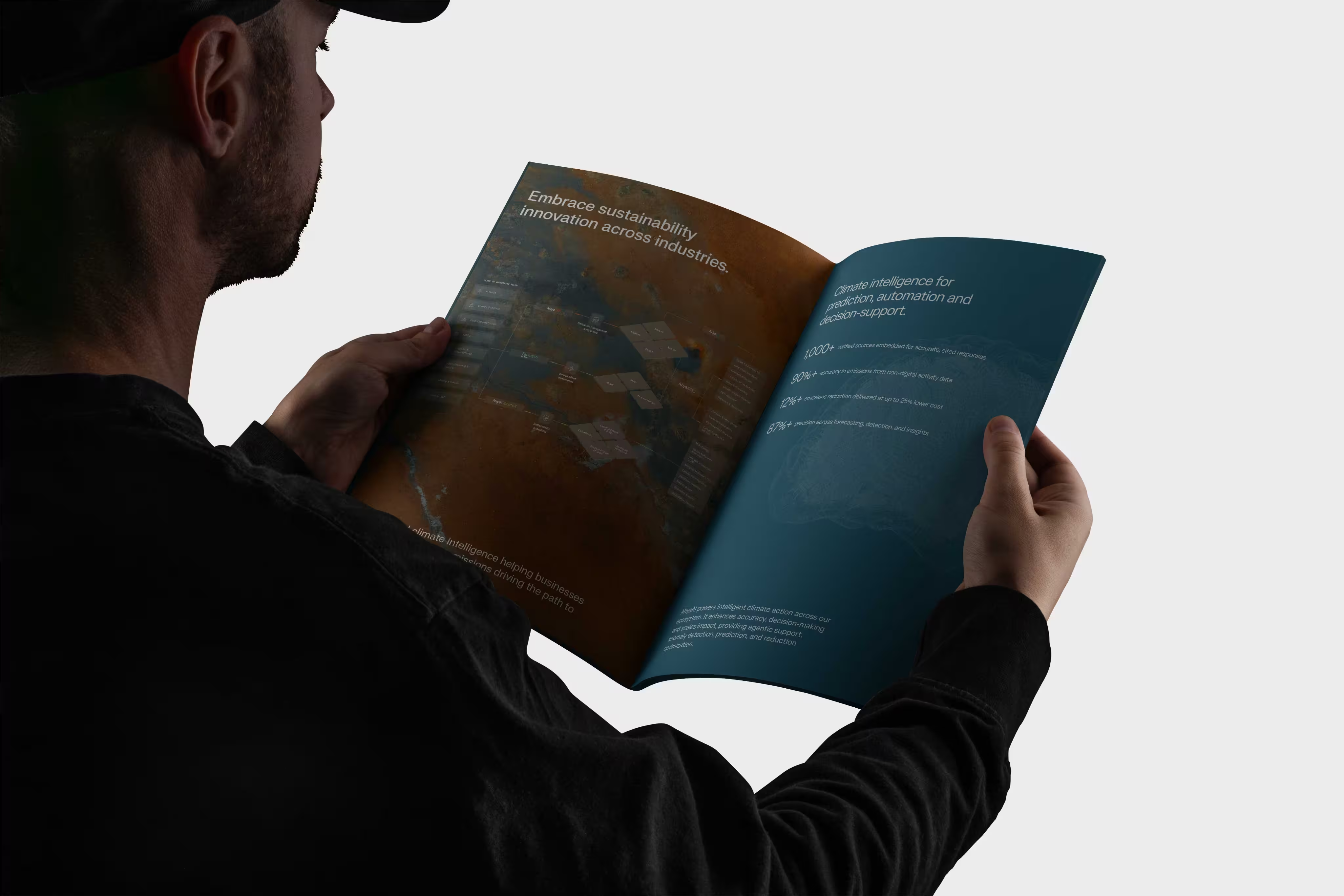
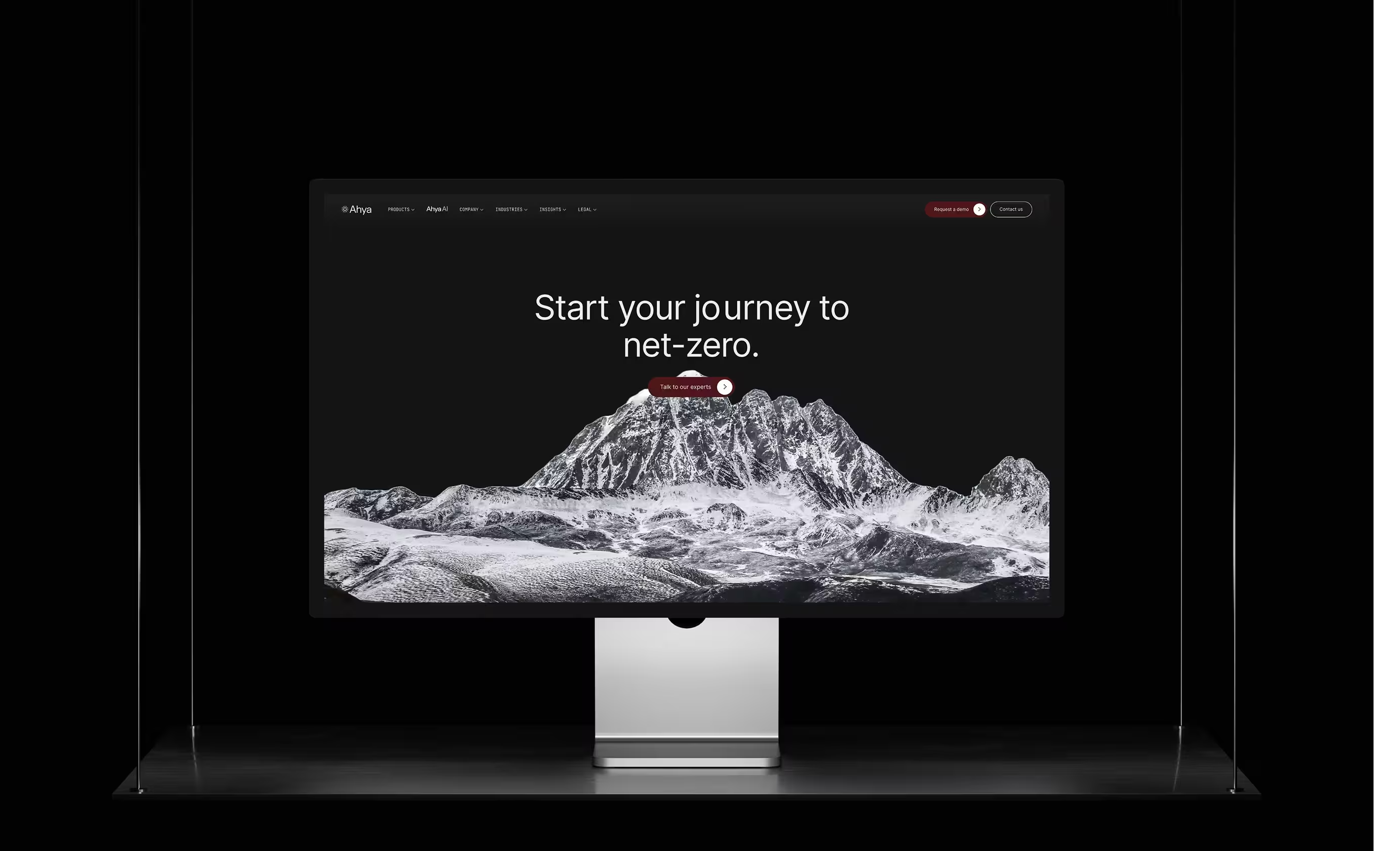
When Ahya came to Neue World there was no brand, no product identity, and a website generating zero leads. Today there is a complete enterprise design ecosystem: a brand with climate science embedded into its mark, a website that structures arguments rather than lists features, and two enterprise - grade product platforms serving sustainability teams across eight industries.
- → Brand Identity Design
- → Web Design
- → Webflow
- → Animation
- → Illustration
- → Product Design
- → Videos
- → Maintenance
- → On-going Support
The Problem
Ahya operates in one of the most technically demanding categories in climate technology - AI-powered emissions measurement, prediction, and reduction for enterprise clients and governments. Their platform ingests real-time environmental data, processes it through machine learning models, and surfaces actionable intelligence for sustainability teams operating across three markets with different regulatory frameworks, languages, and stakeholder expectations.
When they first came to Neue World, the gap was straightforward: a platform with genuine technical depth and real enterprise traction had no visual identity that reflected either. Their digital presence couldn't carry the weight of the conversations they were already having with government bodies and enterprise sustainability officers in the Gulf. For a company asking institutions to trust it with their emissions data and net-zero commitments, the brand was the weakest thing in the room.

The Challenge
Climate tech brands sit in a difficult design territory. The visual language of the sector defaults to one of two extremes: cold, clinical data aesthetics that communicate precision but no purpose, or aggressive environmental imagery with green leaves, solar panels, planet iconography that signals category without communicating capability. Ahya needed neither. Their differentiation is the intelligence layer, not the sustainability mission itself. Every enterprise platform in this space has a sustainability mission. Very few have a machine learning infrastructure that can actually deliver on it.
The additional challenge was geographic and regulatory complexity. A brand that works for a Saudi government sustainability officer, a Pakistani energy company, and a UAE-based enterprise client needs to carry institutional credibility across all three contexts simultaneously which is different visual expectations, different trust signals, different market maturity.
The Solution
We started with entity positioning rather than visual design. Before any logo explorations, we mapped how Ahya needed to be understood by LLMs, by enterprise buyers, by investors, and by regulators in each of the three markets. The brand had to communicate AI-native intelligence first, climate technology second. That inversion was deliberate: it separated Ahya from the category noise and anchored the brand in capability rather than aspiration.
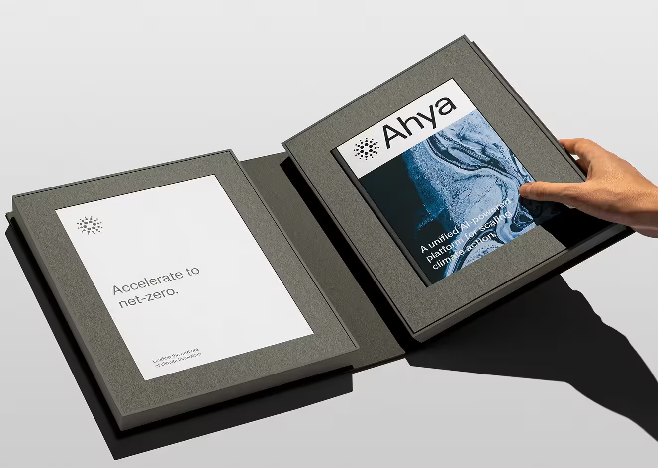
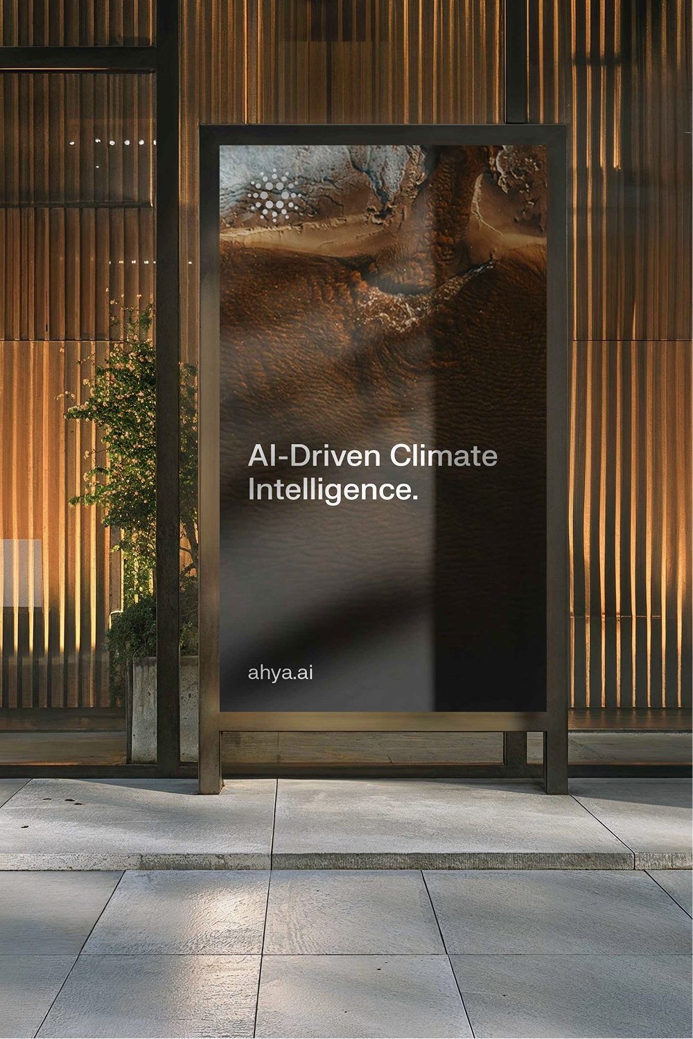
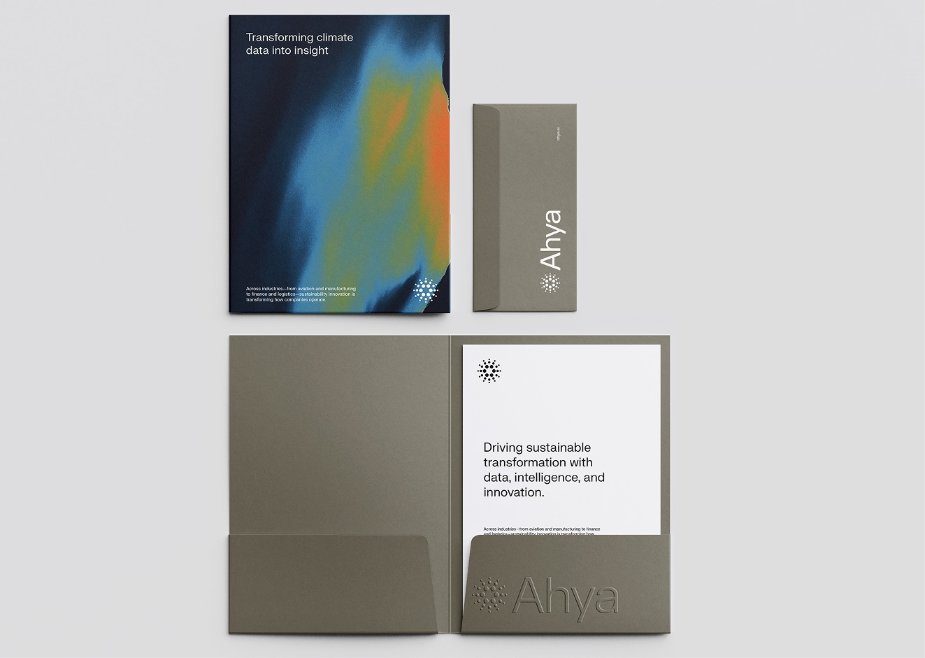
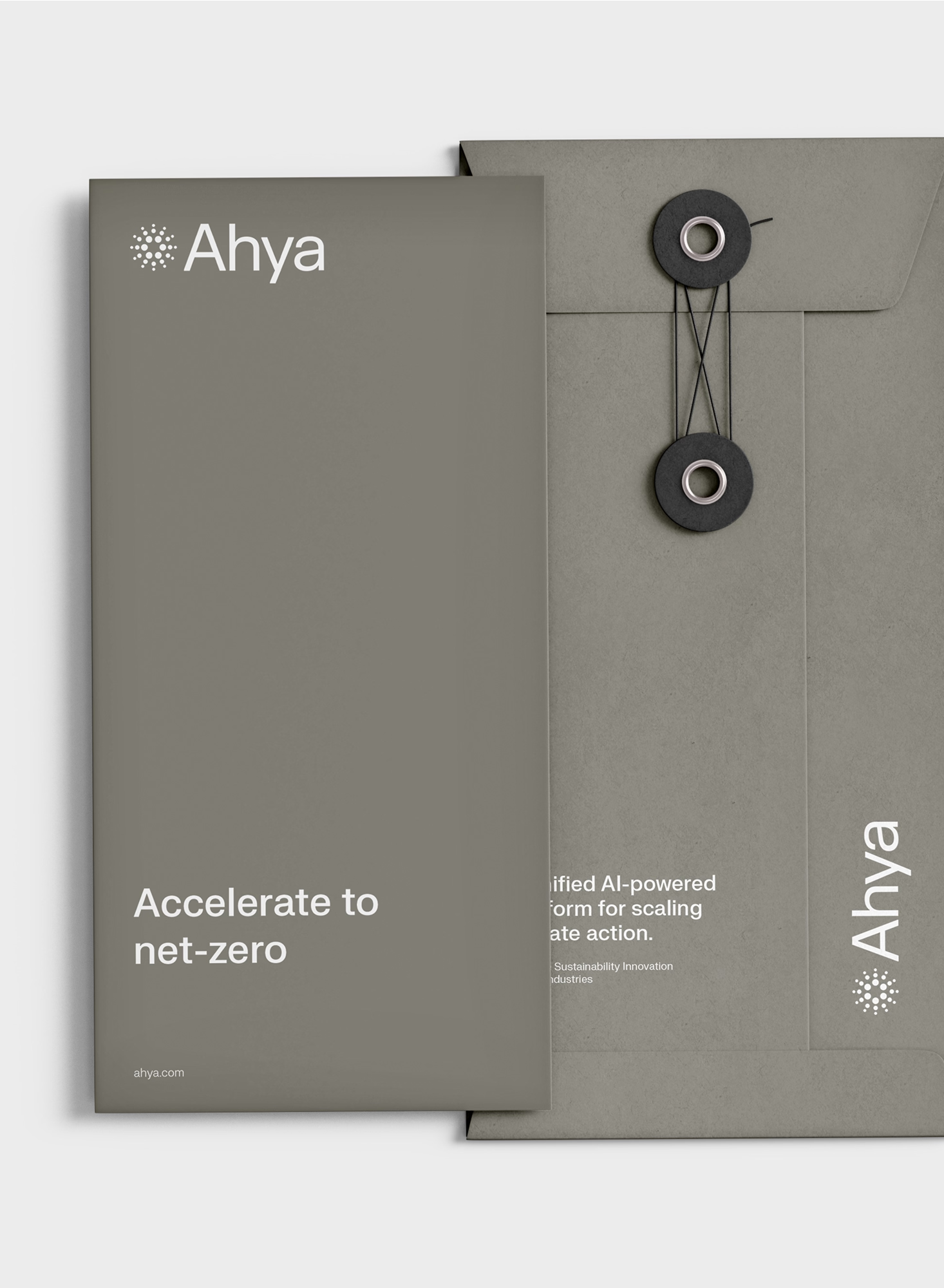
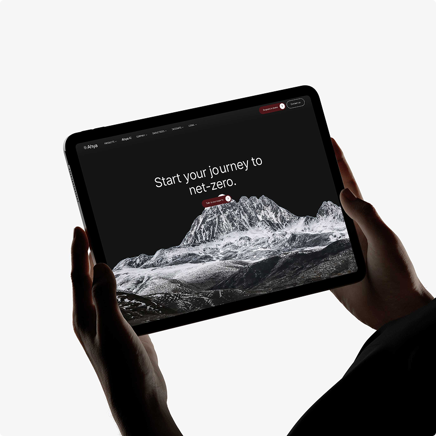
The visual identity system was built around the Ahya mark, a radiating particle structure that communicates data intelligence, measurement precision, and systemic interconnection without any direct environmental metaphor. It works across dark and light surfaces, scales from a favicon to an exhibition installation, and holds its authority at every size. The typographic and colour system was engineered for enterprise context: structured enough for a government pitch deck, refined enough for any meeting.
The Result
Ahya is now operating across Saudi Arabia, Pakistan, and the UAE with a brand and product design system built to match their actual scale. The identity has been through government pitches, enterprise sales cycles, investor presentations, and partner integrations. It has held in every context because it was built for all of them simultaneously rather than adapted from one.
This is our longest active client relationship. That's not an accident. When a design agency understands your sector deeply enough to make your brand smarter with every iteration rather than just different, the relationship compound. We know Ahya's market positioning, their regulatory environment, their competitor landscape, and their product roadmap. That knowledge is embedded in every design decision we make for them.
The product design is where most of the engagement has lived over four years. Ahya's dashboard interface needed to make complex multi-variable climate data readable to non-technical sustainability officers without dumbing down the underlying intelligence. We designed the information hierarchy, data visualisation system, and UI component library from scratch, building a product experience that communicates scientific rigour and operational clarity in equal measure.
.avif)
The design system for a climate intelligence company has to solve a problem that most brand projects don't encounter: the audience is simultaneously reading for emotional resonance and technical credibility.
A sustainability officer at a Saudi state energy company isn't moved by the same visual language as a Series A investor. Both audiences need to feel, in the first three seconds, that Ahya understands the specific stakes of their world. Building one system that accomplishes both is the actual design brief; everything else is execution.
The structures embedded across Ahya's visual language was a deliberate positioning decision. It communicates growth and movement rather than disruption; a brand that operates alongside existing enterprise infrastructure, enhancing measurement and intelligence rather than replacing processes.
In a sector where enterprise adoption depends on low integration friction, the brand philosophy and the product philosophy are the same thing. That alignment is what four years of sustained engagement produces.




Let’s create something meaningful together. Contact us, and let’s build a brand that’s thoughtful, effective, and beautifully designed.