Most websites today are built with bloated templates, unpredictable plugins, and design systems that break under pressure. The result? Slow pages, scattered styling, and teams wasting hours trying to fix what should’ve been clear from day one.
Visual development is changing that. Instead of handing design to one team and development to another, tools like Webflow let you build, test, and ship visually while maintaining clean code and control over CSS. It’s not drag-and-drop fluff. It’s real design execution with structure, performance, and scalability.
At the center of this workflow is Webflow’s Visual CSS Designer. It’s not just a style editor. It’s where you define how every part of your site behaves, like typography, layout, spacing, positioning, and breakpoints, all from a panel that writes production-ready CSS behind the scenes.
Once you understand how it works, you can stop relying on developers for every pixel push and start owning how your brand appears online.
This guide is built for three groups:
- Beginner designers looking to turn designs into working layouts
- Frontend developers who want visual control without losing CSS logic
- Startup teams building their brand without bloated tools or technical delays
Understanding the Visual CSS Designer
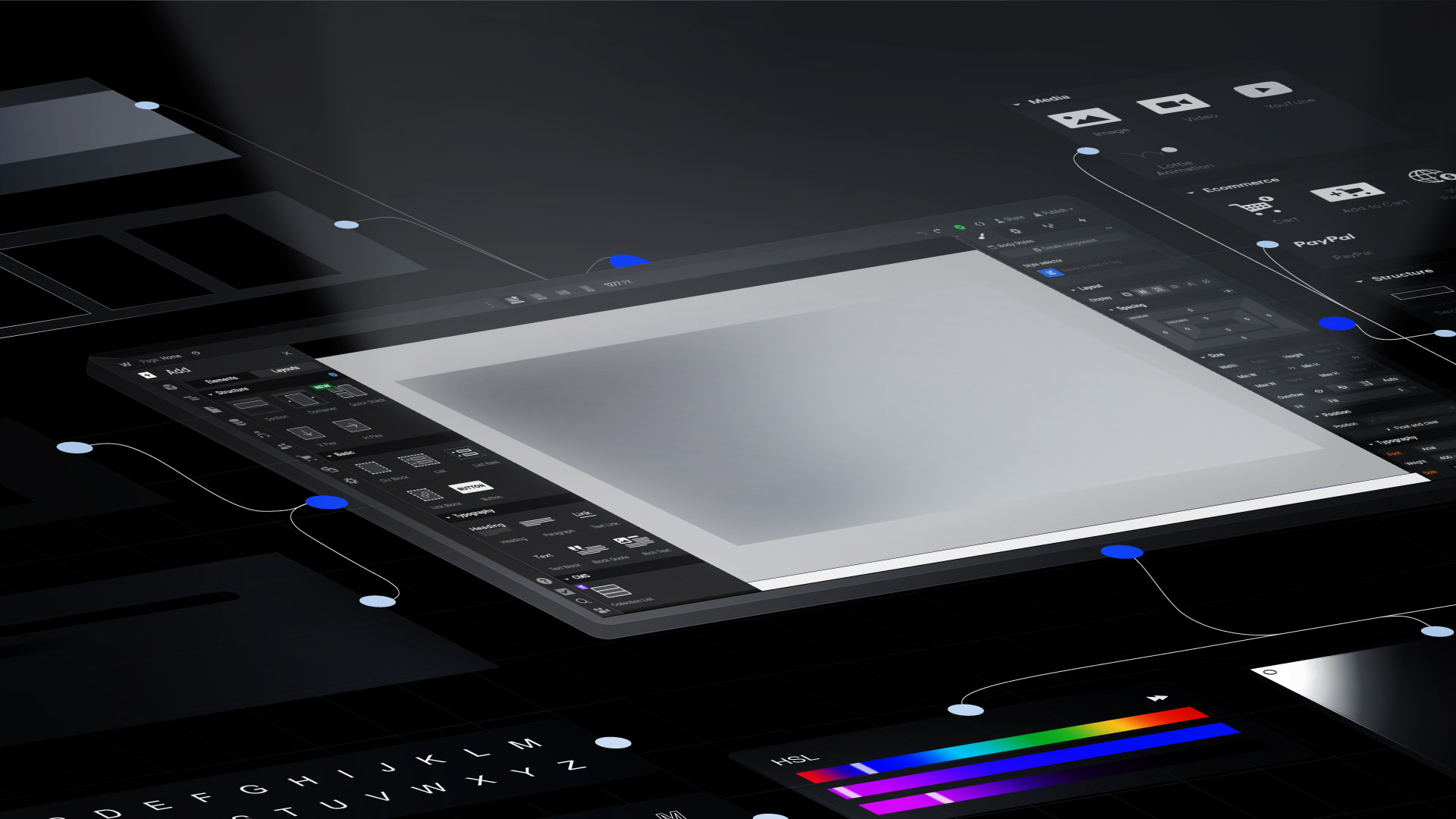
The Visual CSS Designer in Webflow isn’t a code editor in disguise. It’s a real-time interface that lets you apply CSS rules directly on the canvas with full visibility into how styles cascade, respond, and interact.
Unlike traditional development tools, where you toggle between a browser and a code window, Webflow shows the result of your CSS decisions as you make them. There is no build step. No inspection tools. No guessing.
What makes it different from traditional CSS editing?
In tools like VS Code or Figma-to-code plugins, you manually write or generate CSS. You have to manage class names, nesting, specificity, and media queries — all by hand. That’s fine for dev-heavy teams, but it slows you down when design needs to ship fast.
Webflow flips this. You assign styles visually but with the same specificity, reusability, and responsiveness as hand-coded CSS. It lets you build with structure — classes, combo classes, reusable style systems — while seeing every change applied live.
Webflow’s philosophy: No code doesn’t mean no control
A common misconception is that Webflow is designed for non-technical users. That’s wrong. Webflow empowers designers and frontend teams to execute visually — without compromising the logic of traditional CSS.
You still manage box model behavior, flex and grid systems, z-index layers, and inheritance. The difference is that you do it in a way your entire team can see and validate on the fly.
The result is faster design cycles, cleaner handoffs, and fewer bugs.
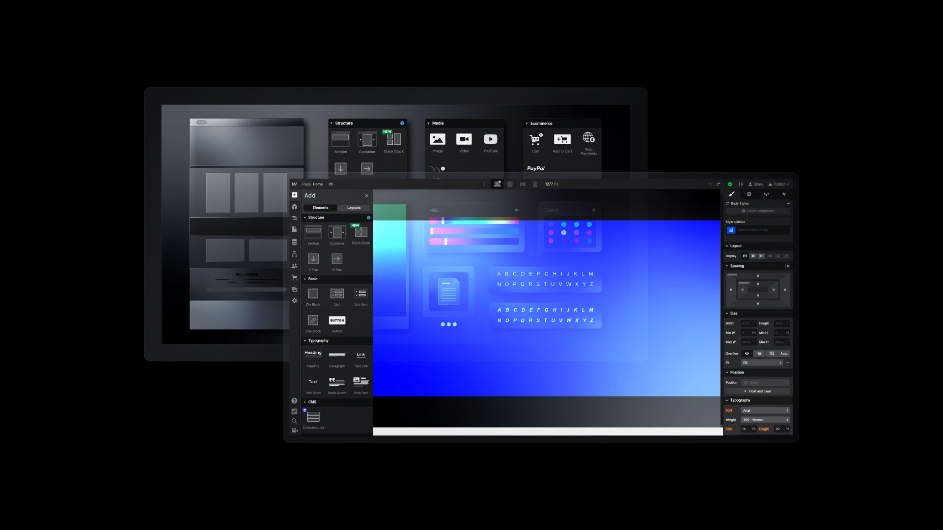
The 5 key interface areas that shape your styles
Designer
This is the core workspace where you build and see your site live. Every element, interaction, and style is displayed in real-time here.
Style Panel
This is where the CSS logic lives. You control typography, color, layout, spacing, positioning, borders, effects, and everything that makes up the box model; every input maps directly to a CSS property.
Navigator
This gives you a DOM-like tree of your entire page structure. You can move, rename, or re-nest elements without touching code. It’s how you keep complex pages organized.
Canvas
This is your live viewport. It shows how your site looks as you build. You can select elements, apply styles, or test layouts, all in the same space.
Preview & Breakpoints
You can toggle the preview mode to hide the UI and interact with the site directly. You can also switch between breakpoints (desktop, tablet, and mobile) and apply custom styles for each screen size without needing media query syntax.
How to Use the Style Panel (Core CSS Controls)
The Style Panel is where the real design decisions happen. Every section inside this panel maps directly to CSS. The difference is that you're not writing properties line by line; you're applying them live, on the canvas, with complete control and instant feedback.
Let’s walk through the three most important areas: **Typography, Color & Backgrounds, and Layout.**
Typography
Typography controls how your product communicates. Webflow’s typography section gives you full control over your type system, from hierarchy to spacing to responsiveness.
How to define heading hierarchy (H1 -H6)
Headings help organize your page structure and influence SEO. Use semantic tags, not just visual size, to define importance. Always use one H1 per page, followed by H2, H3, and so on.
Setting line height, letter spacing, and mobile typography
Too much or too little line height kills readability. Aim for 1.4–1.6em on paragraphs. Adjust letter spacing only when needed — for large headers or logos. For mobile devices, reduce the font size and spacing to ensure the content fits comfortably without requiring zooming.
Best practices for legibility and responsiveness
- Use rems or % for scalable sizing
- Choose system fonts or web-safe fonts to improve load speed
- Use consistent font weights (400 for body, 600–700 for headings)
- Test on real mobile devices, not just the preview
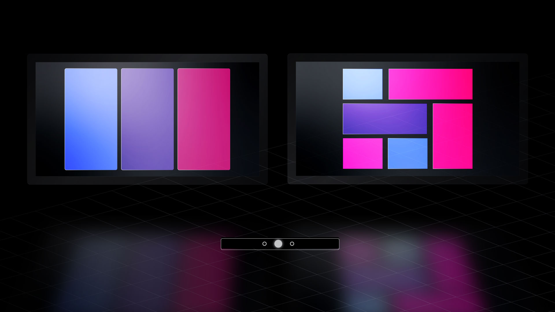
Color & Backgrounds
Color drives emotion, brand recognition, and hierarchy. Webflow’s color system helps you maintain consistency across pages and components.
Using Webflow’s swatch system to create scalable themes
Create global swatches for your brand palette, including primary, secondary, accent, background, and text colors. When you update a swatch, every component using it updates, too, including CSS variables, but not visually.
Backgrounds: solid colors, gradients, images
Webflow lets you apply backgrounds in three ways:
- Solid: best for UI and clarity
- Gradients: use subtly to guide focus or add depth
- Images: set positioning (cover, contain), and use overlays to improve contrast
Accessibility tip: checking color contrast
Use Webflow’s built-in contrast checker to meet WCAG standards. Always aim for AA (minimum) and AAA (ideal) contrast ratios, especially for body text.
Layout: Box Model, Display, and Positioning
Layout is where most Webflow users get stuck, not because it’s hard but because they don’t understand the box model. Everything you build in Webflow is contained within a box. That box has spacing, behavior, and stacking rules.
Visualizing margin vs padding
- Padding adds space inside the element (between content and border)
- Margin adds space outside the element (between it and other elements)
- Get in the habit of using padding for internal structure and margin for external spacing.
Using flex, grid, and block layout options
- Block is default — items stack vertically
- Flex is best for one-dimensional layout (navbars, cards, buttons)
- Grid is for two-dimensional layout (gallery, content + sidebar, complex sections)
Use 'gap' (instead of 'margin') inside Flex and Grid; it's more predictable and responsive.
Positioning elements: relative, absolute, fixed
- Relative: moves the item without taking it out of flow
- Absolute: locks it to a parent (set the parent to relative)
- Fixed: locks it to the viewport (used for sticky headers or floating buttons)
Best practices for stacking, nesting, and responsiveness
- Use z-index sparingly — a higher number = sits on top
- Don’t overuse absolute/fixed — they can break layouts on smaller screens
- Use containers and sections to group layout chunks
- Always test changes across breakpoints as you go
Responsive Design with Webflow Breakpoints
Webflow provides visual control over how your site appears on various devices, eliminating the need for media queries. You’re working directly with breakpoints. Every style you change cascades down unless you override it. That’s both powerful and dangerous.
How Breakpoints Work (Desktop → Tablet → Mobile Landscape → Mobile Portrait)
Webflow’s default breakpoints are based on viewport width:
- Desktop: 992px and up
- Tablet: 768px to 991px
- Mobile Landscape: 480px to 767px
- Mobile Portrait: up to 479px
Each breakpoint is accessible at the top of the Designer. When you switch, you’re not designing a new layout; you’re adapting the existing one.
How Cascade Logic Works in Webflow’s CSS
Webflow uses CSS cascade logic in a top-down flow:
Changes on the Desktop cascade down to all smaller breakpoints.
Changes on Mobile Portrait do not affect Tablet or Desktop.
This means you should start with the largest screen and work your way down. If you start tweaking mobile-first, it breaks everything.
When to Override Styles and How to Do It Cleanly
Use overrides when content no longer fits or loses clarity at smaller sizes.
- Reduce padding to save space
- Hide non-essential elements using display: none
- Change layout direction (e.g., Flex row → column)
Webflow highlights overridden styles with a blue indicator.
Hover the style name to see if it's inherited or custom.
Avoid messy overrides:
- Don’t override to force a fix, change the class or structure
- Consider using combo classes or nested flex/grids instead
Using vw, em, or % for Flexible Design
Using responsive units makes your site feel fluid.
- vw (viewport width): good for fluid headlines
- em/rem: scales with base font size; useful for spacing
- %: suitable for relative widths in grid/flex containers
Best practice: Use max-width to control when things stop scaling.
Don’t rely only on breakpoints; build with flexible units from the start.
Previewing and Testing Responsive Behavior In-Browser
Use the built-in Preview toggle in Webflow to test without the Designer clutter.
Then, use your browser’s Device Toolbar (in Chrome DevTools or Safari) to simulate real devices.
Also, test:
- Touch gestures (sliders, menus)
- Tap targets (buttons too small?)
- Load time and layout shifts on slower connections
You’re not designing a set of pages. You’re designing one system that adapts. Keep your styles lean, your breakpoints intentional, and your testing real.
Advanced Techniques with the Visual CSS Designer
Once you’ve mastered the basics of typography, layout, and responsiveness, you’ll hit a wall, not because Webflow can’t scale but because your system is messy. This section shows how to build smarter with combo classes, interactions, and utility systems that make your site easier to manage at scale.
A. Using Combo Classes and Global Classes
Combo classes let you tweak a base style without affecting every instance. It’s the difference between having one reusable button style and modifying it contextually without having to rebuild it from scratch.
When to Use Combo Classes (H4)
Use them when:
- You want 90% of a base class to stay the same
- You need a minor tweak (padding, color, alignment)
- The context is consistent (e.g., nav, footer, hero)
How to Avoid “Class Soup” (H4)
Class soup happens when you add too many one-off classes:
.btn-red-left-align-small-rounded-bold, this kills maintainability.
Instead:
- Use a base class: .btn
- Add purposeful combo classes: .btn.secondary, .btn.large, .btn.ghost
Each combo should reflect a specific function, not a random look.
➡️ Example: .btn + .cta-section = orange button with more padding; same base used in footer with .footer-theme combo
Use Case: Styling CTA Buttons Differently in Sections (H4)
In your Hero:
.btn.primary → white text, full-width, large padding
In your Footer:
.btn.footer-dark → dark background, small padding, all-caps
Both start with .btn, but each inherits and intentionally overrides its purpose.
B. Working with Interactions (vs. Static Styles)
Don’t confuse styling with interaction. Webflow separates the two, and it matters.
Differentiating Between Style and Interaction (H4)
Style Panel → Static and pseudo states (hover, active, focus)
Interactions Panel → Timed, scroll-based, or click-triggered animations
Use the Style Panel for:
- Hover color transitions
- Button press (active state)
- Input field focus outlines
Use the Interactions Panel for:
- Scroll reveals
- Page load animations
- Hover triggers that animate other elements
➡️ Example: Use Style Panel to change a button's background on hover, but Interactions Panel to make an image scale on hover.
When to Apply Hover/Active/Focus Styles (H4)
Only apply pseudo-states when:
- The interaction is consistent and expected
- You want fast performance (Style states are CSS, not JS)
- You don’t need timeline control
Use Interactions when:
- You’re animating multiple elements
- You need easing, delay, or control
- You’re dealing with triggers beyond hover/click
Leveraging Webflow Collections for Scalable CSS
Collections are not just CMS content; they’re the key to scaling visual design across repeatable patterns.
When you style one CMS card, you're essentially styling dozens of them. But it only works if your CSS structure is consistent.
Why Collections Matter for Visual CSS Consistency
- A Collection page pulls from one design template
- A Collection list repeats a single-style system for multiple items
- One update = global impact
If your blog card is built well, new posts inherit the style automatically; no tweaks are needed. It’s system thinking at the design level.
Styling Dynamic Elements (Cards, Blog Posts, Case Studies)
You can apply the same global classes and utility classes to Collection items. That means your .card, .text-sm, .btn-secondary, and .padding-32 styles still apply to CMS content — just like static content.
The trick is to design the first instance well.
➡️ Example: Blog Card with image, category, title, excerpt, and read more button
Apply:
- .card container
- .card-title global class
- .text-xs for metadata
- .btn.read more for CTA
Then bind dynamic fields inside each element:
- Image → Blog thumbnail
- Text → Title, Summary
- Button → Link to post
How to Bind Dynamic Content While Maintaining Global Class Rules
- Use Static Elements First: Build a static layout using global and utility classes
- Connect CMS Fields: Replace text or image with dynamic bindings
- Avoid Class Overrides: Don’t create a new class for every CMS item
- Set Fallbacks: Add defaults for missing thumbnails or empty fields
Tips: Placeholder States, Empty States, Fallback Images
- Placeholder State: Set default text like “Coming Soon” or “Untitled.”
- Empty State: Customize the empty Collection list message with .text-muted or .state-empty
- Fallback Image: Use Webflow’s conditional visibility or default media field
➡️ Use case: A team page that hides the bio if the field is left blank. Keeps layout clean.
Tools and Plugins to Extend Visual Styling in Webflow
Your visual workflow can be fast and clean. But only if you extend Webflow’s native tools with the right add-ons.
These tools aren’t just nice-to-haves. They’re core to staying consistent, scalable, and fast.
Finsweet’s Client-First System
Client-First gives your class name structure.
Every div, text, and component becomes readable for your team, your client, and your future self.
Use .section, .padding-global, .text-size-xxl, .container-large, .margin-top-48, etc.
It’s a CSS framework for designers baked into Webflow.
Why it works:
- It prevents messy combo classes
- Speeds up handoff
- Works perfectly with global styles
➡️ Clone the Finsweet Client-First style guide directly from their website and use it as your base.
Relume Library
A massive layout library for Webflow.
Relume lets you drag pre-built, responsive sections into your site. Then, adjust the style using global tokens.
It saves time, especially for:
- Landing pages
- Feature sections
- Footers, nav, hero blocks
Use Relume + Client-First together = maximum efficiency.
Webflow Color Tools and Typography Scales
Set swatches at the project level:
- Primary, secondary, muted, dark, accent
- Create variants like primary-light, secondary-dark
For typography:
- Define sizes like .heading-xl, .text-lg, .label-sm
- Use REM or PX, but be consistent
These tokens help you style faster and override less.
Contrast Checkers and Browser Extensions
The design needs to meet accessibility standards. Webflow doesn’t warn you, but tools like:
- WebAIM Contrast Checker
- Stark (browser extension)
- Chrome DevTools' Lighthouse Audit
These help ensure that your text is readable and your buttons meet WCAG standards.
Using Browser DevTools to Inspect and Debug Webflow Styles
Right-click → Inspect.
This is how you debug issues. Webflow’s UI doesn’t show.
Check:
- CSS hierarchy
- Class conflicts
- Margin, padding, position
- Font stack fallbacks
This becomes critical when styles aren’t behaving as expected, especially on CMS pages or mobile views.
➡️ Combine Webflow’s Preview + Chrome DevTools = deeper visibility than the canvas alone.
Conclusion
The Visual CSS Designer in Webflow isn't just drag-and-drop; it’s structured, logic-driven styling that puts you in control.
When you master it:
- Your projects scale faster
- You spend less time fixing bugs
- Your team understands your structure at a glance
Keep building. Clone popular projects. Experiment with layout techniques. Test your breakpoints. Use systems like Client-First. Debug in the browser. And never style without purpose. You’re not just styling; you’re building infrastructure for growth.