
Introduction
Creating the layout/display of a website is the first and arguably one of the most important phases of creating a website, whether you choose to design your site in a Minimal style, Maximalist style, Tech style, or even a Fashion style, when it comes to developing your site you’ll have to make use of a form of display in Webflow, whether it be Block, Flex, Grid, In-line Block, In-line, or None.
Each of these various forms of display in webflow is useful but not every each one has to be used at all times. In a lot of cases, people make use of Flexbox, in some cases people make use of Grid and in some cases, people make use of QuickStack.
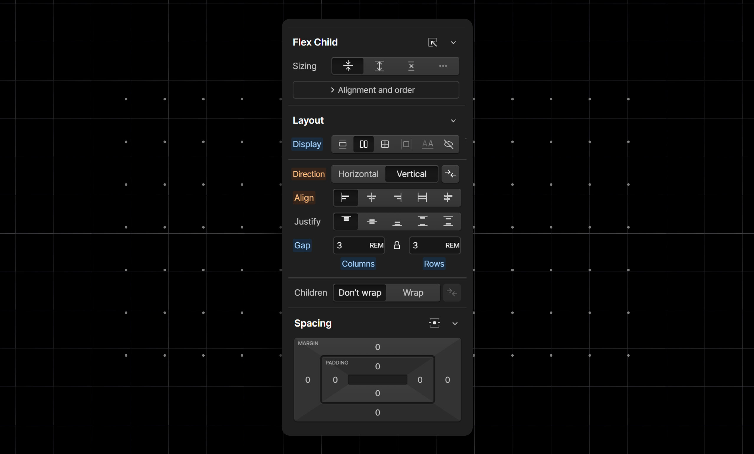
Display Flex
This is a layout that can be applied to Div Blocks, Link Blocks, and many more. Elements set to display flex do not automatically fill up the available space within its parent element and by default are set to a horizontal direction (this means by default that any content put in it will be set side by side).
Features of the display Flex
- It allows you to space out the content in it in many different ways e.g. making all the content to be at the right or at the left, at the top or at the bottom.
- It allows you to make use of Gaps; these gaps can be set horizontally, vertically or both can be synced. Gaps mean that you don’t always have to give all your elements a margin or padding and can instead make use of the gap that has been set on a parent to space content from one another.
- It allows you to make use of Wrap which when properly used with gaps helps your site in its responsiveness. Example: Some content in a Div that has been set to display flex is set to a horizontal direction in desktop view but can also take up a vertical direction on smaller screens.
You can make grid with flexbox to achieve flexible layouts.
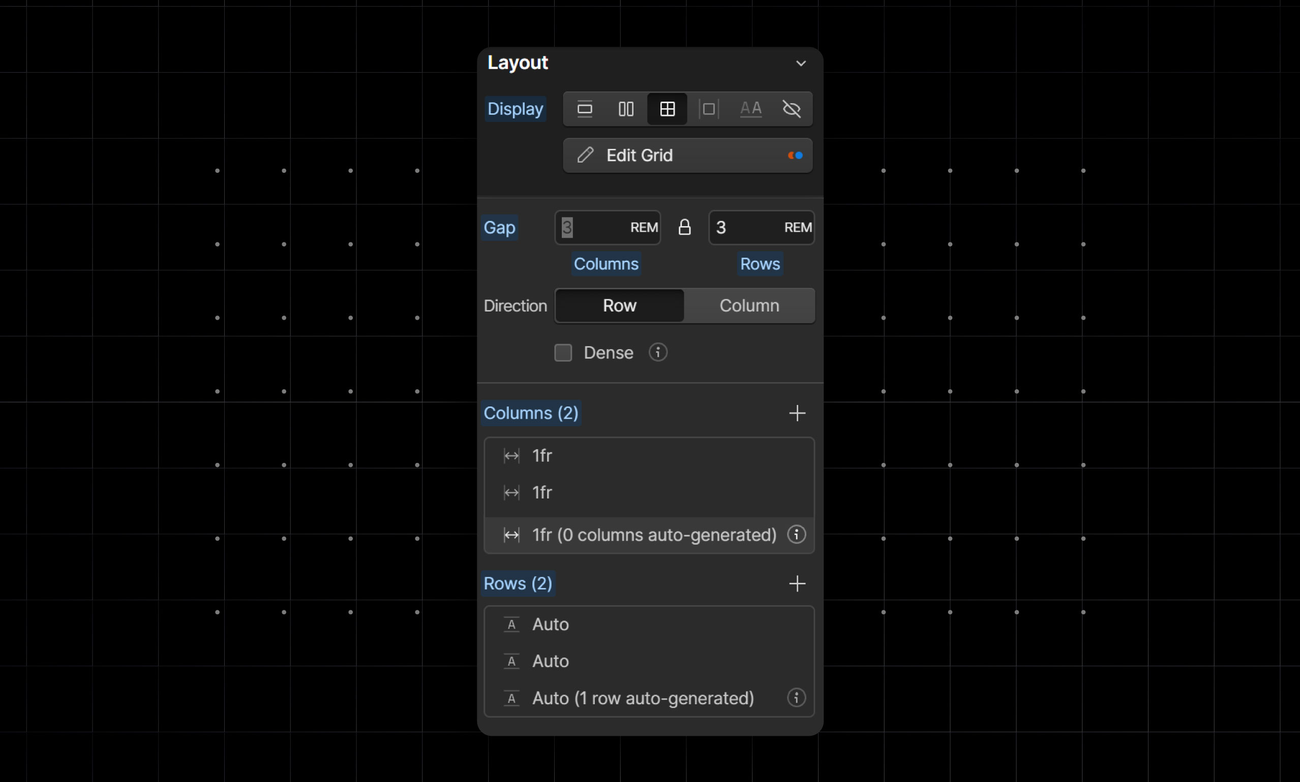
Display Grid
This is the layout that can be used when you want to create a sort of grid-style design, for example maybe you want to have a section for displaying blog posts on a page, you can make use of a grid to accomplish this, as a grid will allow you to determine the amount of content you want to show in a row(horizontal direction) or in a column (vertical direction).
Knowing how to make grid responsive in Webflow is essential for modern web design.
Features of the display grid
- Grid allows you to set how much content you want on a row or a column.
- Elements inside a grid can span multiple columns or rows without that span being shared by all other elements with the same class name.
- Grid allows you to use gaps much like how Flexbox does.
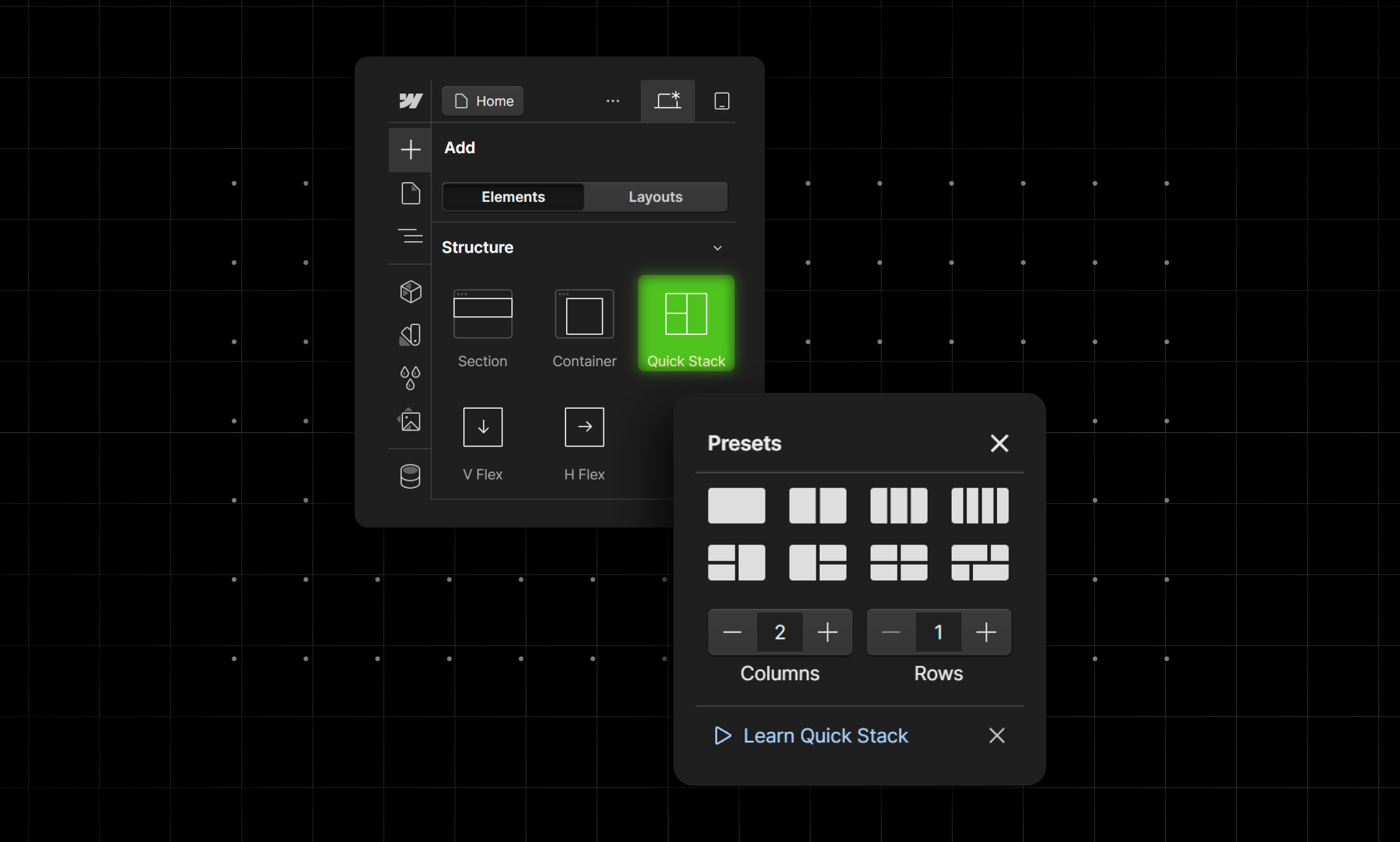
What is QuickStack
A QuickStack is essentially a grid that has already been given children elements that act as Divs in which you can put content. In a way, you can consider a QuickStack as a close relative to Grid.
Quckstacks come with presets which means that you don’t in each case have to set the span of your Div Blocks which is what you would have to do if you made use of Grid.
Though we mentioned that QuickStack is a close relative to Grid, it should also be mentioned that though QuickStacks come with presets they are not as robust and cannot be as customized as a standard grid.
Features of QuickStack
- QuickStack comes with Grid-like presets which can save you a lot of time.
- QuckStack comes with cells that act as Divs in which you can put content (for each new column or row you add a cell is created in which you can put content).
- Quick stack allows you to also make use of gaps similar to how Display Flex and Display Grid make use of it.
Flexbox vs Grid, vs QuickStack
When it comes to designing layouts in web development, Flexbox, Grid, and QuickStack each offer unique advantages. Here's a detailed comparison of these three layout systems:
Ease of Use
Flexbox: Flexbox is relatively straightforward to learn and implement. It's ideal for creating one-dimensional layouts, either in a row or a column. With properties like justify-content, align-items, and flex-direction, it allows developers to align and distribute space among items in a container effortlessly.
Grid: It is more complex than Flexbox but offers more powerful capabilities for creating two-dimensional layouts. It can handle both rows and columns simultaneously, making it suitable for more intricate designs.
While the learning curve is steeper, the potential for precise control over the layout is significantly greater.
QuickStack: It is a newer tool designed to simplify responsive design by automatically stacking elements on smaller screens. Its ease of use is remarkable because it requires minimal configuration.
It’s particularly user-friendly for developers who want a quick and efficient way to ensure responsive behavior without delving deep into media queries and layout adjustments.
Performance and Efficiency
Flexbox: Flexbox is highly efficient for simpler layouts, particularly when aligning and distributing space within a single direction. It performs well across different browsers and devices, ensuring consistent results without a significant performance overhead.
Grid: CSS Grid is also efficient but can become complex when dealing with highly intricate layouts. However, its ability to define explicit rows and columns with precise control makes it very powerful.
While it might require more lines of code, it can streamline the layout process for complex designs, potentially reducing the need for extensive CSS and JavaScript.
QuickStack: QuickStack focuses on performance by automatically adjusting layouts for different screen sizes. It reduces the need for custom media queries and complex layout configurations, thereby streamlining the development process.
However, its performance is contingent on how well it handles specific use cases and the extent of customization required by the developer.
Design Flexibility
Flexbox: Flexbox provides great flexibility for one-dimensional layouts, making it ideal for navigation bars, simple grids, and aligning elements within a container. Its properties allow for easy adjustments to the order and size of elements, enhancing design versatility.
Grid: CSS Grid excels in design flexibility, offering unparalleled control over both dimensions of a layout. It allows for the creation of complex, responsive designs with precise placement of elements. The grid-template areas, along with grid lines and gaps, offer extensive possibilities for creative layouts.
When to use flexbox vs css grid is important for ensuring the right level of complexity and control in your design.
QuickStack: QuickStack's flexibility lies in its ability to automatically adjust to different screen sizes. While it may not offer the same level of control as Flexbox or Grid, it excels in scenarios where quick, responsive adjustments are needed.
It's particularly useful for developers who need to ensure a consistent user experience across various devices with minimal effort.
Best Use Cases
Flexbox: Use Flexbox for simple, one-dimensional layouts where you need to distribute space and align items efficiently. Ideal for components like navigation bars, form controls, and small-scale grid systems.
Grid: Opt for CSS Grid when you need to create complex, two-dimensional layouts. It's perfect for entire web page layouts, dashboards, and any design requiring precise control over rows and columns.
QuickStack: QuickStack is best suited for developers seeking an easy and quick solution for responsive designs. It's ideal for projects with tight deadlines or when you need to ensure that your layout adapts seamlessly to various screen sizes without extensive media queries.
Tips for Choosing the Right Layout Technique
Choosing the right layout technique for your web development project can significantly impact both the design process and the final product.
Here are some tips to help you decide whether Flexbox, Grid, or QuickStack is the best fit for your needs:
1. Understand Your Layout Needs
Before diving into any layout technique, thoroughly analyze your project requirements. Consider the complexity of the layout, the number of components, and how they need to interact.
For example, if your design involves a lot of nested elements and two-dimensional arrangements, CSS Grid might be more suitable. For simpler, one-dimensional layouts, Flexbox can be more efficient.
2. Consider Responsiveness
Responsiveness is crucial in modern web design. If your project requires layouts that need to adapt seamlessly across various screen sizes, QuickStack could be a valuable tool due to its automatic stacking capabilities.
However, both Flexbox and Grid also offer robust tools for creating responsive designs with media queries and flexible units like percentages and viewport-based measurements.
3. Prioritize Performance
Consider the performance implications of each layout technique. Flexbox and Grid are both optimized for performance and widely supported across modern browsers. QuickStack, being a newer tool, might have varying performance based on its implementation and use cases.
Always test your layouts across different devices and browsers to ensure optimal performance.
4. Factor in Design Flexibility
Flexibility is key to adapting and refining your designs. Flexbox offers great flexibility for single-axis alignment and distribution, making it ideal for elements like navigation bars and simple grids. CSS Grid shines in its ability to create complex, multi-dimensional layouts with precise control.
QuickStack, while not as flexible in terms of layout control, excels in quickly adapting designs for different screen sizes.
5. Think About Future Maintenance
Maintenance is an often-overlooked aspect of layout design. Choose a technique that not only meets your current needs but also allows for easy updates and modifications in the future. CSS Grid’s named grid areas and lines can make it easier to understand and modify complex layouts later.
Flexbox's simplicity can also contribute to easier maintenance for straightforward designs.
Conclusion
Whatever layout/display you choose to use in Webflow is up to you, however making use of the wrong one can either make your design not look as good as it could and consume a large amount of your time customizing it.
When choosing your layout/display it is important to consider the needs of your designs and to also consider the scalability of your design as you develop it.