Designing UI Patterns: Nav, Cards, & More
Designers continually find innovative ways to create exciting products that users will love. Creating user interfaces (UIs) that are both easy to use and visually appealing can be challenging, but getting the basics right is crucial for designing interfaces that people can easily understand.
In this post, we'll give you some simple tips on using popular design tricks for UIs, like menus and card layouts. These tips are great for starting from scratch or improving what you already have!
Easy Navigation Tips
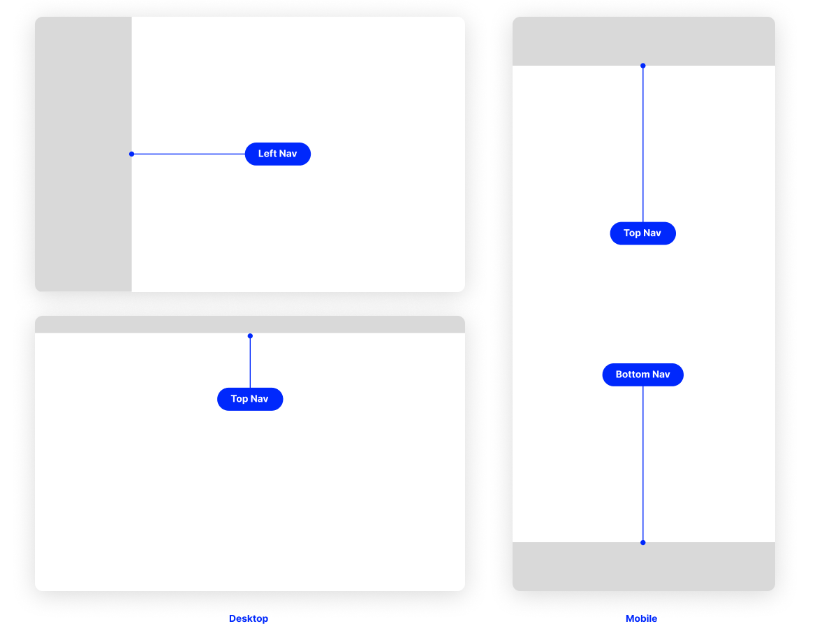
As UI design changes, it's essential to know how to create simple ways for users to move around your design. The key is to include your brand style in your design and make everything easy for users to find their way.
Navigation is important because it can change how users feel about your interface. To make a great UI, consider what users want to do, where they are, and how simple or complex your site is.
By learning about navigation patterns, designers can make user-friendly designs that let people easily explore everything. In the end, a good UI with simple navigation can help businesses grow because users like to use it.
If you're just starting, it's a good idea to make designs that are familiar to users. This way, they don't need to learn new ways to do things. If you make too many changes, users confused and lose interest.
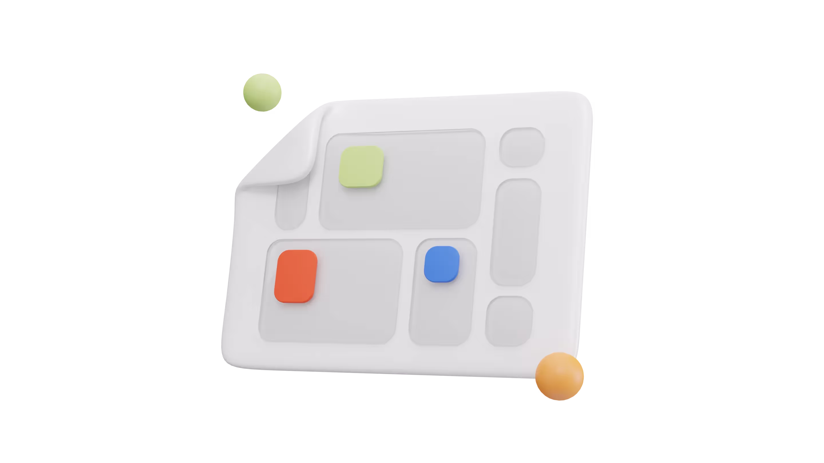
How to Create Cards in UI Design?
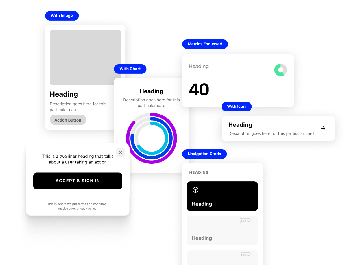
In UI design, making cards is important for how things work and look. Cards can help show important details and make everything look nice.
But how do you make sure your cards also match your brand?
By using a design plan with consistent features, your cards will match your brand's style. This means choosing brand colors and other basics so your cards do their job and look like what your brand stands for.
A consistent design plan is super important because it helps users quickly understand and use your product. Plus, it makes your product stand out. Making cards in UI design can be pretty simple with some thought and care.
Card UIs are popular because they can be used in many ways: for pop-ups, pages, messages, and more. They're pretty versatile!
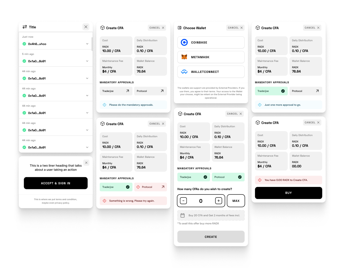
Working with Modals and Dialogs
Designers know how important brand elements are for a company's appearance. When designing modals and dialogs, make sure they fit with your design plan and showcase your brand. These components allow you to impress users and make them remember your brand.
Using the same branding elements and design system can create smooth experiences that build user trust and strong connections.
So next time you're working with modals and dialogs, remember the power they hold in representing your brand, and make sure every component is designed to reflect your company's unique identity.
Tips for Formatting Content Effectively
Want your content to stand out?
Consider these tips for effective formatting. It's important that your content reflects your brand values and what makes your brand different. Another key part is using a design system that keeps everything streamlined and the same.
When using your design system, break down content into repeatable parts. This will save time and maintain a clean, professional appearance. Always remember that well-formatted content captures attention and keeps readers interested.
With a bit of planning, creating a sound design system isn't too hard. With the right tools and advice, you can make a UI that meets users' needs while offering them an easy journey.
With careful planning and consideration, creating an effective design system doesn’t have to be complicated. With the right guidance and resources, you can create a UI that meets the needs of your users while providing a consistent and cohesive experience.
Strategies for Minimalist Presentations
Creating minimalist presentations isn't about plain slides. It's about clearly communicating your message and using design systems that showcase your brand.
To do this, consider the elements that go into your presentation, such as colors and fonts. Picking these elements carefully ensures that your presentation is both informative and engaging.
As someone who has made their fair share of presentations, I can confidently say that taking a minimalist approach not only simplifies the design process but also allows your audience to better engage with your content.
So, give it a try, and see how it can elevate your presentations to the next level.
Conclusion
To wrap up, these UI Pattern tips are just the starting point for improving your designs. You can make your designs stand out in many fun and unique ways. The key is to create something that fits your brand's style. UI Patterns should make things easier, not harder.
Try out these tips, experiment, and don't be afraid to think outside the box!
Get inspiration from other sites or brands. Remember, UI is a crucial part of your brand. If you do it well, you'll create designs that are effective, intuitive, and appealing to everyone.
Design is personal, so use what works best for you and your team. Now, take a break, get comfortable, and start designing – it's worth it in the end.
By understanding how different pieces fit together in various settings and using design systems wisely, you'll create a UI that works well for users and gives them a great experience.
Design systems are powerful tools that help create user-friendly UIs that are both easy to use and visually appealing.