Writing Effective Usage Guidelines: The Basics

As a designer, you know the frustration that comes when a perfectly crafted interface gets misused. A stretched logo. The wrong button color. A layout that doesn't follow any of the established rules. It doesn’t take long before your design system starts to break down not because it’s flawed, but because no one knows how to use it properly.
That’s where usage guidelines come in. They aren’t just documents. They’re the rules that hold your brand together across every screen, platform, and user interaction.
What Are Usage Guidelines and Why Are They Crucial?
Usage guidelines define how your product or brand elements should be used. They clarify what’s acceptable, what isn’t, and what to do in edge cases. Think of them as the operational manual for your design system.
Without usage guidelines:
- Your developers make assumptions
- Your content team guesses at tone
- Your partners remix your logo
With guidelines in place:
- Your product speaks in one voice
- New team members onboard faster
- Every screen looks like it came from the same company
They also ensure everyone has a consistent user experience by laying out clearly defined processes and giving developers shared language when talking about tasks or steps in the interaction flow of the product.
What is Effective Usage?
Effective usage means applying your design system correctly every single time. It’s not about locking your team into rules. It’s about creating clarity.
You want your brand to be instantly recognizable. That doesn’t happen by chance. It happens when typography, color, iconography, tone of voice, and layout follow a shared structure. A structure enforced by your usage guidelines.
The best brands in the world don’t just have great designs they have great usage.
Why is it Important to Have Clear Guidelines for Each Component?
That means having clear guidelines for each component: from fonts and colors to imagery and messaging.
Here's why:
- Logos: Avoid distortion, improper sizing, or misuse of alternative versions
- Colors: Ensure accessibility contrast and correct usage in light/dark modes
- Typography: Prevent inconsistent font pairings or line spacing issues
- Voice and Tone: Keep communication style aligned across teams
This is where a lot of startups go wrong. They build the system but never teach their team how to use it.
So, if you want your brand to stand out and resonate with your audience, a solid design system with clear guidelines for effective usage is an absolute must-have.
How to Write an Effective Usage Guideline
When it comes to how to write guidelines, it’s important to focus on clarity and consistency. Your branding elements and design system are your company's identity, and you want to make sure they are always being used correctly. That's where your usage guideline comes in handy.
You’re not writing an essay. You’re creating a reference that should be fast to skim and impossible to misinterpret.
Here’s what to include:
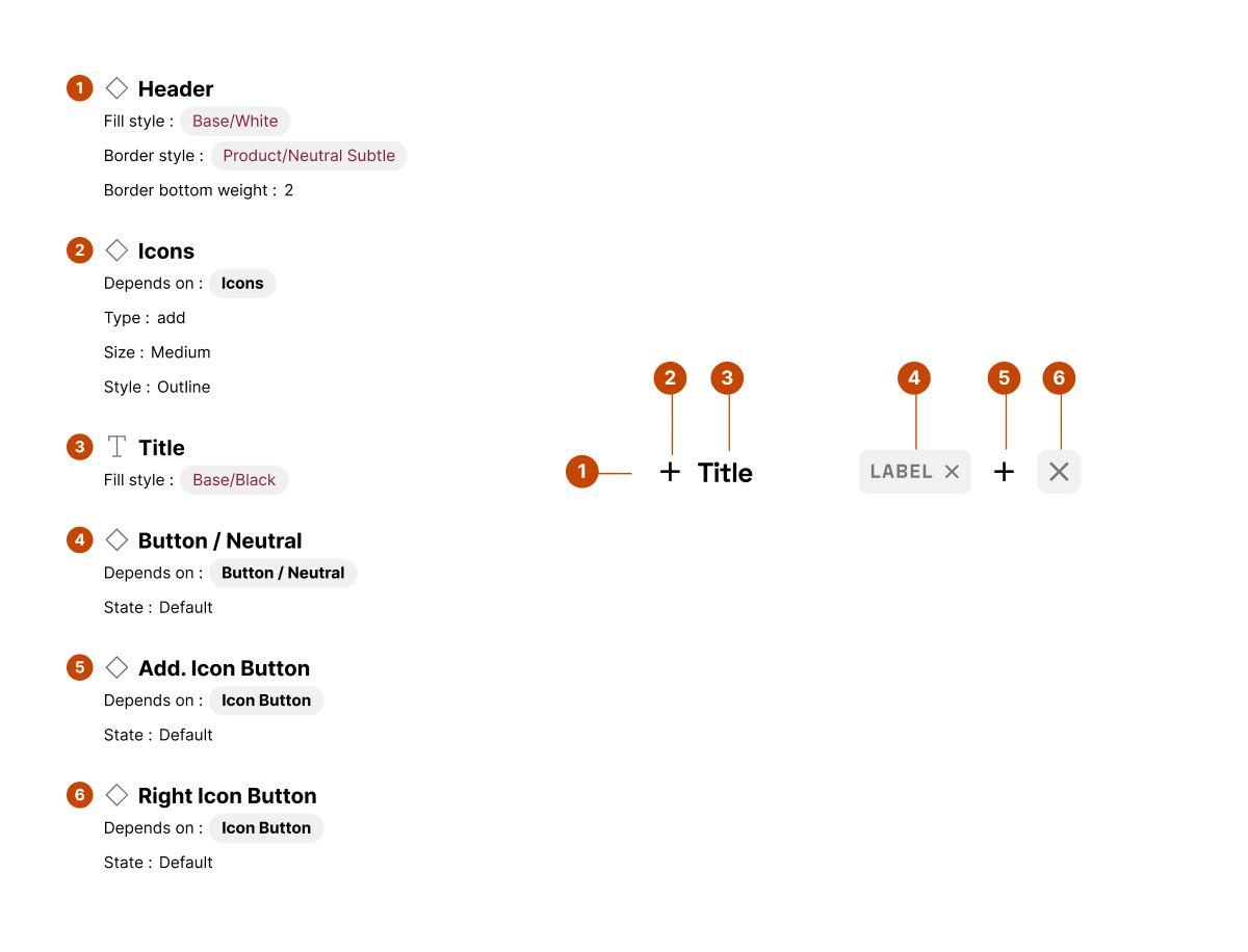
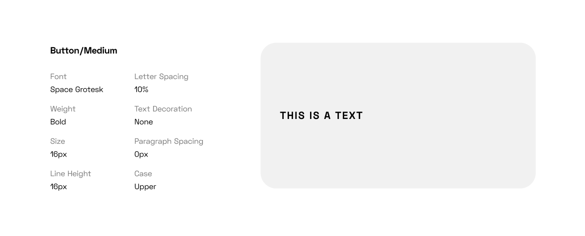
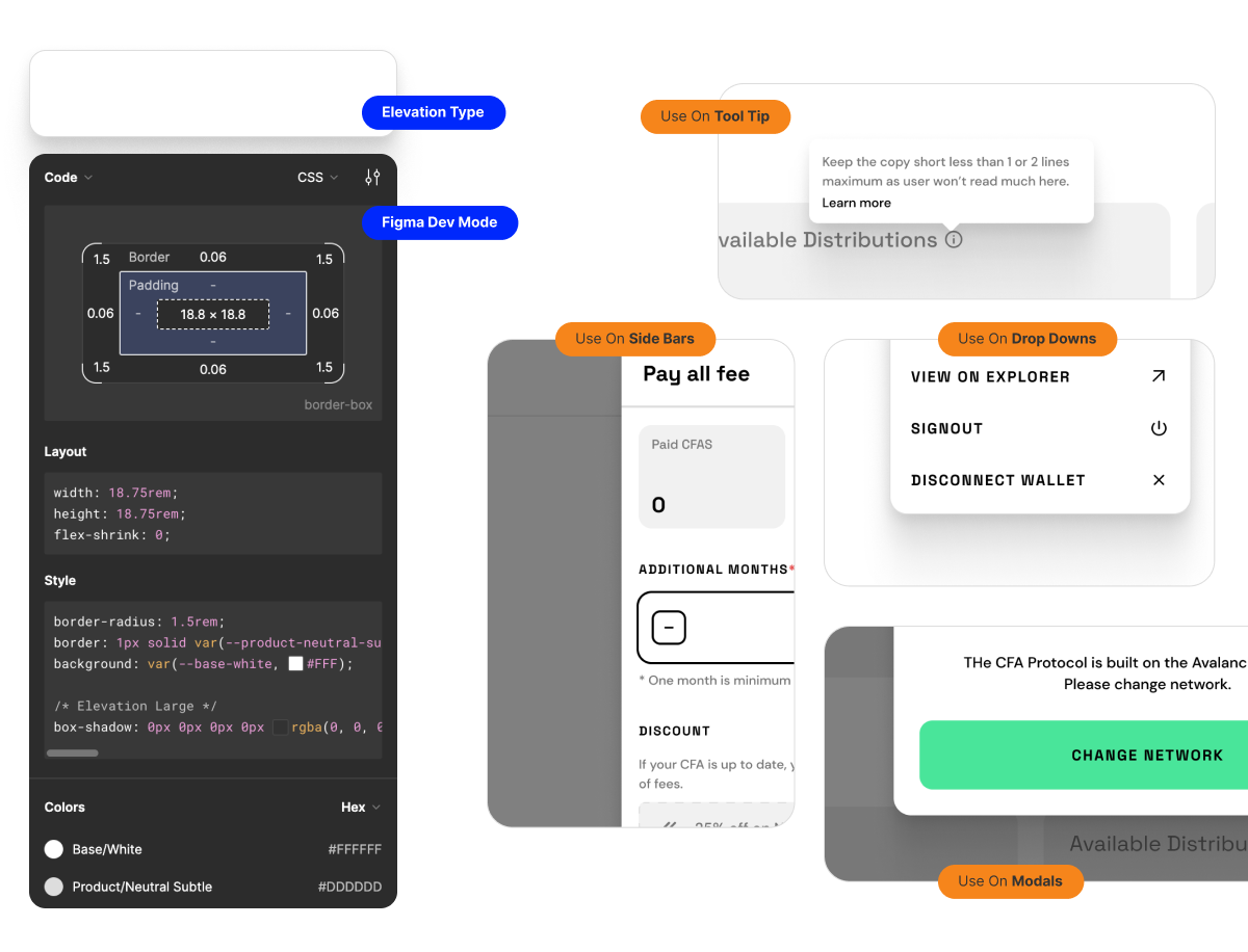
- Component snapshots with correct and incorrect usage
- Dos and Don'ts side-by-side tables
- Edge case rules (e.g., how to resize icons on smaller screens)
- Clear labels and examples for each state (default, hover, disabled)
- Downloadable assets to avoid version mismatch
Make it easy to find, easy to understand, and hard to misuse
You want to make sure your employees and partners trust and follow your guidelines.
Examples of Effective Usage Guidelines
As businesses spend more time refining their branding elements, designing an effective design system for their products and services becomes paramount.
Along with it comes the need for usage guidelines that dictate how components like logos, colors, typography, and images are used across all media channels to ensure consistency.
These guidelines are of the utmost importance as they help maintain visual consistency and build brand recall and trust.
Google Material Design
Every guideline is backed by rationale. Developers don’t just know what to do they know why.
IBM Carbon
Every component is modular, with usage context, accessibility standards, and developer-ready code.
Spotify Design Language
They include real-world mockups to demonstrate usage. The system feels alive, not theoretical. These aren’t just design documents. They’re operational playbooks.
With a casual yet authoritative tone, it is essential to know that following such guidelines not only protects the brand but also helps it become more recognizable.
Creating a User-Friendly Environment With Your Guidelines
Creating a user-friendly environment is paramount when it comes to setting guidelines for product usage.
It's also important to know the branding elements and design system of your product to maintain consistency across all platforms.
Even the most robust design systems fail if no one uses them.
- Host your guidelines on an internal platform with search and filters
- Use visual examples more than long text blocks
- Keep updates regular and notify teams when things change
- Add feedback loops so contributors can suggest updates
- Train new hires on how to navigate and apply the system
The more user-friendly your guidelines are, the more your system gets adopted.
With these tips, designing a user-friendly environment for your product will be a breeze.
Avoiding Common Pitfalls When Writing Usage Guidelines
When it comes to creating usage guidelines, it's important to learn from the mistakes of others in order to avoid common pitfalls.
One major area of concern is branding elements and how they fit into your overall design system.
The importance of consistency in your branding cannot be overstated, but it's important to strike a balance between adherence to guidelines and allowing room for creativity.
Here are some things to keep in mind;
1. Being too vague
Saying “don’t misuse the logo” isn’t helpful. Show what misuse looks like. Be specific.
2. Over-policing creativity
Too many rules can kill innovation. Leave room for flexible layouts or campaign-specific variations.
3. Forgetting about edge cases
If the mobile version of a feature has different behavior, document it.
4. Not testing with real users
Have designers and developers use your guidelines before launch. If they’re confused, improve clarity. Your goal isn’t perfection. It’s usefulness.
Another area to consider is the use of components within your design system. While they have the potential to save time and effort, be wary of becoming too reliant on pre-built components that don't truly fit your needs.
Conclusion
Design systems without usage guidelines are like cars without road signs. Everyone’s driving, but no one knows the rules.
If you want to build products that scale, teams that move fast, and brands that people remember, start documenting how to use your design not just how it looks.
Need help building guidelines that people actually use? Let’s talk.