Designing Icons and Other Graphics
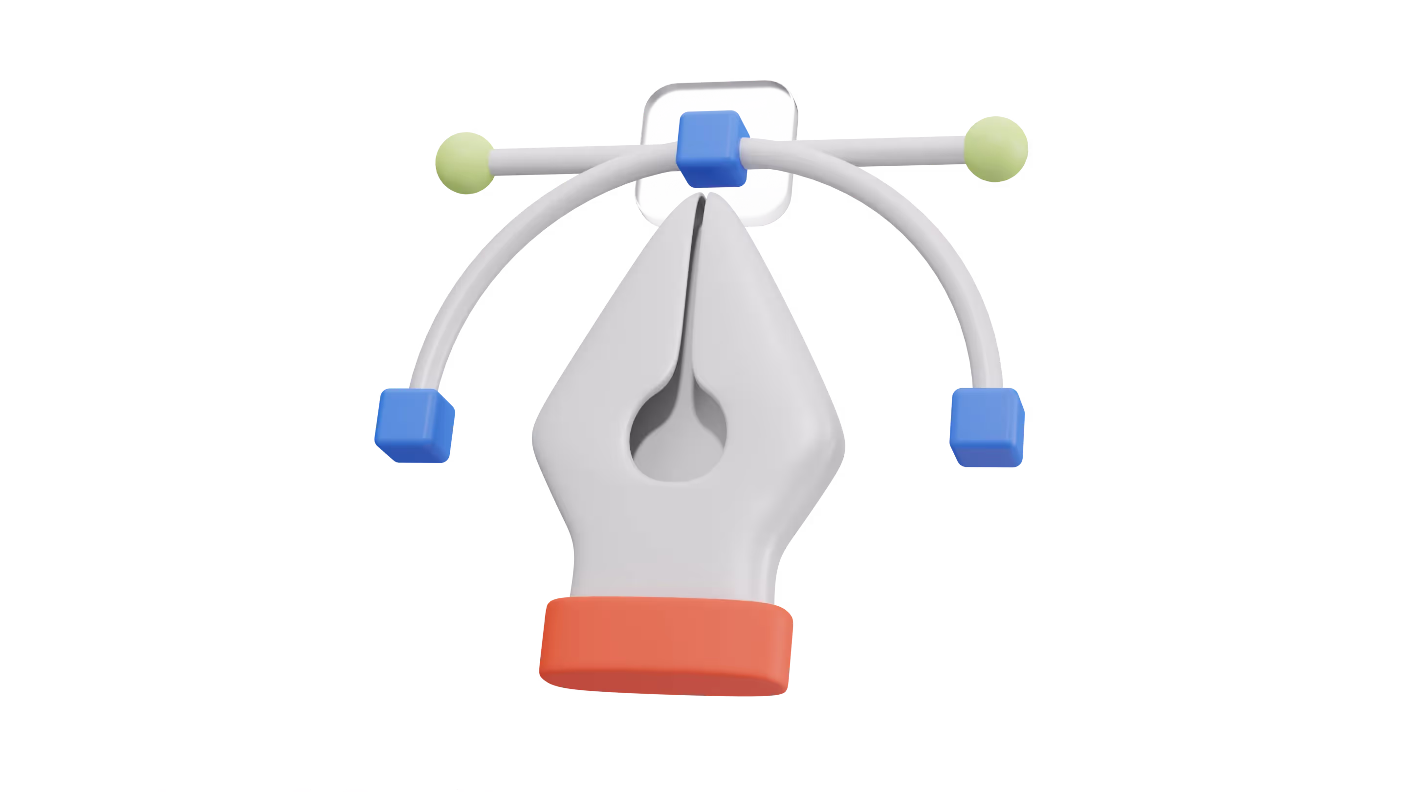
Users form a first impression of your interface in under 50 milliseconds. Before a single word is read, visuals like icons and illustrations set the tone. They guide attention, signal actions, and anchor your brand’s personality.
An icon isn’t just a symbol, it’s a micro-interaction. A visual handshake. The difference between scanning and confusion.
If your icons are inconsistent, unaligned, or overloaded with metaphor, users notice. If your visuals fight your layout, they interrupt the flow.
Every graphic element whether it’s a basic icon or a branded illustration either reinforces clarity or adds friction. Your job is to strip out the friction.
This post breaks down how to design and deploy icons, illustrations, and supporting graphics inside a system so you don’t just make things look good, you make them work.
Icon Libraries in Design Systems
Icons are not decoration. They’re functional tools that drive attention, speed up decisions, and reduce cognitive load. When used right, icons make your product feel faster, clearer, and more intuitive.
What Icons Actually Do
Icons serve specific roles:
- Navigation: Menu bars, tabs, and categories
- Actions: Upload, delete, share, copy, bookmark
- Status & Alerts: Warnings, errors, success indicators
- Communication: Tooltips, labels, and feature highlights
Each icon is a visual shortcut. Users don’t have time to read everything—they scan. And what they scan is often your icon set.
UI Icons vs Brand/Marketing Icons
Not all icons are the same. There are two categories:
- UI Icons: Functional, minimal, system-driven. These need to be pixel-perfect, instantly recognizable, and frictionless. Think of the trash can, hamburger menu, or checkmark.
- Brand/Marketing Icons: Expressive, stylized, often paired with copy. These show up in landing pages, product illustrations, or onboarding flows. They carry emotion and personality—not just utility.
Both types need consistency. But their roles are different. UI icons support behavior. Brand icons support identity.
Design systems that don’t draw this line end up with visual noise. You’ll see mismatched weights, unclear symbols, and icons doing too many jobs. The result: distraction instead of direction.
If you're working with a client, we don't recommend creating icons unless there is budget or time for it. Instead, license an icon pack from online marketplaces that provides ample options to fit multiple use cases while adhering to the above guidelines.
Fonts vs. SVGs
There is always a debate among designers and developers as to whether to use icons as fonts or as SVG versions.
Choosing how to implement icons isn’t just a developer decision it directly affects your product’s performance, accessibility, scalability, and design flexibility. The two most common formats in modern design systems are icon fonts and SVGs (Scalable Vector Graphics).
They solve the same problem in different ways. But if you're building a scalable, modern design system, you'll need to pick based on your goals not convenience.
Icons as fonts have been popular for a long time, as they can be scaled easily without losing resolution. A great example is FontAwesome, they can also be styled using CSS, which provides designers with more control over their appearance.
However, they also have some limitations.
For example, icons as fonts can’t have multiple colors, and they can’t be animated. A couple of other challenges that you can face with Font Icons is the difference between creating the design system that focusses on it’s size or quantity of icons.
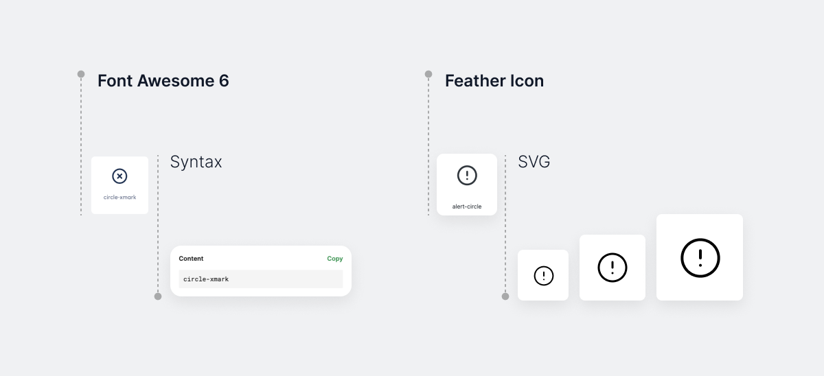
SVG Icons: The Modern Standard
On the other hand, SVG icons such as FeatherIcons are vector-based, which means they can be scaled without losing quality. They can also have multiple colors and can be animated using CSS or JavaScript.
Ultimately, the decision between using icons as fonts or as SVG versions depends on the specific needs of the project. If you need simple, scalable icons that can be styled easily with CSS, then icons as fonts might be the best choice.
SVGs are XML-based vector images. Every part of the icon is a shape or path, which makes them fully scalable and controllable through CSS or JavaScript.
Pros:
- Fully accessible: you can use proper ARIA labels or titles
- Sharp rendering at all sizes and screens (no blurring)
- Multi-color and gradient support
- Easily animated using CSS or JavaScript
- Fine-tuned control: manipulate each shape independently
Cons:
- Slightly more complex to implement (inline SVG vs. external file)
- Requires good organization (you’ll need an icon library or sprite system)
If you need more complex icons with multiple colors, animation, and scalability, then SVG icons might be the better choice.
Regardless of which option you choose, it’s important to keep your design system consistent. This means choosing a set of icons and sticking with them throughout your design.
By doing so, you can ensure that your design is cohesive and easy to navigate, which will help improve the user experience.
Organizing Icons in Your Design System
Effective icon management is key to maintaining consistency and scalability across your design system. A disorganized icon set leads to confusion, inconsistency, and ultimately, a bad user experience.
To make your design process efficient and ensure that your iconography remains consistent across products, you need a strategy for organizing and managing icons.
1. File Naming Conventions: The Foundation of Consistency
When working with a large set of icons, a clear and consistent file naming convention helps you quickly identify and implement icons into your projects. Adopting a systematic approach from the start will save you time and effort in the long run. Here's how you can approach it:
Naming Guidelines:
- Be Descriptive: Use names that describe the icon’s purpose (e.g.,
close,download,notifications). - Use Hyphens or Underscores: Stick to either hyphens or underscores to separate words. Avoid camelCase as it’s harder to read at a glance (e.g.,
icon-closeis clearer thaniconClose). - Prefix by Category: Group icons by their usage category and prefix each icon name (e.g.,
action-submit,status-error,ui-checkbox). - Version Control: If you're updating icons, version control is essential. Add version numbers or dates to filenames (e.g.,
settings-v1,settings-v2) so it's easy to track changes.
Example Naming Structure:
action-submitui-dropdowncontent-textstatus-error
Adopting this structure across your design system ensures that you can quickly locate, manage, and update icons when necessary.
2. Categorizing Icons by Purpose
The next step in organizing icons is categorizing them by purpose or functionality. Having a structured folder system or tagging system in place helps designers and developers find the icons they need without wasting time. Organize icons into these categories:
Common Categories:
- Actions: Icons representing user actions (e.g., submit, edit, delete, share).
- Content: Icons related to content (e.g., text, image, media, documents).
- UI: Icons that are part of the user interface (e.g., buttons, sliders, checkboxes).
- Status: Icons representing states (e.g., error, success, loading, warning).
- Branding: Logos, trademarks, or custom-designed brand-related icons.
- Navigation: Icons used for site navigation (e.g., home, back, menu, forward).
Tips for Effective Categorization:
- Subcategories: If your set of icons grows large, break down categories into subcategories. For example, the “Actions” category could include subfolders for “Editing,” “Sharing,” “Navigation,” and so on.
- Icon Purpose Tagging: If you're using a design tool like Figma or an asset manager like IconJar, make sure to tag icons with keywords like “primary,” “secondary,” or “interactive,” making it easier for other team members to find the right icon for the job.
3. Using Figma Components for Scalable Icon Management
Figma is an industry-standard design tool, and using it for organizing your icons can make your design process more efficient. With Figma Components, you can create reusable icon instances that can be modified globally, ensuring consistency across your design system.
Tips for Using Figma Components:
- Create a Master Component: Design a "master" version of each icon. From this master, create instances that can be used in your design.
- Variants: Use Figma's Variants feature to bundle icons of different states (e.g., active/inactive, hover/normal) in one component set, allowing for quicker iteration.
- Naming Convention: Apply the same naming conventions to Figma components as you would for your icon files. For example, “icon-close,” “icon-search,” etc., to keep it organized in the Assets panel.
Benefits of Figma Components:
- Consistency: Changes made to a master component automatically propagate to all instances.
- Efficiency: Once your icons are set up as components, designers can simply drag and drop them into their projects. The system ensures they are always using the most updated version.
4. Using Asset Management Tools: IconJar
IconJar is a powerful tool for managing and organizing your icon assets. It allows you to tag and categorize icons, making it easy to find the right one, even as your collection grows.
IconJar works well for teams that use icons in a collaborative environment, especially when dealing with large icon libraries.
Key Features of IconJar:
- Folder Organization: Like a file system, you can create folders for categories (e.g., actions, content, status, etc.) and drag icons into the appropriate folder.
- Tagging: IconJar allows you to tag icons with keywords (e.g., “outline,” “filled,” “interactive”) for easy searching.
- Preview and Export: Easily preview icons before you use them, and export your icons in different formats (SVG, PNG, etc.) when needed.
Why Use IconJar?
- Faster Search: As your icon library expands, having tags and categories allows you to find what you need faster.
- Sharing: Teams can export shared libraries, ensuring consistency and centralizing access.
- Cross-tool Compatibility: While IconJar works seamlessly with Figma and Sketch, it's also compatible with most design software, making it versatile.
Icon, 3D or Illustration
When it comes to designing icons, you want to focus on creating something simple yet distinct so that it’s easy for users to identify at a glance. It should communicate a message, and be versatile enough to work with different devices, sizes, and contexts.
Iconography also plays an important role in user interface (UI) elements such as buttons and menus, so it's important to consider how they’ll look when combined together.
In addition to icons, illustrations can help you communicate complex ideas in a the intended message quickly and efficiently. Additionally, icons should adhere to the your overall design system, which ensures a consistent look across all platforms or products.
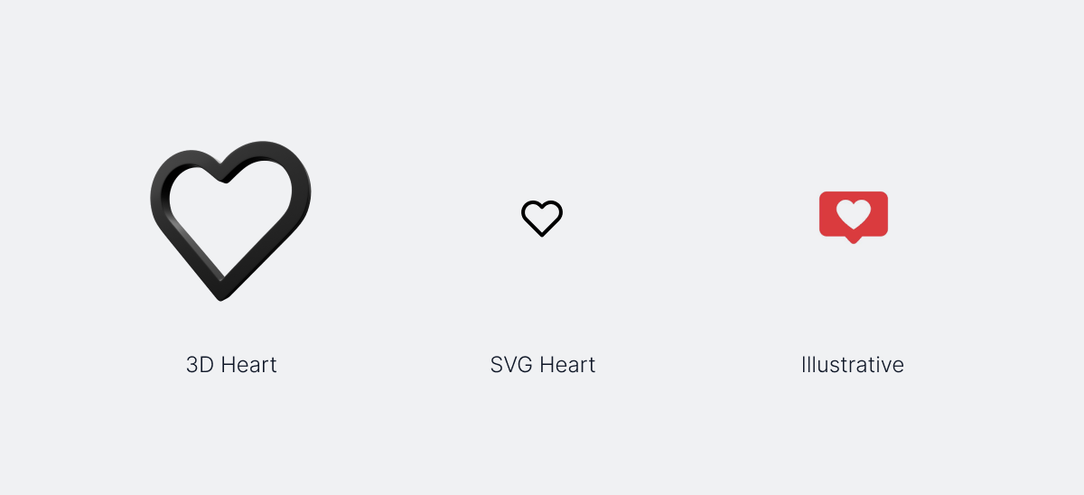
Illustrations are another important type of graphics used in design systems. They can help tell stories or demonstrate complex ideas in an easy-to-understand way. When purpose of the creating illustrations, be sure to create or use it without being too complex or detailed.
Use basic shapes and colors to create an iconic symbol that stands out from the crowd. Additionally, consider adding subtle touches like shadows, gradients, and textures to give your icons a unique look.
Overall, icons and illustrations are an important part of any design system. When designing these visual elements, it’s important to keep them simple, cohesive, and relevant to their intended purpose.
SVGs vs Icon Fonts: Pick One, Not Both
There’s a lingering debate - should you use icon fonts like FontAwesome, or SVGs?
SVGs win.
- Fully scalable, animatable, and more accessible.
- Supports multiple colors and gradients.
- Can be styled per component using CSS or JavaScript.
Icon fonts come with accessibility and styling trade-offs. They're harder to maintain, limited to single-color, and don't scale as cleanly across devices. If you're still using them, it’s time to move on.
Use an SVG sprite sheet if you're worried about performance. Tools like IcoMoon and SVGOMG help optimize your icons before shipping.
When to Use Illustrations
Illustrations should never compete with core content. Use them to:
- Support onboarding steps
- Communicate empty states or success messages
- Visually explain a product feature
Avoid overly detailed illustrations. Keep them lightweight, consistent in style, and aligned with your brand colors and tone. Tools like Humaaans, Blush, and Open Peeps offer modular illustration libraries.
For systems work, build your own illustration component library in Figma with defined use cases and layout behaviors. Treat them as reusable assets, not one-offs.
File Structure and Asset Organization
A bloated icon folder wastes team time. Structure your visual assets like a developer would:
- Base icons → universal symbols (search, close, edit)
- Functional icons → product-specific actions (upload, invite, sync)
- State icons → feedback visuals (success, error, empty)
Use clear naming conventions (ic-search-16, ic-upload-colored, ic-error-outline). Sync your asset library across tools using Figma Libraries, Storybook, or Zeplin for handoff.
Accessibility and Performance
If your visuals don’t work for all users, they’re broken.
- Always include
aria-labelsor hidden text for SVGs. - Maintain a 3:1 color contrast for icons with interactive states.
- Test your icon legibility in light and dark modes.
- Compress SVGs to avoid bloated load times—use Gzip or SVGO.
Design System Examples to Learn From
- IBM Carbon: Has strict icon guidelines with defined pictograms and UI icons carbon icons
- Atlassian Design System: Demonstrates icon usage across Jira, Trello, and Confluence with consistent visual metaphors
- Shopify Polaris: Balances iconography with motion and accessibility-first design
Conclusion
Designing icons and graphics can be one of the most exciting (and sometimes time-consuming) elements of your design system. If your icons don’t help users act faster or understand more, they’re noise.
- Build with consistency, not creativity
- Use real grids and enforce strict structure
- Default to SVGs and accessible patterns
- License icons early unless you have time to maintain a full library
- Keep illustrations functional and modular
As visual elements become increasingly popular and asked for in digital products, designers must recognize they play a vital role in how consumers perceive their product.