Safe Society Case Study: Webflow Design for Non-Profits
See how we built a digital sanctuary for Safe Society. A Webflow case study on non-profit branding, UI/UX, and support for abuse survivors.


Goals
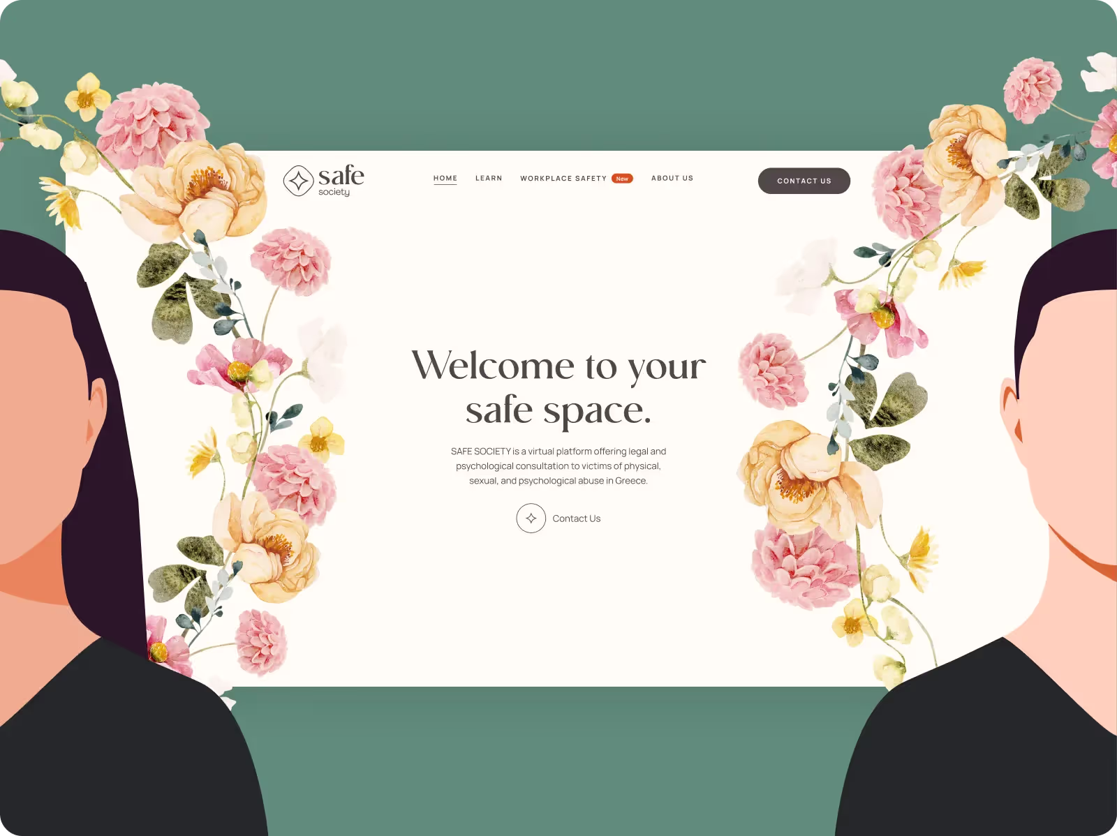
Safe Society’s mission was clear: to create a digital space where abuse survivors feel safe and supported. The platform went beyond functionality, becoming a sanctuary providing warmth, trust, and accessibility. We aimed to design a brand identity and user experience to connect survivors with life-changing legal, psychological, and therapeutic resources while ensuring every interaction felt intuitive and reassuring.
We focused on crafting an environment that prioritizes safety and simplicity to achieve this. The platform’s design had to overcome the hesitation many survivors feel when seeking help, using thoughtful visuals and user-friendly navigation to create an atmosphere of care. At its core, Safe Society aimed to empower individuals by making support accessible and building trust through design.
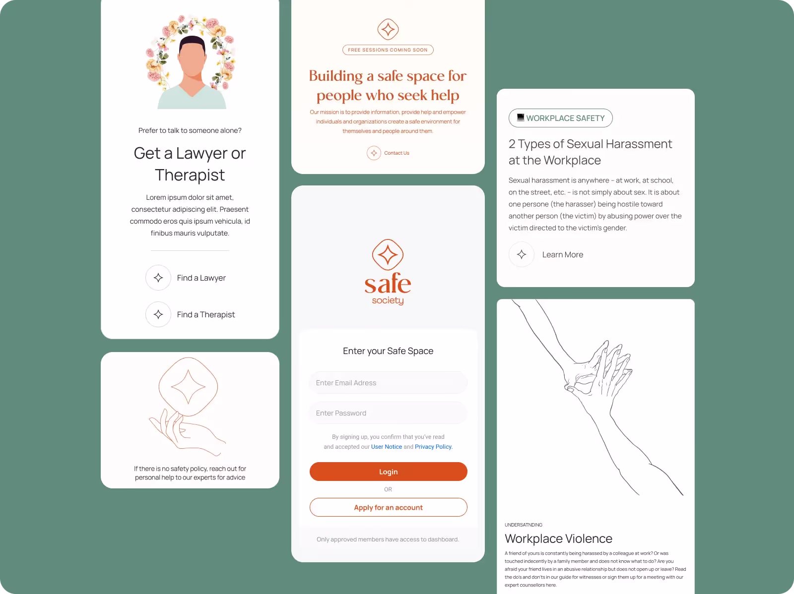
Building A Brand Identity That Resonates
Building a brand identity for Safe Society meant capturing the essence of safety, trust, and empowerment. It wasn’t just about visuals; it was about creating a language survivors could connect with a design that offered reassurance at first glance. From the calming color palette to the carefully chosen typography, every element was crafted to foster a sense of protection and care.
The brand had to speak directly to the needs of its audience. For survivors, engaging with resources can be daunting. The identity we developed aimed to break down those barriers, conveying warmth and accessibility while maintaining a professional, trustworthy tone.
Key Designs Principles:
Warmth, Safety, and Comfort
Colour Scheme
The color palette was carefully chosen to evoke a sense of calm and reassurance. Soft, muted tones created a welcoming environment, while subtle accents guided users’ attention without overwhelming them. Each hue was selected to communicate warmth and trust, reflecting the platform's mission of providing a safe space.
Typography
Typography played a pivotal role in creating a supportive experience. Rounded, approachable fonts conveyed friendliness while maintaining readability across devices. The typefaces balanced professionalism with warmth, ensuring survivors felt valued and understood.
Imagery
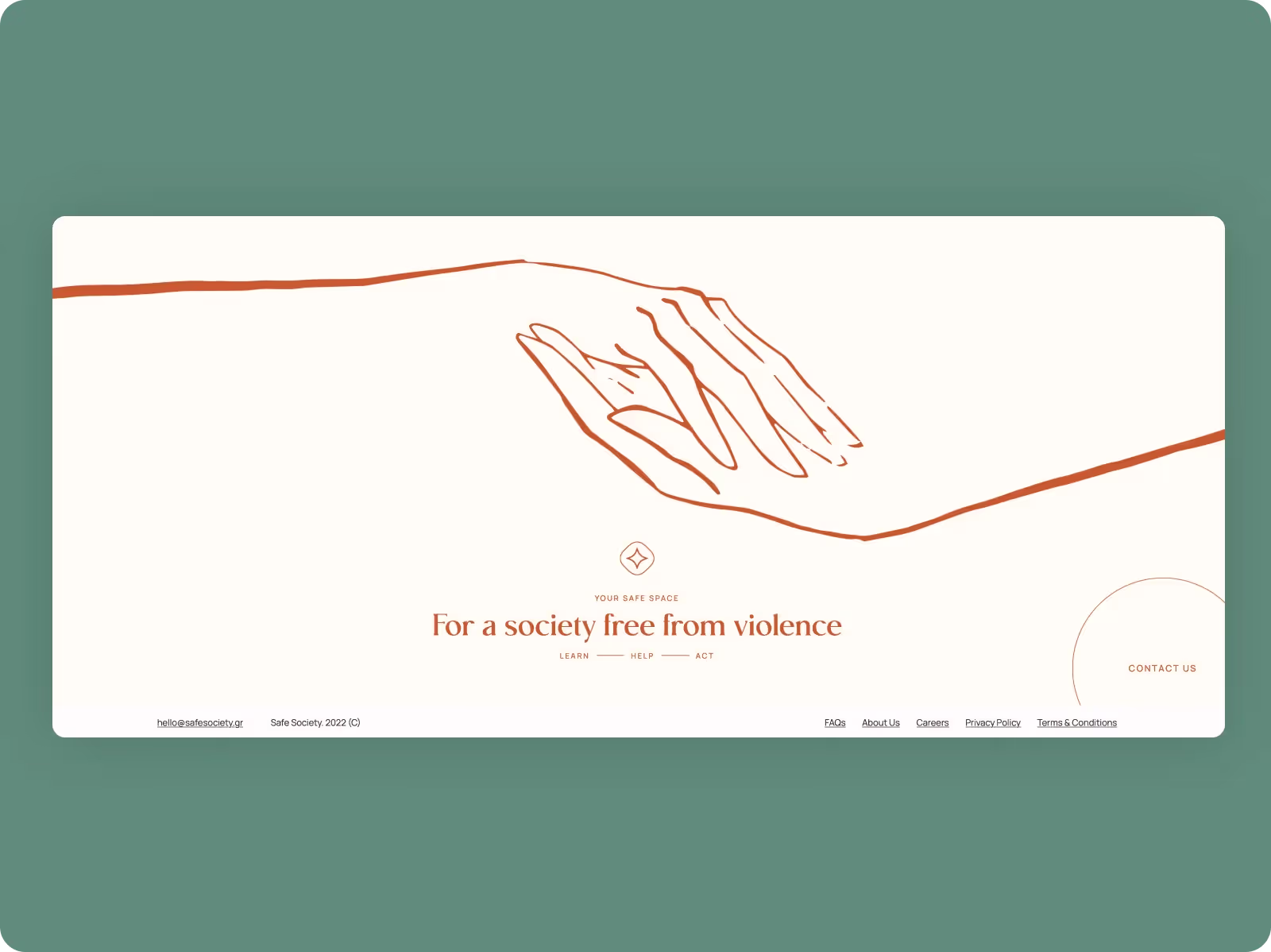
Imagery was used sparingly yet powerfully. Soft visuals and abstract patterns replaced triggering or overly literal graphics, creating an atmosphere of discretion and care. Each image enhanced the platform’s message of hope and protection, resonating deeply with its audience.