Establishing a Visual Language: Colors

90% of snap judgments about a brand are based on color alone. If your colors don’t align with your message, your audience might lose trust before they even read a word.
Think about it: Would you take a bank seriously if its branding was neon pink and lime green? Probably not. Colors have been known from time immemorial to shape perception, trigger emotions, and influence decisions more than we realize.
When choosing a palette, it should be about communicating the right message, not just for aesthetics or good looks. Once you get it wrong, your brand will automatically feel off. But when you get it right, you tend to create instant recognition and trust.
So, how do you establish a color system that works? Let’s break it down.
Why is Color Important in a Design System?
We all know that Colors are symbolic, communicate, and have meanings. We have various colors that fit how we live our lives daily. Colors in a design system impact emotions, create contrast and harmony, and serve as a visual anchor for any brand.
The right color choices elevate brand recognition and create memorable user experiences, while poor color choices can lead to confusion or disengagement.
Also, color can guide the viewer's eye, highlighting essential elements and creating a clear visual hierarchy. It helps to draw attention to key information and develop a sense of order. Overall, knowing how to use the right color has a lot of emotional impact on your design and increases your Aesthetic Harmony.
Key Benefits of a Well-Designed Color Palette
1. Colors Create Instant Recognition
Color is often the first thing the human brain notices, and over time, we have seen brands and projects identify with unique colors that speak to their brand values and breathe recognition.
A strong, consistent use of color builds recognition. You need to ensure that your brand’s colors are not scattered or inconsistent, which may affect how people see and remember you.
One way to get your audience's attention or get them to know your brand is to have a well-designed color palette.
This makes it easier for your audience to know it’s your brand before seeing your name.
This kind of visual memory is invaluable. It means your brand remains top-of-mind, reducing the effort needed to establish trust with your audience.
2. Colors Evoke Emotion and Influence Perception
There’s a reason hospitals use soft blues and whites while luxury brands lean into black and gold. Colors are there to shape how people feel and respond to your brand.
For starters, colors are classified into primary and secondary colors, and each color has something it is identified with and communicates as. While red commands attention and conveys urgency.
Generally, red always creates a sense of excitement, and green, on the other hand, is associated with nature, growth, and health.
Black has always been identified as bold, elegant, and powerful, while white means minimalism, cleanliness, and clarity. This and more reasons are why most brands stick to colors that fit their beliefs.
3. Colors Improve Readability and User Experience
The most common type of contrast that increases readability is black text on a white background because it makes it easier to read.
As a designer, know that one of your roles is to ensure that your viewer doesn’t have to work to understand your design. So, always aim for a good contrast that eliminates barriers and lets the message shine through effortlessly.
When it comes to user experience, you must use the right or bold colors to draw attention immediately.
You can also try softer or cool colors to pass less critical information.
Try a well-chosen color scheme if you want your users to navigate your design effortlessly. Also, for large amounts of text, like articles or blogs, light backgrounds with dark text are easier on the eyes.
They mimic the contrast of ink on paper, which is familiar and comfortable for most users. So, when designing, always test your color choices in real-world scenarios.
Gather user feedback to ensure your design works as intended across different devices, lighting conditions, and accessibility needs.
4. Colors Differentiate You in a Crowded Market
Every industry has specific dominant colors. Some tech companies love blue because it signals trust and stability. To stand out, you need to choose a color that makes you unique; that way, you won't have to look like everyone else.
Some organic brands use greens and browns, which signify nature and wellness. If you look like everyone else, you fade into the noise.
Some strategic color selections allow you to stand apart, including bold and unique color palettes that will help you stand out and make you unforgettable.
5. Colors Drive Conversions and Influence Behavior
Studies show that color can increase brand recognition by 80% and impact consumer behavior at a subconscious level. A red “Buy Now” button may create urgency, while a blue interface may encourage prolonged engagement.
This is because the brain processes color faster than text before a user reads your message. We advise writers to add more infographics to their text to help create lasting impressions. Thoughtful use of color increases engagement, improves trust, and drives action.
Concept of Establishing a Visual Language: Colors in Design
Establishing a visual language in design through color means intentionally using colors to communicate ideas, emotions, and brand identity. Language Colors in design aren’t random; they’re meticulously chosen to enhance the brand's message, evoke emotion, and create visual Consistency.
The Role of Colors in Design
One of the top roles of colors in design is shaping perception, guiding attention, and influencing decisions. A well-chosen palette makes a brand instantly recognizable, setting the right tone before a single interaction.
Companies that use consistent colors across their website, packaging, and marketing create stronger connections with their audience.
When colors feel off, dull, harsh, or mismatched, they can confuse or even push people away.
Beyond branding, colors improve usability. High-contrast text ensures readability, while accent colors highlight essential actions, like buttons or key messages.
The right colors make navigation effortless and decision-making instinctive. Poor color choices frustrate users in digital interfaces, while thoughtful color design creates a smooth, engaging experience.
Whether in branding or user experience, color is a tool that, when used effectively, makes communication clear and has a lasting impact.
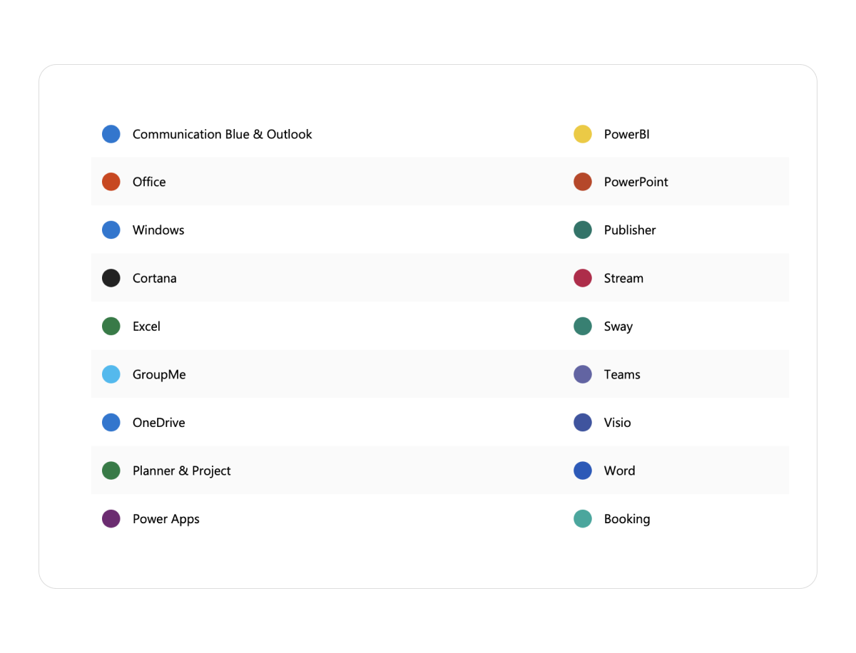
For example, Microsoft effectively uses color to distinguish between its various products, keeping a unified brand image across platforms.
Color can enhance the user experience and create a visually appealing design.
Basic Rules for Creating a Color Palette
When it comes to using colors, some basic rules should be followed.
Keep Your Palette Simple
An overwhelming number of colors can make a design feel cluttered. Stick to 2-3 primary colors and build secondary and tertiary colors from them. This helps maintain Consistency across various elements. For instance, check out how Atlassian’s Color System follows this principle.
Use Color with Intention and Purpose
Every color should serve a purpose. Use colors strategically to reflect your brand or enhance functionality. For example, avoid generic red for error states – instead, choose shades that align with your brand colors for more cohesive designs.
Consider Accessibility in Your Color Choices

A color palette should be accessible to all users, including those with visual impairments. Ensure you have sufficient color contrast for text and functional elements to improve legibility and navigation.
Creating a Color Palette for Your Design System
Identify your Primary Brand Color
This usually comes from their side if you have a graphic designer or brand designer. So, follow the brand guidelines to pick the primary colors you can use. If you are the one creating this brand, do some research on your market and come back to this article.
We are focusing on Design System for Digital Interface, so once you have that - continue this article.
Assuming you have your Primary Color, we will use our Layer’s Foundation Purple to show you how to get started.
Layers Foundation is a product created by the Neue World team to bridge the gap between Clients and Freelancers and build a trustless platform using blockchain technology. Because Neue World’s Design Team created the complete website and brand guidelines, let’s use that as a guide for us to move forward with this article.
Let’s use our Primary Brand Color, #8E0DFF, and this tool called UI Color Palette to help us build a Color Palette based on Google Material Design.
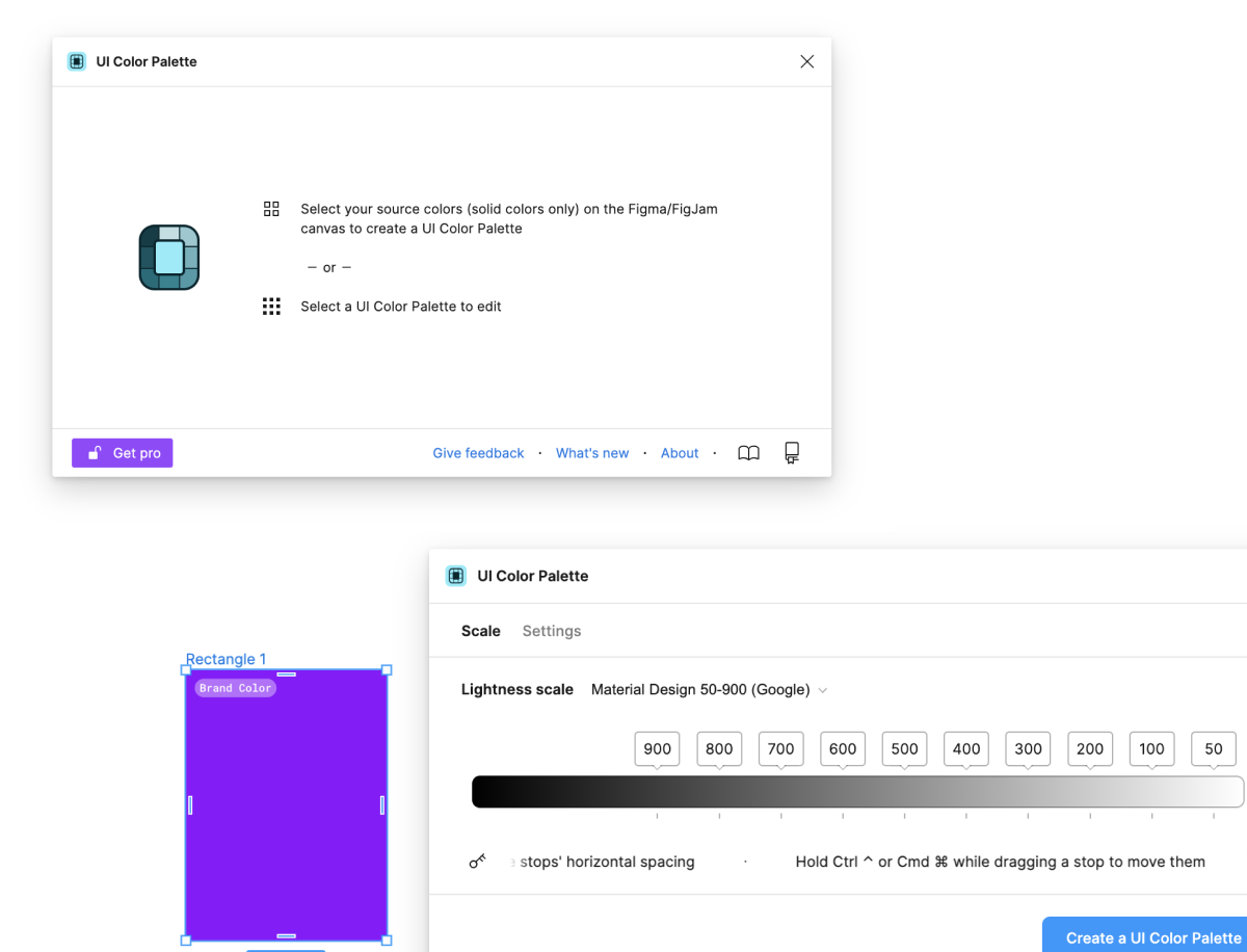
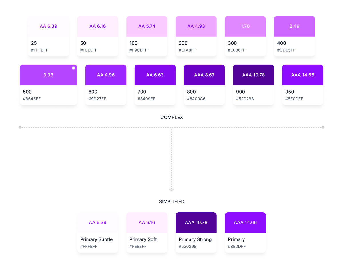
And then once we have it, we will reduce the color palette from being so complex (remember, this is a beginners guide) and focus on just the ones that we want.
- Primary
- Primary Hard
- Primary Soft
- Primary Subtle
Purpose of doing this is such that the primary palette is comprised of neutrals, white, and purple (our primary) to make sure that the brand stays consistent due to the purple, while the neutrals and whites are used in logical ways throughout product and marketing to guide the eye and highlight the important bits.
We can then use Primary (#8E0DFF) for primary actions, buttons, text links, for indicating progress and represent the brand. Neutral can be used for text and headings, and white or Subtle Grey for page backgrounds.
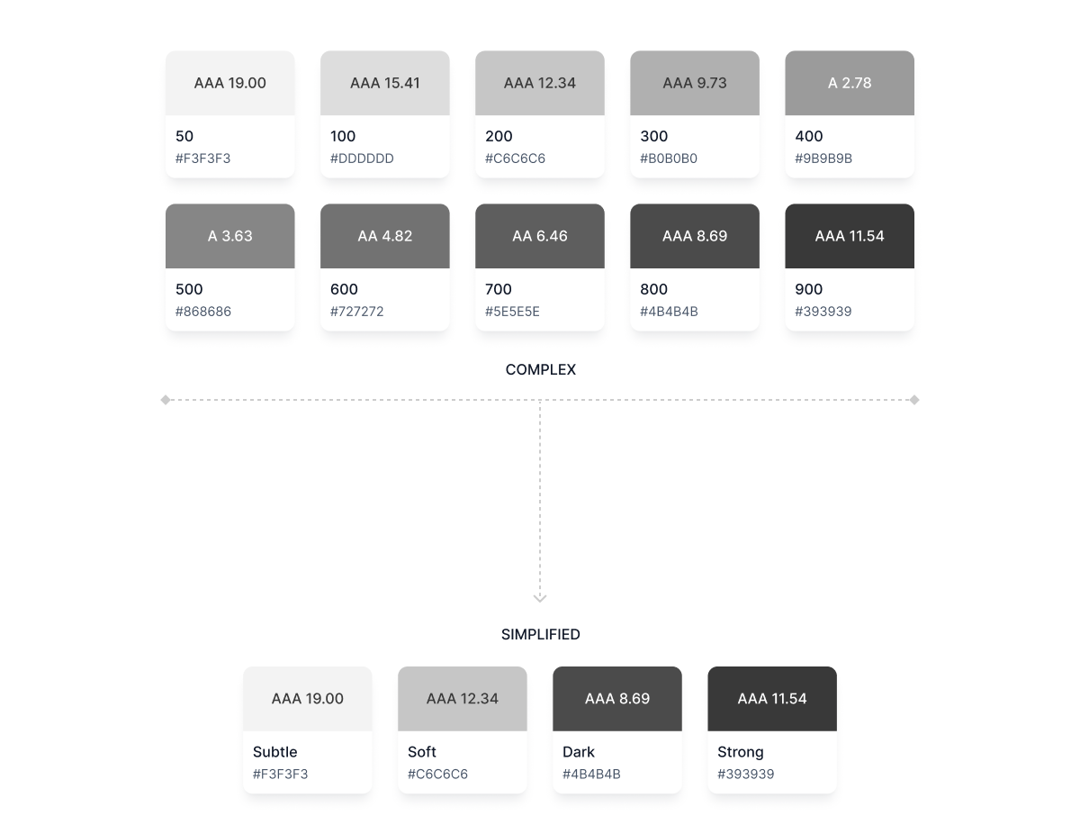
You can also use a similar technique to build colors for the following
- Neutrals
- Error
- Success
- Warning
No Pre-Existing Brand Guidelines? Start Here
Crafting a cohesive color palette can feel daunting if you're starting from scratch. This language contains shapes, typography, patterns, textures, and, most importantly, colors.
Establishing a color palette for a design system is key to achieving the desired aesthetic. However, finding the right balance between the tones can be complicated.
Here’s a step-by-step guide to building a palette that will define your visual language:
1. Start with Your Brand’s Personality
Before picking colors, think about what your brand stands for. Is it bold and energetic, or calm and trustworthy? A law firm and a children’s toy brand shouldn’t have the same color vibe. Your colors should match the emotions you want people to feel when they see your brand.
2. Learn How Colors Influence People
Colors send messages before words do. Red feels urgent; blue builds trust, green signals growth, and black gives a luxury feel. Look at how big brands use colors—banks stick to blue because it feels secure, while fast food chains use red and yellow because they create excitement and hunger.
Pick colors that align with your message.
3. Check Out the Competition
Look at what brands in your industry are doing. Are they all using the same colors? If yes, you have two choices—blend in or stand out. T-Mobile didn’t follow the telecom industry’s love for blue; they went for bright magenta, which is now unmistakably theirs.
4. Pick Your Main Color
This is the color people will associate with your brand the most. Think of Coca-Cola’s red or Starbucks’ green. Your primary color should match your brand’s personality and be used consistently everywhere—on your website, marketing materials, and products.
5. Add Supporting Colors
Once you have a primary color, you need a few supporting shades to add depth. These should complement your primary color without competing with it. Keep it simple—two to four additional colors are usually enough to create a balanced look.
6. Make Sure Everything Is Easy to Read
Your colors should look good, but they also need to be functional. Have you ever tried reading yellow text on a white background? It’s a nightmare. High contrast makes text easier to read, and that’s non-negotiable. If people can’t read your content, they won’t stick around.
7. Give Each Color a Job
Every color in your palette should have a purpose. The main color is for branding, secondary colors add accents, and neutral shades keep things balanced. In digital design, colors guide users—buttons should stand out, links should be clear, and essential elements should grab attention.
8. Test Your Colors in Real Life
A color might look great on your computer screen but different in print or mobile. Test your palette across various platforms, websites, packaging, and social media to ensure Consistency everywhere.
9. Set Rules and Stick to Them
Once you’ve locked in your colors, document them in a style guide. Include color codes (HEX, RGB, CMYK), so they stay the same across different platforms. Ensure your team follows the guide because Consistency makes a brand look professional and memorable.
10. Be Open to Change
Your color palette isn’t set in stone. Over time, your brand might evolve, and your colors might need a refresh. But don’t make random changes, if you tweak your colors, do it with purpose and in a way that keeps your brand recognizable.
A strong color palette isn’t just about looking good, it’s about making sure people recognize and trust your brand at a glance. Get it right; your colors will do half the talking for you.
Conclusion
Building a color palette that conveys the right message and enhances user experience is crucial for any design system.
Great design demands intentionality. The colors you choose must look good and enhance readability, improving usability, creating recognition, and forging emotional connections.
By following the tips in this guide, you can create a well-structured, accessible, and visually compelling palette that reflects your brand’s identity and values.
Frequently Asked Questions
How do I choose colors for my design system?
Start with your brand’s core values and audience. Use primary, secondary, and accent colors that enhance usability and aesthetics.
What is color accessibility in design?
Color accessibility ensures all users, including those with visual impairments, can easily engage with your content. High-contrast color combinations improve legibility and navigability.
Why should I limit the number of colors in my palette?
A smaller color palette promotes Consistency, making your brand more recognizable. It also helps create cleaner, less cluttered designs.
How do you name colors in design systems?
There are different approaches to naming colors in a design system. You can name colors by their function (e.g., "primary," "error"), then add a numerical scale for variations (e.g., "primary-100," "error-500"). This ensures clarity, scalability, and consistent usage across your design system.
What is visual language in design?
Visual language in design is a set of elements and principles that create and communicate a specific visual message. This includes using color, typography, imagery, and other design elements to create a visual language that conveys a particular message or emotion.