Over time, Web3 has been the shift that breaks more than just backend logic. It breaks the way people interact with digital products. With Web3, you’re not just designing interfaces anymore; you’re creating trust. You're not simplifying screens; you’re simplifying blockchain.
Every click now carries weight. Every misstep has consequences.
Most users are unaware of how wallets work. They’re unsure what gas fees mean. They hesitate because they don’t understand. That hesitation is where your growth stalls.
If you’re building in Web3, your most significant edge isn’t your tech. It’s your experience design.
This blog breaks down what founders and marketers need to know. The core design challenges. The complex problems are still unsolved. And clear opportunities await teams that get the design right in Web3.
The Evolution from Web2 to Web3
Web2 design was about frictionless access. Login with Google. Tap to pay. Swipe, scroll, and consume. Platforms owned the data and controlled the experience, and the job of a designer was to keep you in the loop more smoothly and efficiently.
In Web3, it is no different; users now own their data. They manage wallets, sign transactions, and control access. There’s no central platform to catch their mistakes. If something breaks, it’s on them. Or worse, it’s on you, the product team.
Design in Web2 was about usability. Design in Web3 is about responsibility. You’re not designing for ease. You’re planning for an agency. That means building interfaces that educate, guide, and protect users without slowing them down.
For founders, this isn’t just a technical shift. It’s a brand shift. Your design becomes the frontline of trust. If it confuses, they’ll churn. If it reassures, they’ll stay. In Web3, UI isn’t just what they see. UX is how they decide to believe you.
The UX Challenge: Designing for the Unfamiliar
Most people don’t understand how a blockchain works. They’re not supposed to. But in Web3, they’re forced to.
Sign a transaction. Switch networks. Approve a contract. Even basic actions are packed with technical friction. It’s no surprise users feel lost or, worse, suspicious. Confusion breeds mistrust, and mistrust kills retention.
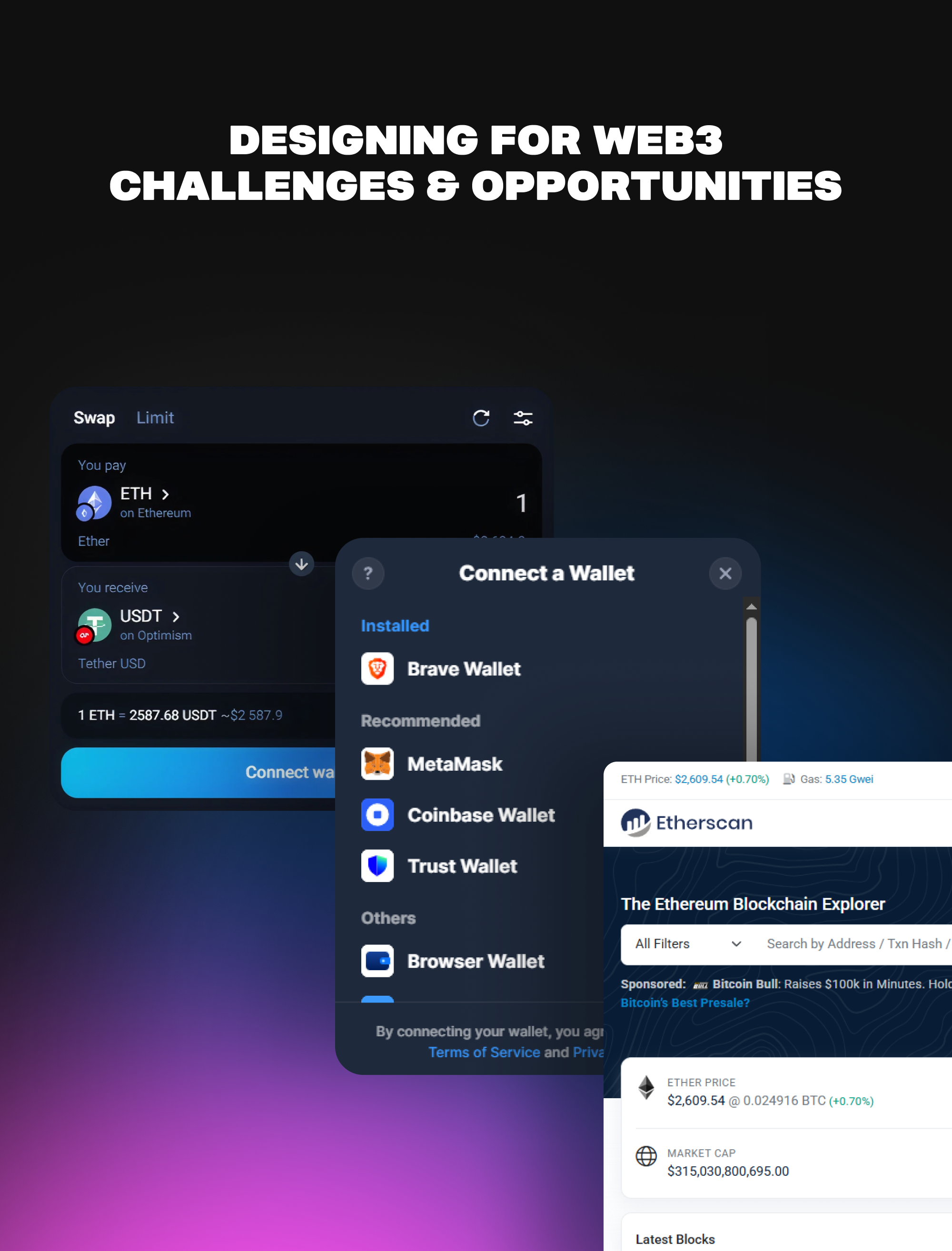
Look at wallet setups. A few wrong clicks, and you’re locked out. Or the language: “gas fees,” “hashes,” “signing,” and “bridging.” These terms aren’t intuitive. They don’t invite trust. They raise barriers.
Design becomes your only translator. When you guide users through unfamiliar flows, you lower the perceived risk. Simple changes, such as human-readable wallet names, progress bars for transaction status, or tooltips explaining actions, can make the difference between a bounce and buy-in.
Key Challenges in Designing for Web3
What are the challenges of being in the field of UI/UX design related to Web3?
Web3 forces UI/UX designers to work without a fixed blueprint. Unlike Web2, where users have well-defined patterns and platforms, Web3 is fragmented, with different chains, tools, wallets, and mental models.
Most users come in without context. You’re not just designing a product. You’re designing onboarding, education, and reassurance simultaneously.
The speed of innovation also adds pressure. New protocols ship weekly. Standards change mid-project. You might design for one wallet, allowing users to switch to a different one. And while technology evolves rapidly, design maturity doesn’t.
This leaves designers in a constant cycle of adaptation, often without precedent or best practices to fall back on.
Is UI/UX necessary for Web3 development?
Yes, and it’s non-negotiable. The technology behind Web3 may be decentralized, but its adoption remains deeply human. And humans don’t adopt what they don’t understand or trust. UI/UX design is about translating abstract, complex systems, such as smart contracts, tokens, and DAOs, into actions that people can take with confidence.
Without design, even the most powerful dApps stay unused.
A product’s value doesn’t lie in the blockchain it’s built on. It lies in how easily people can use it. Developers build the infrastructure, but UI/UX is what turns that infrastructure into an experience. Without that bridge, you’re building for developers, not users.
What is the difference between UI and UX design?
UI (User Interface) is the layout, buttons, colors, typography, and visual elements users interact with. UX (User Experience) is the logic behind the layout, the flow, structure, and emotional response users feel when navigating a product. UI is what people see; UX is how people feel.
In Web3, this distinction matters more than ever. You can have a clean interface (UI), but if users don’t understand how to connect their wallet, track a transaction, or recover their assets (UX), they’ll leave. UX defines usability. UI delivers clarity.
Both are needed to guide users through unfamiliar territory, such as token swaps or DAO voting.
How do UI and UX designers work together in Web3?
In Web3, UI and UX designers must be closely aligned. UX designers map out the experience of how users onboard, interact with smart contracts or recover wallets. They anticipate friction and design flows that reduce it.
UI designers translate those flows into clean, intuitive screens that communicate clearly, especially when blockchain actions are irreversible or unfamiliar.
Because most users don’t understand cryptographic terms or on-chain logic, this collaboration is non-negotiable. UX focuses on what needs to happen and why it needs to happen. UI focuses on how it looks and how fast it clicks. In Web3, a misstep in either breaks trust.
When they work together, you build products that feel safe, even if the tech under the hood is complex.
Opportunities and Roles in the Web3 Design Ecosystem
Web3 design is still in its early stages, and that's the opportunity. Designers who understand both the technical constraints and the human side of decentralized products are rare. That gap creates room for real impact.
UX Designers
You focus on simplifying the unfamiliar. From onboarding flows for wallets to reducing the fear around transactions, your job is to lower the barrier to entry. In Web3, UX isn't optional; it's the bridge between innovation and adoption.
UI Designers
You translate complex systems into clean, intuitive visuals. Designing for dApps, DAOs, and

decentralized exchanges requires clarity and adaptability. You’re creating not just interfaces but trust signals.
Product Designers
You blend strategy with execution. You handle user research, wireframes, and prototyping for products that evolve in real-time, including NFT platforms, DeFi tools, and governance portals. You don’t just design screens; you shape behavior.
Motion and Interaction Designers
Your role is rising fast. Web3 actions often lack clear feedback; your animations and transitions provide clarity and transparency. When a user stakes a token or signs a transaction, your work confirms what’s happening and why it matters.
Visual + Brand Designers
You help projects build credibility. In a space crowded with scams and clones, branding isn’t decoration; it’s defense. You craft identities that communicate legitimacy, ethos, and mission.
Every one of these roles is underserved. If you’re a designer with curiosity, this space is wide open, not just for freelancing but for shaping how the next internet feels to humans.
Creating & Designing Web3 Projects
How do I create a Web3 project?
Creating a Web3 project starts with choosing a problem worth solving. Are you building a dApp, a DAO, a token-based community, or something else?
Once your vision is clear, you’ll need to define the core functionality, including what users can do, how value flows, and which blockchain infrastructure best supports it (e.g., Ethereum, Solana).
From there, you work with smart contract developers to build the backend logic. This stage involves more than code; it requires understanding how trustless systems, tokens, and wallets interact in a permission-less environment.
The next step is shipping a usable product. This involves prioritizing the front-end design and experience, integrating wallet connections (such as MetaMask or WalletConnect), setting up smart contract interactions, and managing security layers.

You’ll also need to consider scalability, community building, and feedback loops. A successful Web3 project isn’t just code that works; it’s a product people can use, trust, and return to. That means involving design from day one, not after launch.
How to design for Web3?
Designing for Web3 means designing for trust. You're not just making things look clean. You’re helping users navigate systems that are unfamiliar, irreversible, and high-stakes.
The experience has to be informative without overwhelming, especially when dealing with transactions, permissions, and gas fees.
Unlike Web2, there is no centralized support to call when things go wrong, so your design must do more upfront: explain what's happening, what could go wrong, and how to fix it.
How to create Web3 design?
Web3 design starts with understanding your user’s mindset. Most are not crypto-native. They’re cautious, often overwhelmed, and don’t want to make mistakes. Your job is to reduce friction, build trust, and guide them through steps like signing transactions, swapping tokens, or engaging with on-chain governance.
.png)
That means designing flows that break down complex interactions, adding progressive disclosure, and validating every click before it happens.
From a workflow perspective, you still use familiar tools, such as Figma, Framer, and Notion, but

apply them differently. You’ll prototype wallet connections, test interaction patterns such as token swaps or DAO voting, and explore modular UI systems that adapt to a rapidly evolving ecosystem.
How AI Is Transforming Product Design for Web3
AI is removing the grunt work so Web3 designers can focus on what matters: clarity, flow, and trust. In a space already defined by complexity, including wallet integrations, gas fees, and DAO voting mechanisms, AI accelerates the process of transforming abstract ideas into usable interfaces.
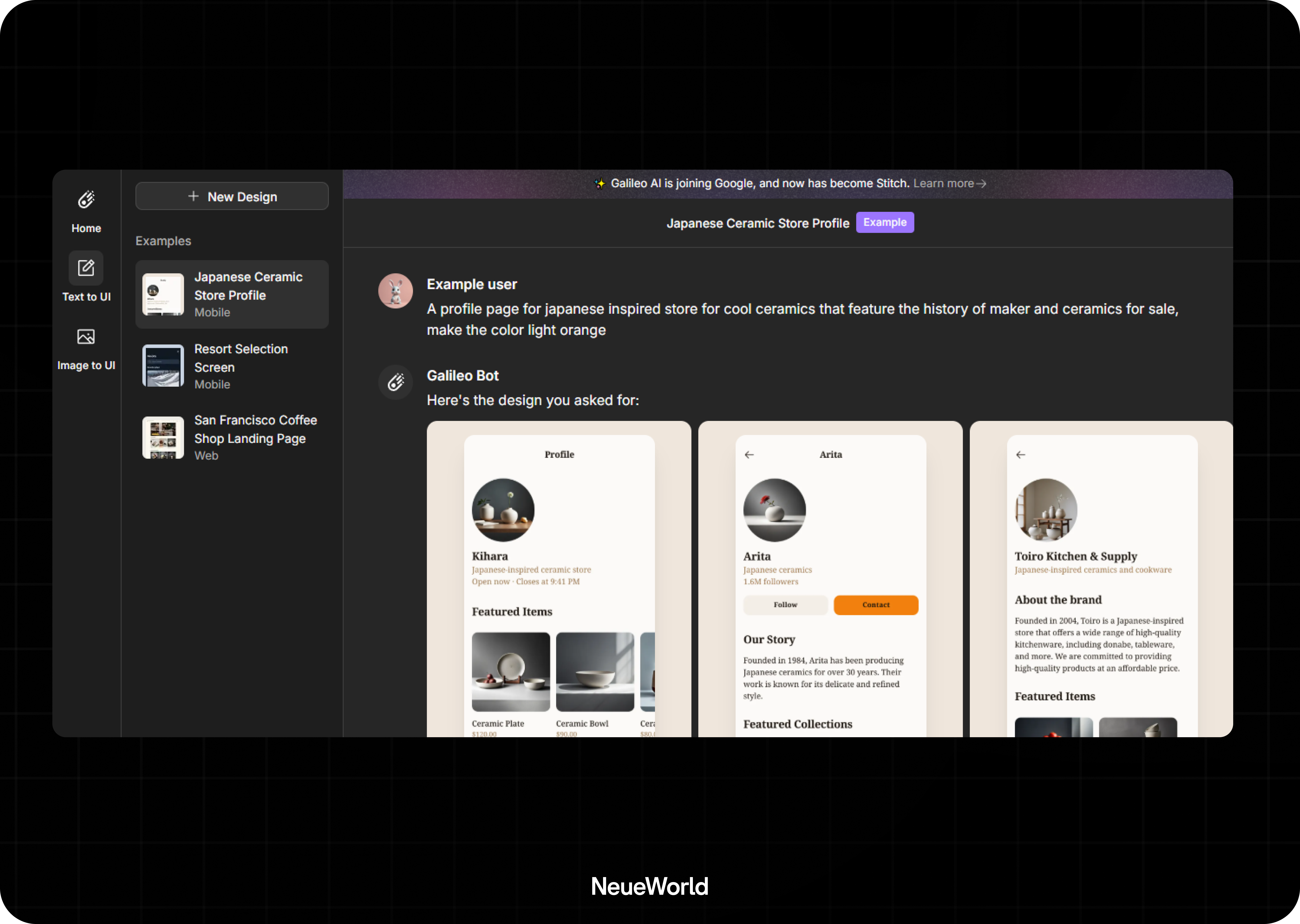
Tools like Galileo AI generate UI screens from text prompts, letting designers skip wireframing and focus on testing.
Diagram’s Automator in Figma helps automate routine tasks, like renaming layers or creating variants. These aren’t just time savers; they enable teams to ship faster in a space that rewards momentum.
More importantly, AI helps designers adapt to user behavior in real-time. With AI-powered analytics, you can study how people interact with innovative contract interfaces, NFTs, or DeFi dashboards, then optimize accordingly.
Best Platforms and Tools for Web3 Design
Designing for Web3 means you’re building at the edge of tech and trust. To do that effectively, you need tools that support decentralized logic, on-chain interaction, and seamless user experience.
Start with Figma for collaborative UI/UX design; it remains the go-to tool for mocking up dApps, wallets, dashboards, and onboarding flows.
Use Framer or Webflow to quickly prototype and test landing pages, especially when launching tokens or communities. These tools enable you to rush while maintaining design quality.
Then come the crypto-native platforms. Thirdweb offers prebuilt innovative contract modules with SDKs that are designer-friendly.

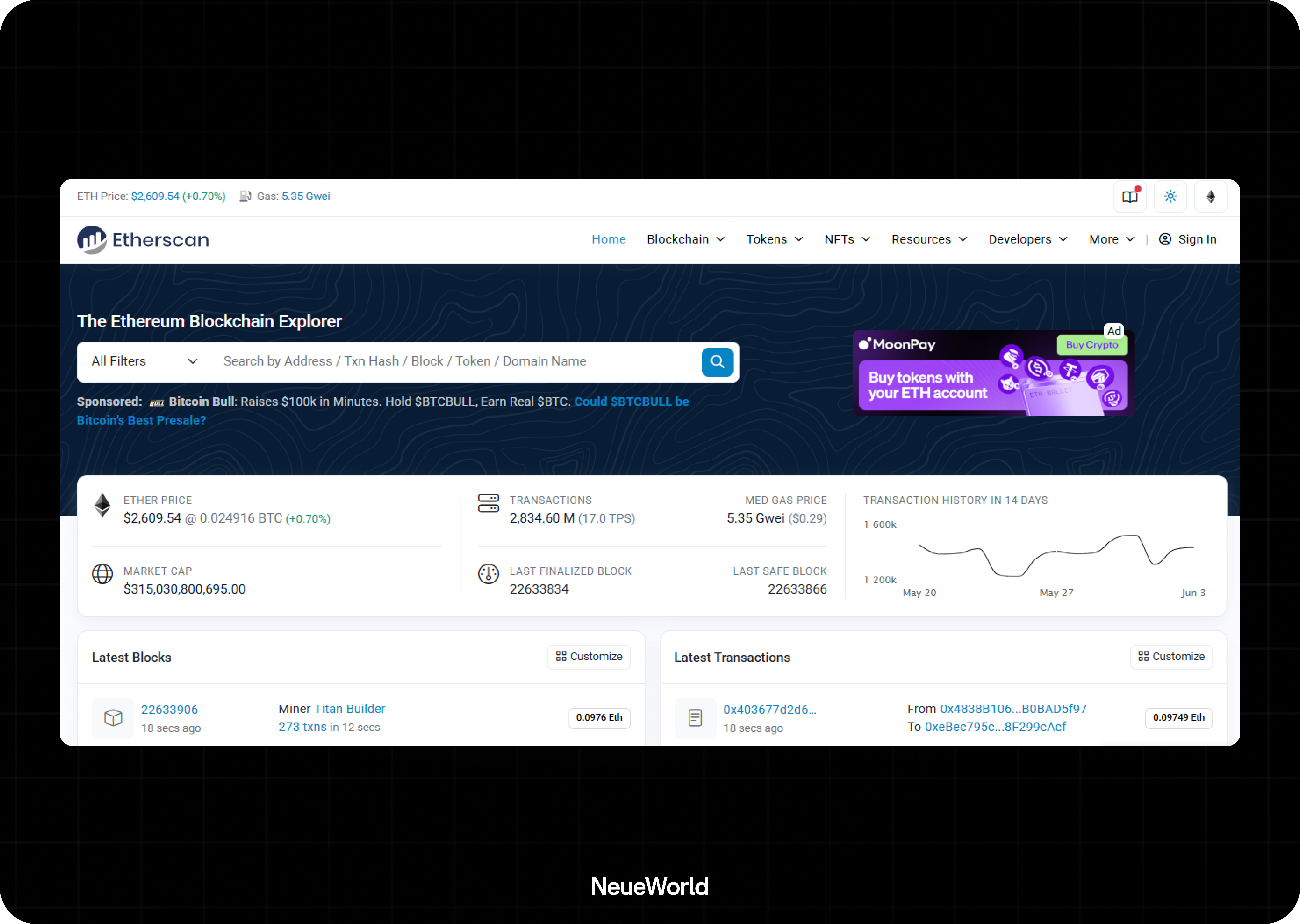
RainbowKit and Wagmi are great for customizing wallet connection flows. Use Etherscan, Tenderly, or Zerion to understand how transactions behave in the wild.
On the testing side, Metamask’s developer mode, WalletConnect, and Vercel deployments help simulate real-world interactions.
Finally, no design system is complete without Storybook; use it to build reusable components that stay consistent across products.
.png)
These tools, when used effectively, can help you reduce confusion, improve usability, and accelerate your iteration cycles, which are crucial for moving quickly in Web3 while keeping users engaged.
Conclusion
Design in Web3 isn't just about looking good; it’s about helping people feel safe in a space that’s still figuring itself out. Founders and marketers who treat design as a strategic layer, not a final coat of paint, stand a better chance of building products people use.
The gap between Web3’s potential and today’s UX reality is still wide. But every bright wallet layout, precise transaction flow, or simplified dApp onboarding closes it.
If you're building in this space, design is your front line. Make it intuitive. Make it transparent. Make it trustworthy. And if you need a partner to help you get it right