It’s a known fact that you have just 0.05 seconds to make an impression when someone visits your site or app. That means the first impression is 94% design-related.
What does this mean?
It means that your website isn’t just a brochure. It’s a sales rep, a storefront, and a customer service channel rolled into one. So, when people land on your site and leave without taking action, something is broken.
In all honesty, you don’t need more traffic. You need more conversions. That means turning visitors into leads, customers, users, or subscribers. If your traffic is high but your conversion rate is low, you’re not growing, you’re leaking.
This is where UX/UI design comes into play. It’s a leverage point. A well-designed user interface does more than look clean. It reduces bounce rates, improves user engagement, and guides your visitors toward action.
A better user experience translates into real business outcomes: higher sales, longer session
durations, lower drop-off rates, and increased trust.
What Does Good Design Look Like?
A good design means creating something that is both functional and aesthetically pleasing, while also being practical, understandable, and environmentally conscious. It's about more than just visual appeal; it's about creating an experience that guides users towards their goals.
When founders complain that their site isn’t converting, the first instinct is usually to tweak the headline, change button colors, or add a new pop-up. But most times, the real issue runs deeper. It’s not about what’s visible, it’s about what’s missing.
Good Design isn’t decoration. It’s a silent engine. It works beneath the surface to help users trust, navigate, and make decisions without hesitation.
So when we talk about “good design,” we’re not asking if your font looks premium or your hero section has enough whitespace.
We’re asking: does it reduce hesitation?
Does it answer the user's next question before they ask?
Does it make the path to value feel obvious?
If it doesn’t, no amount of polish will fix your bounce rate.
Let me break it down in 3 simple ways that explain what a good design for your website should look like;
1. It Solves, Not Shows Off
A good-looking website that confuses users is bad Design.
If your landing page has stunning visuals but people don’t know what to do next, you’ve lost the plot. Real design guides. It points. It whispers the next step with clarity, not clutter.
Example:
A SaaS homepage that leads with benefits, follows with social proof, and concludes with a frictionless signup form converts better than one packed with animations and lacking a clear CTA. This is an example of good Design.
On the other hand, a website with a beautiful but confusing layout is an example of bad Design.
2. It’s Fast, Focused, and Responsive
Good design loads fast, adapts across devices, and removes everything that doesn’t move the user forward.
- Pages load in under 2 seconds
- Buttons are easy to tap, not squint at
- Layout reflows seamlessly on mobile
Because over 60% of web traffic is mobile, and even a 1-second delay in load time can result in a 7% drop in conversions.
3. Design That Moves Users, Not Just Pleases Them
Most users don’t read, they scan. They're not analyzing your Design. They're reacting to it.
And in that split-second reaction, your Design either guides them forward or lets them stall.
Good Design doesn’t just decorate, it directs. It reduces hesitation, builds rhythm, and makes decisions feel effortless.
Here’s how it works:
- Visual hierarchy tells the brain what to do next. Headlines, subheadings, and layout structure create a clear path.
- Color contrast and white space isolate the most critical actions.
- Microinteractions (like hover states or progress bars) give users subtle feedback that they’re on the right track.
- CTA buttons aren’t just buttons; they're moment-of-truth decision points. Their shape, color, and copy decide whether people commit or bounce.
- Responsive Design ensures that none of this falls apart on mobile devices.
.png)
Keep in mind that Design is not decoration, it’s guidance.
ROI Justification: UX/UI as a Conversion Investment
If your CFO still sees Design as an expense, not an asset, show them this:
For every $1 invested in UX, businesses can expect a return of up to $100. That’s according to Forrester Research, not Design Twitter.
Good UX isn't decoration. It’s a system that reduces friction, speeds up decisions, and quietly builds user confidence at every step of the funnel.
- Better Design = fewer drop-offs
- Better structure = fewer support tickets
- Better experience = more returning users
When your UX works, your support team breathes easier, and your conversion numbers increase without requiring more ad spending.
You're not just designing screens. You're creating a growth system. If good UX pays off so clearly, why are most websites still built like pretty billboards that don’t convert?
Because most teams stop at aesthetics.
But the real conversion power?
It starts in the first five seconds of user attention.
First Impressions Matter: The Role of Visual Appeal
You don’t get a second chance at a first impression. And on the internet, you barely get a first. The visual appeal of your website, from its layout to its color scheme, plays a crucial role in shaping this first impression.
If your landing page appears outdated, cluttered, or inconsistent with your brand, trust is compromised. And once a user doubts your credibility, no headline or offer can save the experience. They click away, and your bounce rate increases.
But when your site looks clean, modern, and intentional, when it accurately reflects your brand’s personality and values, it immediately signals quality.
It tells your visitors:
- You take your work seriously.
- You understand their expectations.
- You’re worth their time.
And that’s the foundation of conversion. Before they interact with your CTA buttons, read your offer, or scroll through features, they’re deciding if your brand feels right.
Every font, color, spacing, and layout choice contributes to how users feel the moment your site loads.
And those first few seconds? They shape whether visitors explore further or leave for someone who got it right. But looking good isn’t enough. Your site can be beautiful and still lose users if the experience underneath breaks trust or causes friction.
How UX Design Increases Conversion
Let's assume you’re running a startup. You’ve spent $10,000 on ads this month. Traffic is steady. Your product is solid.
But conversions? Still flat.
Leads come in, poke around, then vanish. No one can tell you why. Your devs blame the funnel. Marketing blames traffic quality. However, the truth is that your users aren’t confused about your offer; they’re confused by the experience. And every confused user is a lost customer.
That’s the leak no spreadsheet shows. Users won’t email to say, “Your form made me overthink.” They leave. This is why UX design isn’t a surface-level fix; it’s a diagnostic tool. It helps you uncover the tiny cracks where attention slips, hesitation creeps in, and action stalls. Fix those, and you stop bleeding revenue.
So, here’s what to do:
UX Is Your Conversion Diagnosis Toolkit
Don’t guess. Record. Test. Iterate. These are the tools that show you what your users can’t tell you:
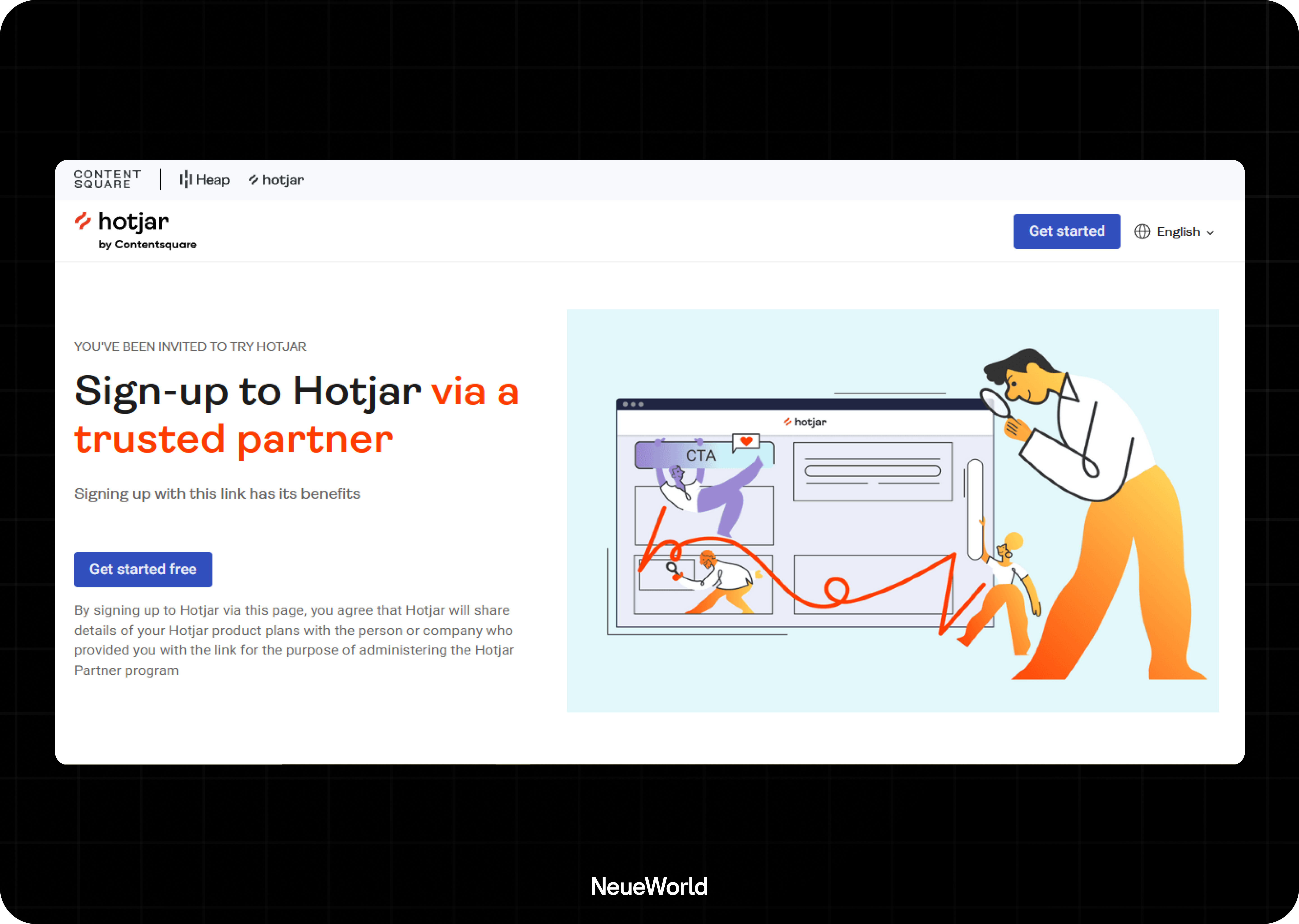
- Session Recordings (Hotjar, Nocodelytics): See what users do, not what they say

- A/B Testing (Adobe Target ): Find what layout or copy moves the action
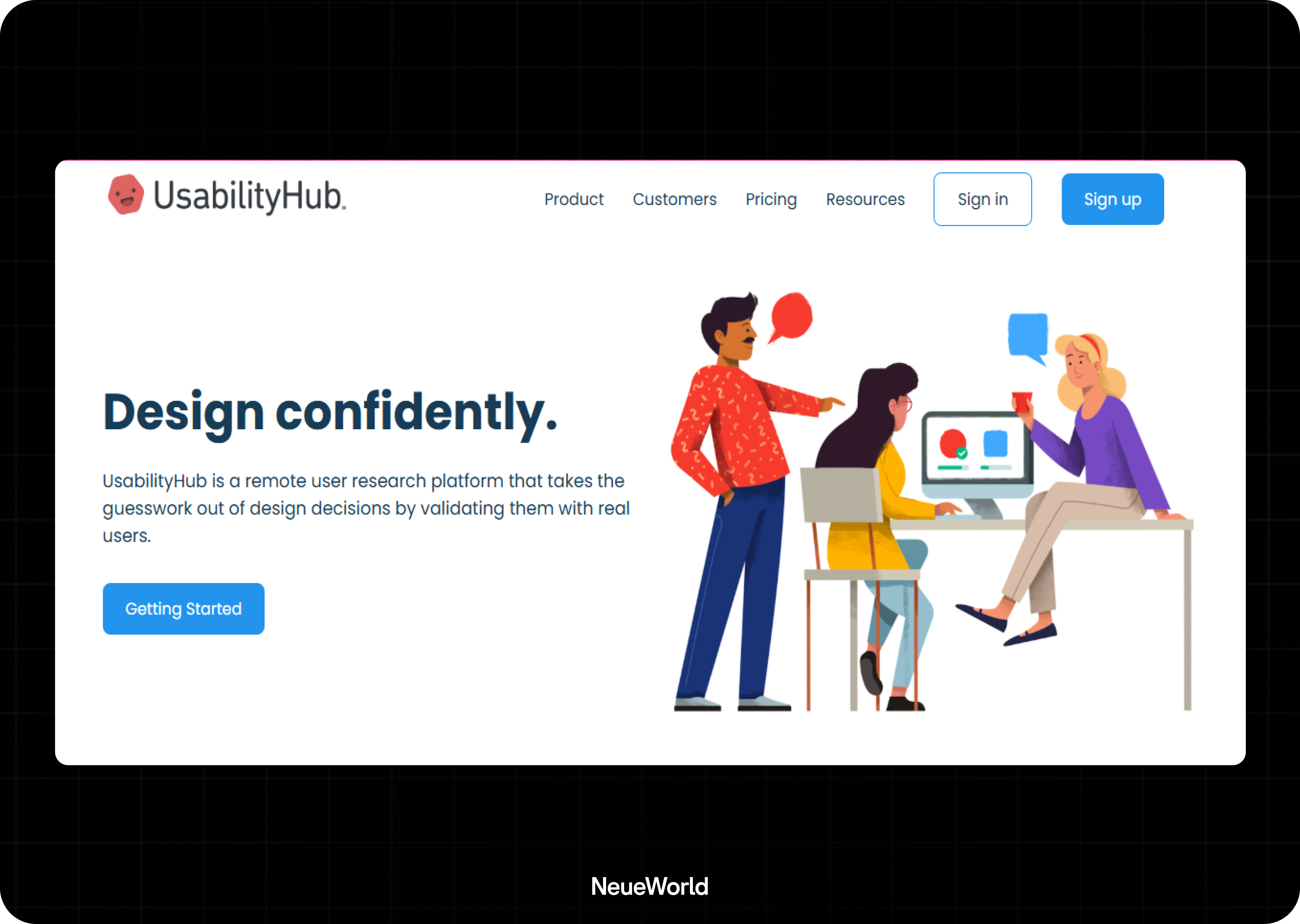
- Usability Testing (Maze, UsabilityHub): Watch real people struggle and fix it before launch
- Scroll Maps & Heatmaps: Understand attention patterns and dead zones
Every bounce has a cause. Your job is to find it and fix it.
UX Design Isn’t Finished When You Ship, It Starts
Conversion optimization is ongoing. Make sure you;
- Review weekly UX feedback
- Prioritize changes based on funnel leaks
- Re-test and improve based on user behavior
UX design isn't “done.” It evolves.
That’s the power of UX, not in theory, but in practice.
Tools like Hotjar show exactly how people move through your site, where they scroll, rage-click, or drop off.
Platforms like Maze let you validate design decisions with real users before launch.
Even Webflow’s native interactions help build smoother transitions and micro-interactions that keep users engaged.
Every test run, every scroll tracked, every form abandoned, it’s feedback. And every adjustment you make based on that feedback increases your conversion rate.
UI Elements That Direct Attention and Drive Action
Your users aren’t scanning every word; they’re scanning for signals. Your visual hierarchy tells them what matters most. Headlines, button styles, and spacing guide these elements to direct attention, build momentum, and shape the path to action.
Take CTA buttons. Change the color, add a hover effect, rewrite the text from “Submit” to “Get Started,” and suddenly more users click.
This is why every detail matters:
- Color contrast makes actions pop
- Whitespace reduces visual clutter
- Microinteractions give instant feedback that builds trust
- Responsive Design ensures everything works across devices
- Loading speed keeps bounce rates low (a delay of 1 second can drop conversions by 7%)
Design doesn’t need to shout, it needs to point. When the right UI elements stand out at the right time, they do more than look good. They move users forward.
Common UX Mistakes That Kill Conversions
Confusing Navigation
When users can’t find what they’re looking for, they leave.
Confusing navigation, such as hidden menus, vague labels, or excessive options, can create decision fatigue. Your navigation should reflect your user’s mental model, not your org chart.
If someone lands on your homepage, can they find the product?
The pricing?
The next step?
If they have to guess, you’re losing leads. Streamlined, intuitive navigation keeps bounce rates low and sessions long, and that’s where conversions happen.
Weak CTA Copy
A great CTA button doesn’t just sit there; it drives action.
“Submit” and “Click Here” are dead zones. They don’t tell users what they’re getting or why it matters. Strong CTAs are specific, value-driven, and time-sensitive:
- “Get your free demo.”
- “Start saving today.”
- “Download the guide.”
This one tweak alone can significantly lift conversion rates. If your CTA doesn’t match user intent or feels vague, even your best landing page design can fall flat.
No User Feedback Loop
You can’t improve what you don’t understand. Sites without a feedback loop, heatmaps, surveys, or post-action feedback are operating in the dark. You need to know where users get stuck, where they click in frustration, and where they hesitate.
Tools like Hotjar or Nocodelytics help close that gap.
If users abandon a form, do you know why?
If your onboarding feels slow, how do you know which part?
Feedback isn't just lovely, it’s how high-converting websites evolve.
Bad Mobile Experience
Over 60% of global web traffic now originates from mobile devices, yet many websites still treat mobile as an afterthought. That traffic share isn’t just impressive, it’s where most conversion journeys begin.
In fact, Google reports that 61% of users are unlikely to return to a mobile site they had trouble accessing, and 40% will visit a competitor’s site instead. When users land on a mobile page that’s clunky, slow, or misaligned, they don’t give second chances. They disappear, often for good.
Pinch-to-zoom, buttons too small to tap, pages that take forever to load, these are silent killers. A poor mobile experience doesn’t just frustrate users; it destroys trust. And when trust drops, so do conversions.
A responsive design isn’t just about resizing, it’s about rethinking layout, hierarchy, and interaction for smaller screens. If your mobile bounce rate is high, this is likely your biggest leak.
High Bounce Rate = Low Conversions
A bounce means a missed opportunity. When a user lands on your site and leaves without interacting, that’s a bounce, and every bounce is a failed conversion. Bad UX (slow load times,
.png)
messy layout, unclear messaging) pushes users out before they ever see your offer.
You can invest in ads, SEO, or social media, but if the experience fails at the entry point, you're just funding exits. Fixing UX is the most cost-effective way to turn traffic into revenue.
.png)
You’ve seen what breaks conversions. Now let’s fix them. These are the design practices that keep users moving and coming back.
Best Practices for High-Converting UX/UI Design
1. Use Clear, High-Contrast CTAs
Don’t bury the action. Your call-to-action should be impossible to miss above the fold, repeated strategically, and written with intention.
Instead of “Submit,” try “Get Your Free Quote.” Instead of “Learn More,” try “See How It Works.” Strong CTAs guide decisions—weak CTAs waste traffic.
2. Prioritize Readability Over Aesthetics
Users don’t read, they scan. Use short paragraphs, simple fonts, and strong headings. Break content into digestible sections. If your page looks like a wall of text, it’s a bounce trap. Readability is what keeps people engaged long enough to convert.
3. Design for Mobile First
Most of your users are accessing your content on mobile devices. Ensure your Design adjusts not only visually but also functionally. Buttons should be tap-friendly, content should reflow naturally, and load times should be optimized for a seamless user experience.
A clunky mobile experience kills conversions before they even begin.
4. Simplify Form Fields
Every extra input field lowers your conversion rate. Only ask for what you need. Remove friction. Use smart defaults, clear labels, and progress indicators if your form has multiple steps. A form should feel fast, not frustrating.
5. Add Personalization Where It Matters
Users respond to relevance. Utilize browsing behavior, location, or previous actions to deliver tailored content, such as personalized recommendations, bright banners, or dynamic CTAs. Tools like Webflow logic, cookies, or third-party platforms can power this without complete code setups.
6. Build Accessibility Into the Design
Don’t leave users behind. Ensure your text is readable, that color contrasts meet accessibility standards, and that everything functions properly with screen readers and keyboard navigation. Accessibility isn’t a feature; it’s the foundation of inclusive UX.
Conclusion
Thousands of people can land on your site, but if they don’t click, sign up, or buy, you’ve wasted your spend. UX/UI design is what bridges the gap between interest and action. And in most cases, it’s not your ad copy or pricing that’s holding people back; it’s your interface.
Design is the first layer of trust. Structure is what carries people through your funnel. And experience is what makes them come back.
Investing in good UX is about protecting the traffic you already have. It’s about building systems that consistently convert without requiring constant effort.
If you're ready to turn your site into a conversion engine, Neue World is prepared to help. We've done it for SaaS, eCommerce, fintech, and everything in between. Let’s redesign the way your users experience your brand.