Having a Website on Webflow that looks beautiful and is mobile-responsive, yet receiving little to no attention on Google, is an all-too-common problem faced by businesses today.
Just like many other mobile-centric designers, Google’s mobile reading, scoring, and ranking econometrics are often overlooked.
In 2026, having an SEO strategy optimized for mobile usage will serve as the most important building block for any business. Mobile devices will single-handedly drive most traffic, especially to e-commerce websites.
Furthermore, the overwhelming majority of users tend to leave a site that doesn’t load within a few seconds, serving as a ticking bomb to customer retention. Who can forget mentioning how visibility largely depends on mobile page performance under Google's highly sophisticated ranking system?
The focus of this guide will not be the basic fundamentals of responsiveness on Webflow, but rather focus on auditing your website and making necessary improvements to ensure long-term optimization for mobile search features.
It will enable you to put into practice everything that affects your overall rank, including default settings provided by Webflow and manual adjustments necessary using tools like Google Search Console, PageSpeed Insights, and other performance-based metrics.
Let us ensure your site is built for winning engagements.
Mobile SEO in 2026: What’s Changed?
If your website doesn’t have a mobile version, you're falling behind.
More than 63% of organic traffic now comes from mobile devices. That's not a trend; it’s the standard. Start counter’s 2026 report indicates that mobile traffic is rapidly gaining dominance over desktop traffic, particularly for consumer-facing and newly launched brand websites.
For businesses today, mobile accessibility is no longer an option; it is a necessity. Google’s mobile-first indexing means that your mobile site is indexed before, or even instead of, the desktop version.
Why Webflow Makes Mobile Design Easy (But Mobile SEO Still Needs Work)
Webflow does a great job with responsive design out of the box, and they have various settings. Adjusting breakpoints, previewing layouts across devices, and making changes is possible without the need for CSS code. But this is where most people get it wrong:
Having an automated layout shift for smaller screens is a too simplistic approach to mobile layout design. It is significantly more complex, considering business goals and user-centric design approaches.
Mobile SEO is deeper; it focuses on load speed, image compression, tap targets, Core Web Vitals, and structured data. These Webflow features will not be optimized without your manual effort.
Even if your mobile site appears visually appealing and takes 6 seconds to load or pushes content down, Google considers that a poor user experience. Your rankings will also suffer as a consequence.
How to Know If Your Webflow Site Has Mobile SEO Issues
Most teams assume their site is mobile-optimized because it looks fine on an iPhone. However, visual responsiveness doesn’t necessarily mean your mobile SEO is effective. Search engines don’t rank sites based on appearance; they measure structure, speed, and usability under mobile conditions.
Here’s how to spot the red flags before they cost you traffic:
High Mobile Bounce Rate in Google Analytics
If your mobile bounce rate is noticeably higher than your desktop rate, users might be frustrated with load times, misaligned elements, or unreadable fonts. Check the “Device Category” breakdown inside Google Analytics and compare behavior between desktop and Mobile.
Mobile Pages Ranking Lower Than Desktop
Open Google Search Console’s performance report. Filter by device and compare ranking positions. If your mobile rankings lag behind desktop, it’s a clear signal that something is underperforming.
Common Mobile Usability Errors
Inside the Mobile Usability tab in Google Search Console, watch for alerts like:
- “Text too small to read”
- “Clickable elements too close together”
- “Content wider than screen”
- These issues can still impact mobile SEO, even if your site appears fine in Webflow’s preview.
Lighthouse and Chrome DevTools
Run a Lighthouse report directly from Chrome DevTools → select “Mobile” under device type. You’ll
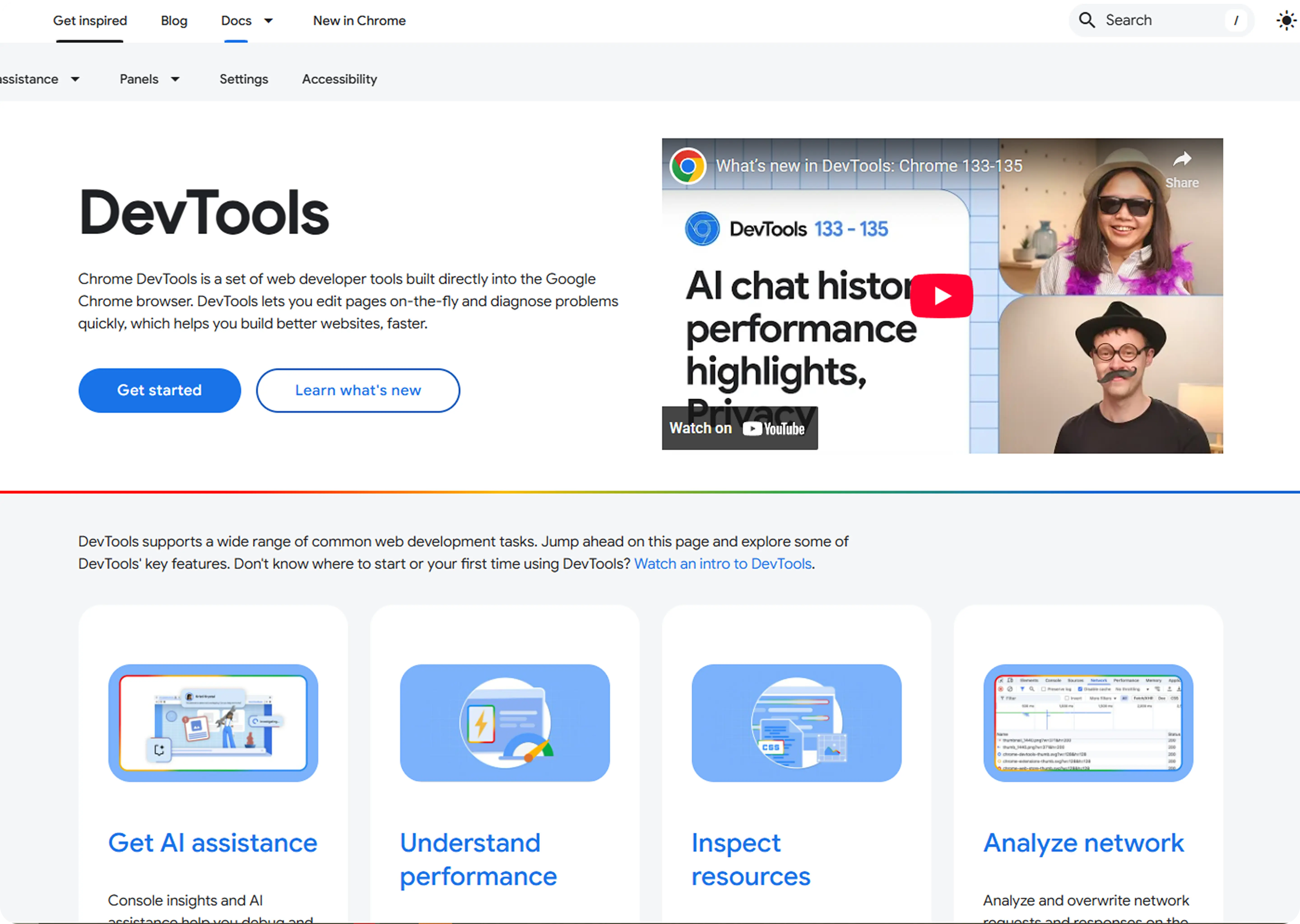
receive data on mobile-specific load times, layout shifts, and performance metrics, including First Input Delay and Cumulative Layout Shift.
Also, use Chrome’s device toolbar to simulate your site across screen sizes. This helps uncover issues Webflow’s editor might not show.
Your site might “look” mobile-friendly. But unless these tools give you the green light, Google might disagree and penalize your rankings accordingly.
Core Mobile SEO Principles
Optimizing your site for mobile SEO is more than just resizing it to fit the screen. Google evaluates how your site behaves on small screens under real conditions on 4G, with a thumb, and often with zero patience.
These are the mobile SEO principles that matter most. Here’s how to apply them directly inside Webflow:
1. Page Speed Is King
Google doesn’t wait. If your mobile page takes over three seconds to load, most users will bounce, and Google will take note.
Here’s how to cut load time inside Webflow:
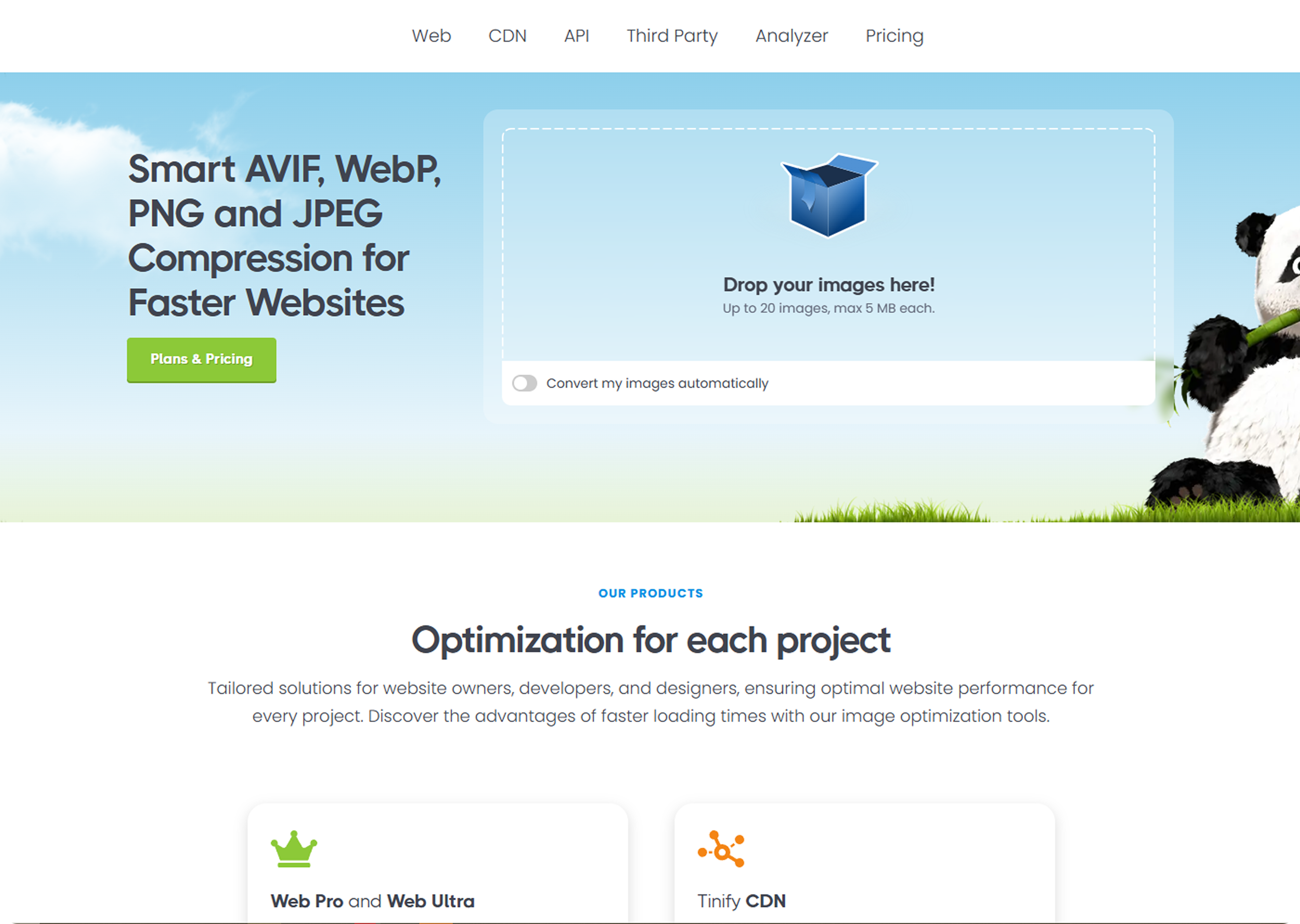
- Compress images: Export assets in WebP format. You can use tools like TinyPNG or Webflow’s built-in image settings.
- Minimize large media: Avoid autoplay videos and heavy Lottie files. If animation is non-essential, disable it on Mobile.
- Audit interactions: Webflow makes animations easy, but too many on mobile slow things down. Use page-level media queries to turn off animations below 768px.
Use Google PageSpeed Insights to see if media is dragging your performance score.
2. Tap Targets and Spacing
Mobile users use their thumbs, not a cursor. If your buttons or links are too small or too close together, you’ll get flagged in Search Console under “clickable elements too close.”
Here’s how to fix this in Webflow:
- Keep a minimum tap area of 48px x 48px.
- Use Webflow’s spacing tools to add enough padding between links or buttons, especially on nav bars and footers.
- Avoid stacking multiple CTAs in a single row on mobile view.
3. Font Size and Readability
Small fonts don’t just frustrate users—they can also lead to penalties in mobile usability audits.
- Use a font size of at least 16px as a baseline.
- Set fonts in REM units so they scale better across devices.
- Check your content blocks in Webflow’s mobile preview. A common mistake: fonts that look fine on desktop but collapse into cluttered, unreadable chunks on small screens.
Bonus tip: Always test line height. Webflow defaults to 1.4–1.6, which usually works well for mobile readability.
How to Fix Common Mobile SEO Issues in Webflow
Most mobile SEO issues in Webflow aren’t technical; they’re oversight. You design once, it looks great on desktop, and you forget to check how it behaves at 375px.
Here’s how to spot and fix common issues that hurt your rankings and mobile experience:
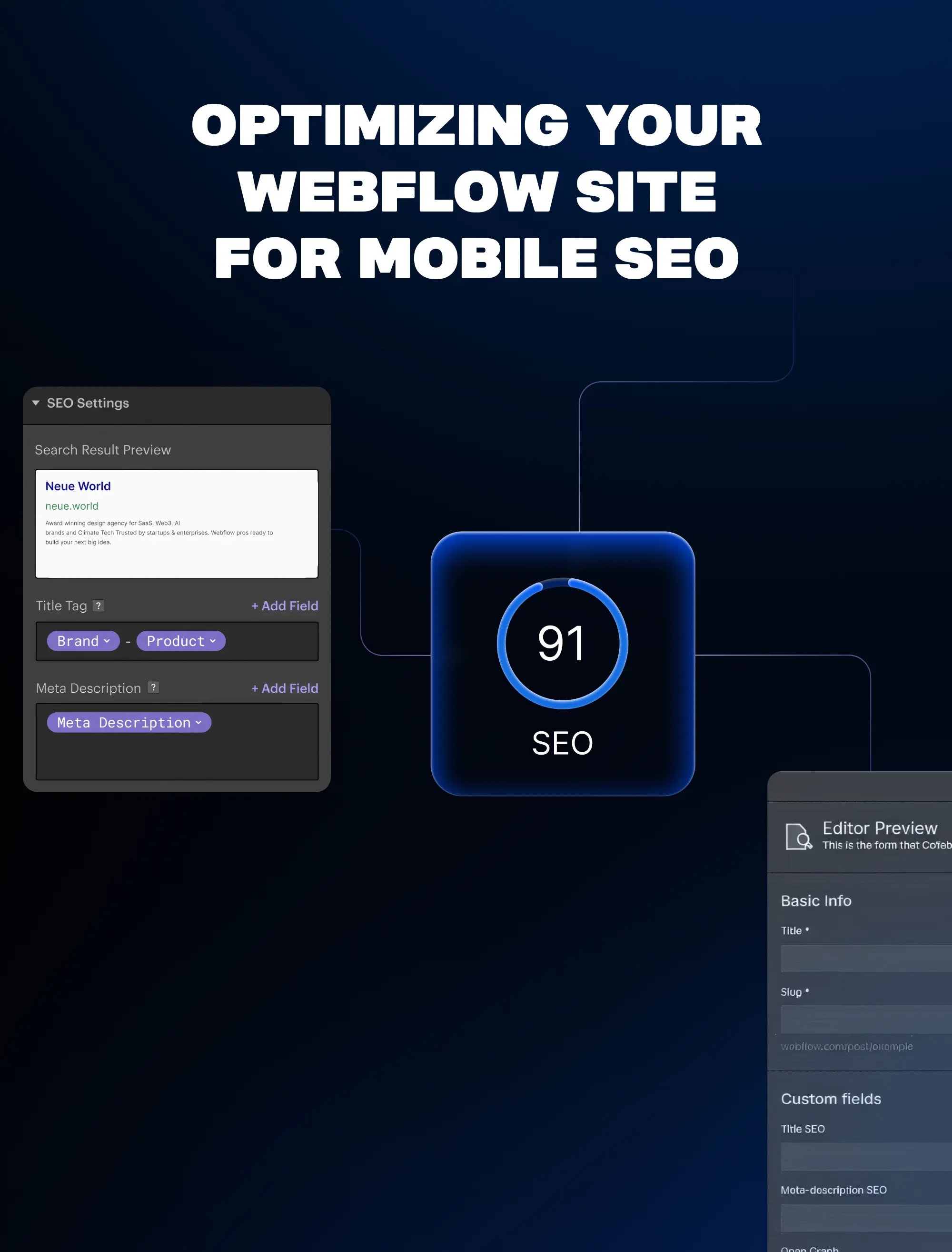
1. Set Custom Meta Titles & Descriptions
Webflow doesn’t generate mobile-specific metadata, but Google reads titles and descriptions as mobile-first.
To update:
- Go to Pages → Page Settings (gear icon)
- Scroll to the SEO Settings
- Add a clear, mobile-relevant title (under 60 characters)
- Add a description that answers what the user will find, within 155 characters
Why it matters: On Mobile, shorter metadata fits better. Clipped titles lower click-through rates. Mobile-first indexing makes this step mandatory.
Pro tip: Use tools like Google SERP Snippet Preview to test how it appears on Mobile before publishing.
2. Use Clean Slugs and Mobile-Friendly Open Graph Tags
- Slugs should be short, descriptive, and lowercase (e.g., /mobile-seo-guide, not /blog-post-2398238)
- Add mobile-optimized Open Graph images (1200x630 works best, under 300kb)
How to update:
- In Page Settings, scroll to Open Graph Settings.
- Upload a relevant, compressed OG image.
- Make sure it matches your blog post topic, it improves preview quality on mobile sharing (especially WhatsApp and Twitter/X)
3. Fix Overflow on Mobile Breakpoints
One of the top causes of horizontal scroll, especially in Webflow, is unhandled overflow.
Common culprits:
- Sections with fixed width instead of % or VW
- Lottie animations or images pushed outside the padding.
- CMS-rich text blocks containing pasted code
To fix it:
- Switch to Mobile Portrait preview
- Inspect any section that causes horizontal scrolling
- Apply overflow: hidden on the parent container
In Webflow:
- Select the container or section
- Go to Style Panel → Layout → Overflow and set it to hidden
Bonus: Add max-width: 100% to wide media elements (images, video) for smoother mobile fit.
4. Hide Desktop-Only Elements Correctly
Let’s say you’ve got large illustrations or complex grids meant only for big screens.
You can safely hide them on Mobile using Webflow’s built-in visibility controls—but avoid hiding any content critical to SEO (like H1s or core copy).
To do it:
- Select the element
- Scroll to Style Panel → Layout → Display
- Choose Display: None for Mobile Landscape and Mobile Portrait
What not to do: Don’t use this to hide full articles or product text—that can be flagged as cloaking.
5. Test All Breakpoints Manually
Webflow lets you visually adjust four key breakpoints:
- Desktop (base)
- Tablet
- Mobile Landscape
- Mobile Portrait
Many SEO issues occur because people only check on tablets and assume Mobile will cascade properly. That’s rarely true.
Do this for every page:
- Toggle between breakpoints (top bar)
- Check that:
- Fonts are legible
- CTAs aren’t hidden or overlapping
- Footer doesn’t collapse
- There’s no horizontal scroll
Test on a real device too. iPhone and Samsung Galaxy are the most common screen sizes for mobile traffic in 2026.
Mobile Page Speed: How to Optimize Without Breaking Design
Speed isn’t just a UX bonus; it’s a ranking signal. On Mobile, even a 1-second delay can drop conversion rates by up to 20% (Google, 2024).
Webflow helps with performance out of the box—fast hosting, clean code, and auto-optimized assets. But that’s not enough if you’re loading five Lottie animations, running chatbots, and layering scroll interactions on every section.
First, Test the Damage
Start with two tools:
- Google PageSpeed Insights → Run a test for your homepage and key landing pages, especially
- On Mobile. Focus on metrics like First Contentful Paint and Time to Interactive.
- Webflow’s Audit Panel → Inside the Designer, open the Audit panel (top right corner). It flags
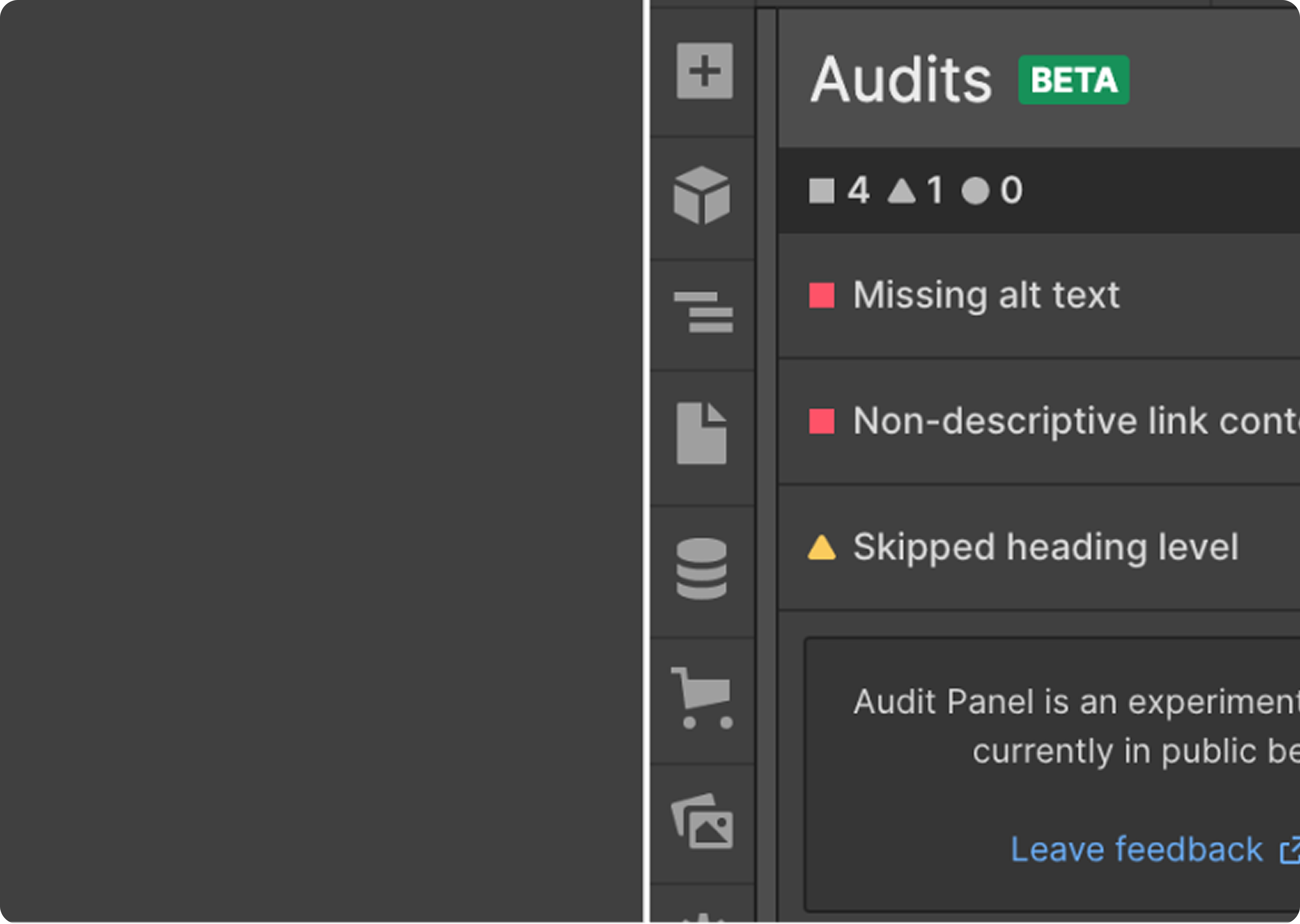
- layout and accessibility issues, but also catches missing alt text or oversized images.
Tip: Don’t aim for a perfect 100 score; optimize for experience, not just the grade.
What’s Slowing You Down on Mobile?
From real audits we’ve done on Webflow builds, these are the usual suspects:
- Too many interactions: Scroll-based animations, page load effects, and fade-ins can cause rendering to stall, especially on low-end Android phones.
- Oversized images: Even when responsive, a 1MB image still loads before being scaled down to fit the screen. That’s a waste.
- Third-party scripts: Tools like Intercom, Calendly embeds, or analytics platforms load full JS bundles that slow down your Time to Interactive.
How to Fix It—Without Breaking the Look
Use Lazy Loading for Images and Videos
Webflow supports lazy loading by default, but double-check:
- Select the image → Go to Element Settings.
- Make sure Lazy Load is enabled.
Do the same for background videos or hero banners. This defers offscreen assets until the user scrolls down.
Delay Heavy Scripts Using Finsweet’s Script Manager
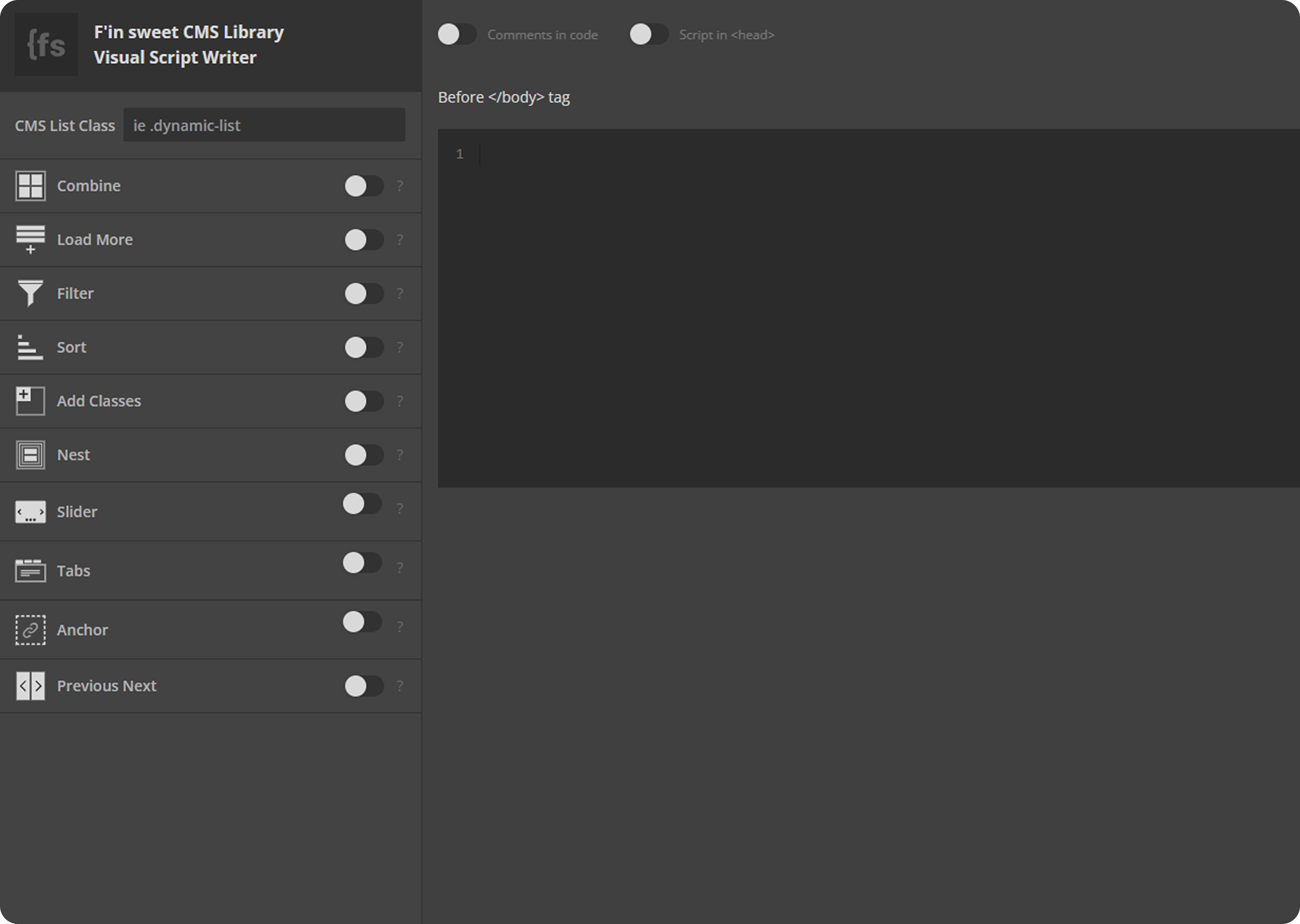
If you’re running tools like Hotjar, HubSpot, or Intercom, use Finsweet’s Script Manager to delay loading until after interaction or a time delay.
Example: Load Hotjar only after 5 seconds of user activity have elapsed. That keeps the initial page load lean.
Remove Repeated Lottie Animations
Lottie files are light, but not when used 4+ times on a page.
Instead:
- Use one global animation and reuse it
- Compress Lottie using LottieFiles Optimizer

- Only load animations above the fold if necessary
Don’t Just Shrink—Redesign for Mobile
Page speed isn’t always a technical fix. Sometimes, the fastest fix is a more innovative mobile layout.
- Hide or simplify animations on smaller screens
- Reduce the number of sections stacked on Mobile
- Replace heavy video backgrounds with static fallback images
Mobile optimization means designing with constraints, not compromises.
How to Track Mobile SEO Performance
How to Track Mobile SEO Performance
Mobile SEO isn’t set-it-and-forget-it. You need to monitor how your pages behave on Mobile after launch and refine them based on real data.
Here’s how to track what’s working (and what’s not):
Use Google Search Console’s Mobile Usability Report
Go to Search Console → Mobile Usability under the Experience tab.
It flags issues like:
- “Clickable elements too close together”
- “Text too small to read”
- “Viewport not set”
Fixing these matters. Google penalizes mobile UX issues, especially on high-intent landing pages.
Compare Mobile vs. Desktop Traffic in Google Analytics
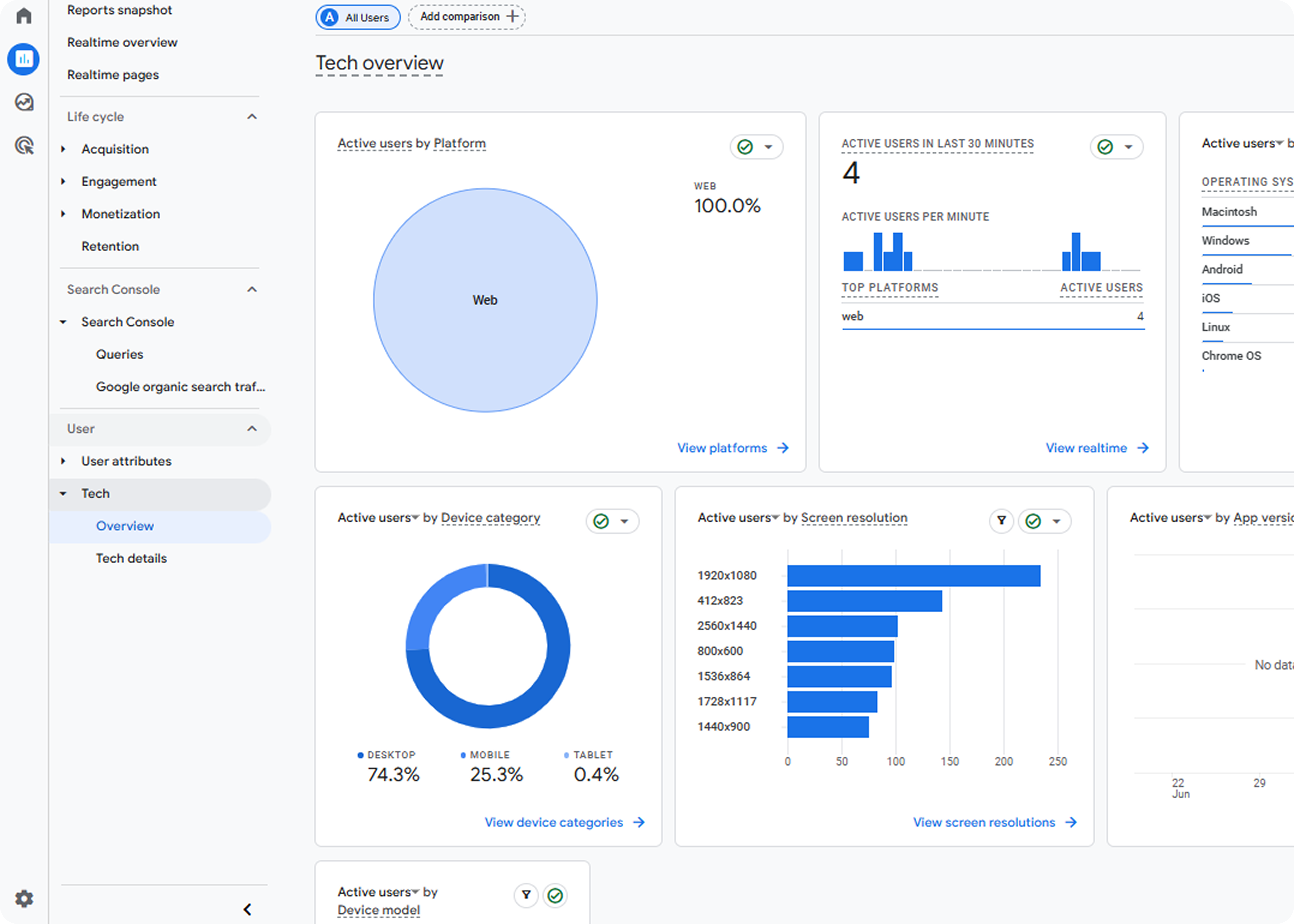
In GA4, head to:
- Reports → Tech → Device Category
Watch for:
- High bounce rates on Mobile but not desktop
- Lower conversions on Mobile
- Longer time to interact on Mobile
If Mobile consistently underperforms, it’s likely due to a UX or speed issue.
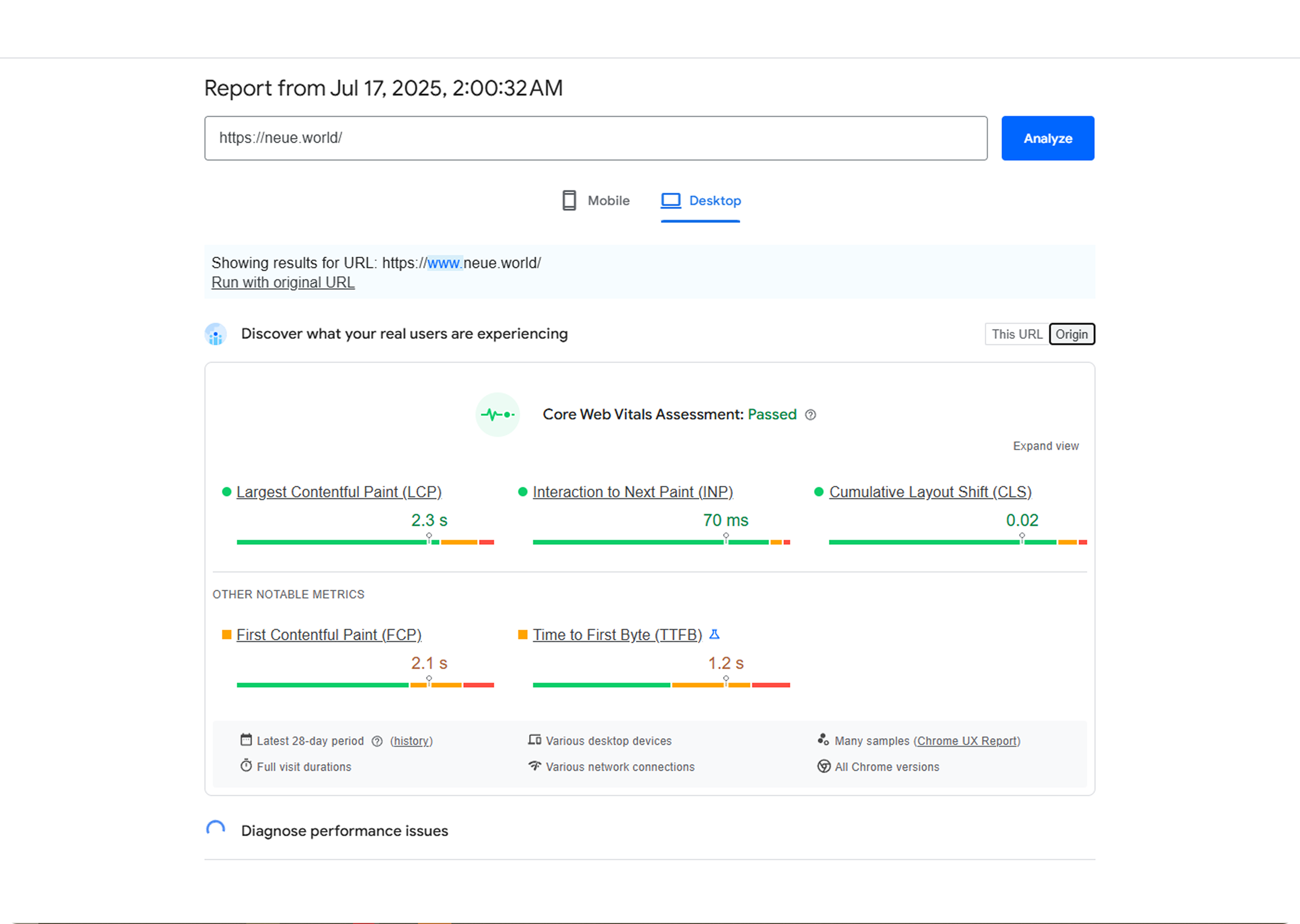
Monitor Core Web Vitals (Mobile)
Use PageSpeed Insights or Lighthouse to test mobile performance. You can also check core web vitals in Google Search Console.
Focus on:
- LCP (Largest Contentful Paint) – should be under 2.5s
- CLS (Cumulative Layout Shift) – under 0.1
- INP (Interaction to Next Paint) – new Core Vital replacing FID
Run these tests often, especially after new animations, CMS changes, or layout tweaks.
Mobile SEO Audit Checklist (2026)
If you want to know whether your Webflow site is truly mobile-optimized not just responsive this checklist is your starting point. These are the non-negotiables:
Load Time
- PageSpeed Insights score above 85
- Time to Interactive under 3s
- Core Web Vitals pass for Mobile
Layout & UX
- Content readable and functional at 320px width
- No horizontal scroll or overflow bugs
- Tap targets (buttons, links) at least 48px
- Forms are fully usable on Mobile
Technical SEO
- Viewport meta tag set correctly
- Mobile-friendly Open Graph tags
- Clean, short slugs (SEO-friendly URLs)
- No blocked resources in robots.txt
- Fix broken links
Content Visibility
- No hidden content on Mobile using display: none (unless it's decorative)
- Structured data present and valid (use Google’s Rich Results Test)
Popups & Interstitials
- No intrusive pop-ups that block content
- Any modals close easily and don’t overlap the main content
- CTA banners adapt to screen size (and don’t cause layout shifts)
Conclusion
Mobile SEO isn’t optional; it’s the default standard.
Google indexes mobile-first. Users browse mobile-first. If your site doesn’t load fast, read clearly, or work seamlessly at 320px, your traffic and conversions will pay the price.
Most mobile SEO problems in Webflow aren’t technical; they’re structural. Overlooked tap targets. Uncompressed images. Breakpoints never tested. Each one chips away at visibility.
Fix the small issues now. Avoid a complete rebuild later
If your team needs help auditing, optimizing, or scaling your mobile SEO setup in Webflow, Neue World can help. You bring the product, we’ll make sure it shows up where it matters.
FAQs About Mobile SEO and Webflow
Is Webflow mobile-friendly?
Yes, Webflow is mobile-friendly by design. It utilizes responsive layouts and provides complete control over breakpoints for Tablets and Mobile Devices. However, to rank well, you still need to handle mobile SEO details, such as page speed, font sizing, and tap targets, yourself.
How do I check mobile SEO on Webflow?
Use Google Search Console’s Mobile Usability Report to spot layout issues like tiny text or unclickable elements. Pair it with Lighthouse (via Chrome DevTools) and Webflow’s built-in mobile preview. These tools highlight performance and usability gaps across different devices.

Can Webflow sites rank on Google?

Yes, Webflow sites can rank well on Google as long as your SEO fundamentals are solid. Webflow gives you complete control over meta titles, slugs, alt text, Open Graph tags, and schema. Mobile-first design, clean structure, and fast load times are key to visibility.
What are the top mobile SEO tips for Webflow?
- Set custom meta titles and descriptions
- Use clean, readable fonts (min. 16px) and proper spacing
- Compress images using WebP or AVIF
- Minimize interactions and animations that slow mobile pages
- Test on multiple devices before going live
How do I optimize page speed in Webflow?
Start with PageSpeed Insights to measure load times. Then:
- Lazy load images and videos
- Compress large assets
- Delay third-party scripts using tools like Finsweet’s Script Manager
- Remove unused animations or complex Lottie files
- Keep mobile interactions minimal and purposeful