
Most people blame weak ads when a marketing campaign flops, but in reality, the ads often aren’t the issue, the landing page is. You can invest money in targeting the perfect audience, write compelling copy for your ads, and still see conversions flatline if your landing page is silently losing visitors within the first few seconds.
Across industries, the average landing page conversion rate sits at just 4.02%. Even worse, more than half of visitors leave without clicking a thing if the page loads slowly, doesn’t make sense immediately, or fails to show them the next step.
Every second of delay or confusion is a lost lead and you might not even realize it until your analytics start showing a steady decline.
The 10 Mistakes and How to Fix Them
Weak or Vague Value Proposition
Think of your value proposition as the single, apparent reason why someone should choose you over anyone else. It’s the core of your hero section the first thing they see. If that message is watered down with generic claims or buried in buzzwords, people won’t stick around long enough to know what you offer.
Here’s the honest truth: 55% of visitors leave within eight seconds if they don’t immediately get what’s in it for them. Eight seconds isn’t long enough to explain your whole process or company history, it’s just enough time to answer the only question in their head: “Is this for me?”
How to fix it:
- Lead with the outcome your customer wants, not a laundry list of features.
- Speak in plain language that they can process in seconds.
- Tie your message directly to their pain points or goals.
If your headline could be swapped onto a competitor’s page without anyone noticing, it’s too vague. The goal is for someone to land on your page and instantly think, “Finally, exactly what I’ve been looking for.”
Poor Mobile Optimization
More than half of your visitors are seeing your landing page on their phones, often in less-than-ideal situations: in transit, in line for coffee, or between meetings. Mobile now accounts for 58% of all web traffic, yet many landing pages still deliver a worse experience on mobile devices than on desktops.
In some cases, conversion rates drop by 40% or more once a visitor switches to a phone.
The first killer is speed. Google reports that if your page takes more than three seconds to load on mobile, over 50% of users will leave before it finishes loading.
The second is usability: cramped layouts, buttons that are barely tapable, tiny fonts that require zooming in to read, and forms that feel like a chore to fill out. Every friction point is a reason to bounce.
How to fix it:
- Design with mobile in mind from the start, not as an afterthought.
- Ensure the headline, value proposition, and main call-to-action are visible without requiring the user to scroll.
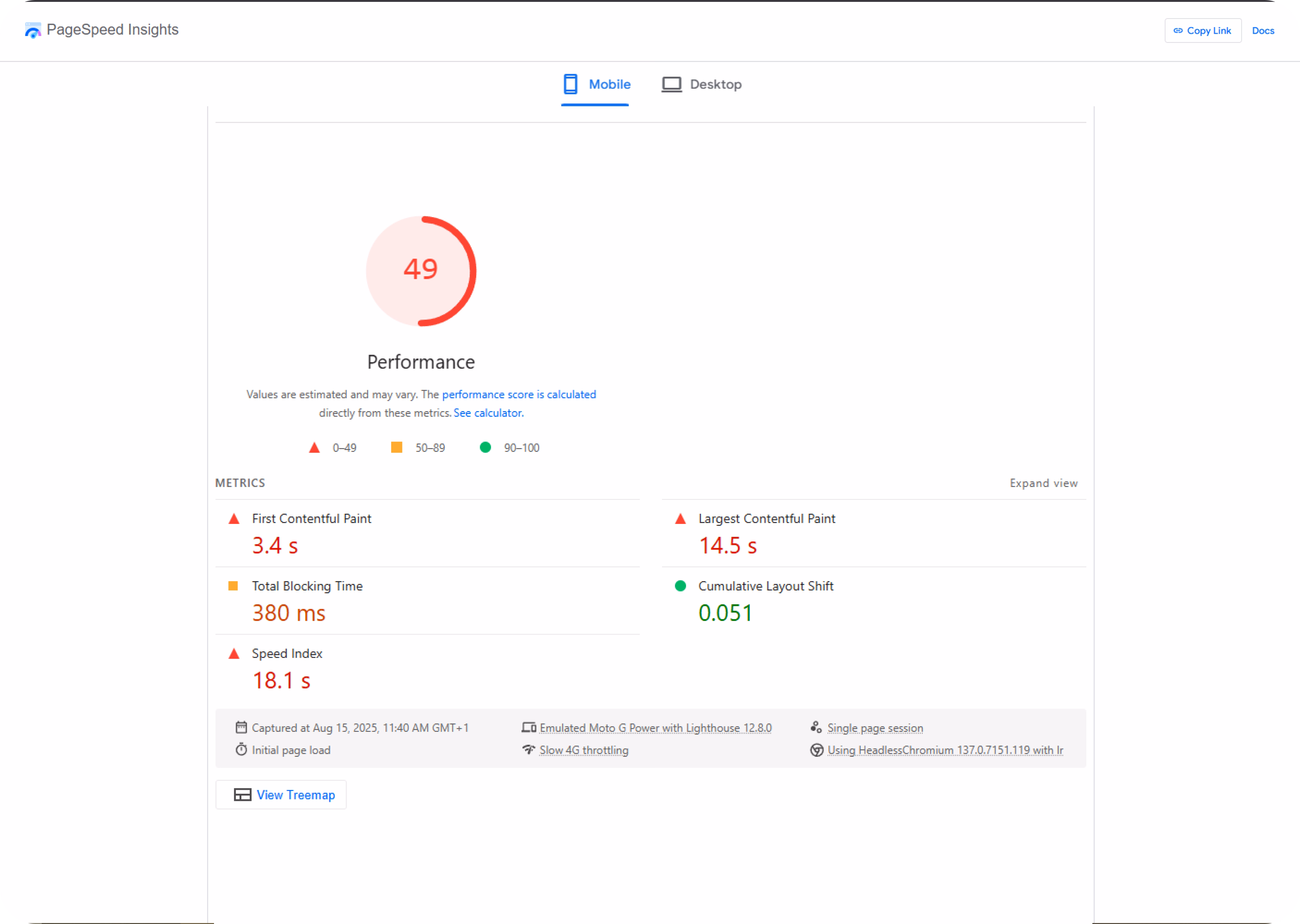
- Use Google PageSpeed Insights to identify bottlenecks, compress large images, and remove unnecessary scripts.
- Test your landing page on multiple phones yourself, if it’s frustrating for you, it’s frustrating for your customers.
Weak or Generic Call-to-Action Buttons

Your call-to-action button is the make-or-break moment. This is where a visitor either takes the next step or clicks away. Too often, landing pages waste that moment with dull labels like “Submit” or “Click Here.” Those words don’t inspire action, they sit there.
Numbers back this up. Unbounce found that specific, benefit-focused CTAs can increase conversions by up to 202% compared to generic ones. That’s a massive lift for something as small as a few words.
Your CTA should communicate what people can expect. “Get My Free Guide” feels personal. “Start My Trial” is transparent about the next step. Even changing “Sign Up” to “Explore our Case Studies” gives people a reason to click.
Don’t hide your CTA. Place it above the fold so that people can see it without scrolling, and repeat it at natural decision points on the page. Use a button color that contrasts with your design.
And here’s a small but powerful trick, add “click triggers.” These are short, trust-building phrases next to the button, like “No credit card needed” or “Takes 2 minutes.”
They remove hesitation and help visitors make a commitment. Think of your CTA as a direct invitation, let it be confident, clear, and easy to say yes to.
Using Stock Images That Don’t Connect
Everyone’s seen the same lifeless stock images, the perfectly lit office handshake, the staged group high-five, the generic smiling customer service rep. They might fill a gap on the page, but they don’t build trust.
The data backs it up. A Nielsen Norman Group study found authentic, real images get 35% more engagement than generic stock photos. When people sense an image is staged or irrelevant, it creates distance instead of connection.
The solution is straightforward: use genuine visuals. Show your actual team, real customers using your product, or snapshots from behind the scenes. If your budget’s tight, even photos from a smartphone can work if they feel genuine.
You can also strengthen trust with social proof visuals, screenshots of positive reviews, customer milestones, or even posts from happy clients on social media.
Your landing page isn’t just selling your product or service, it’s a trust of sale. Every image should make a visitor think, “This is real, and I can see myself here.”
Ignoring Social Proof and Trust Signals
When you ask someone to give you their email, payment details, or time, they’re deciding whether they trust you. That decision happens fast.
According to BrightLocal, 91% of consumers trust online reviews as much as personal recommendations. This isn’t just for online stores. SaaS companies, service providers, and even nonprofits benefit from showing visible proof that real people have had a good experience.
Too many landing pages hide testimonials at the bottom or leave them out entirely. Bring them up front. Use short quotes from happy customers, video testimonials, or quick case studies with real numbers. Screenshots from social media work too, especially if they’re unfiltered.
Trust badges also help, whether it’s “SSL Secure,” payment provider verification, or “Featured In” press logos. These small signals add up to a profound sense of safety.
When someone lands on your page, the unspoken question is: “Do people like me already trust this brand?” If you can answer “yes” immediately with clear, credible proof, you make it much easier for them to click the CTA.
Asking for Too Much in Your Forms
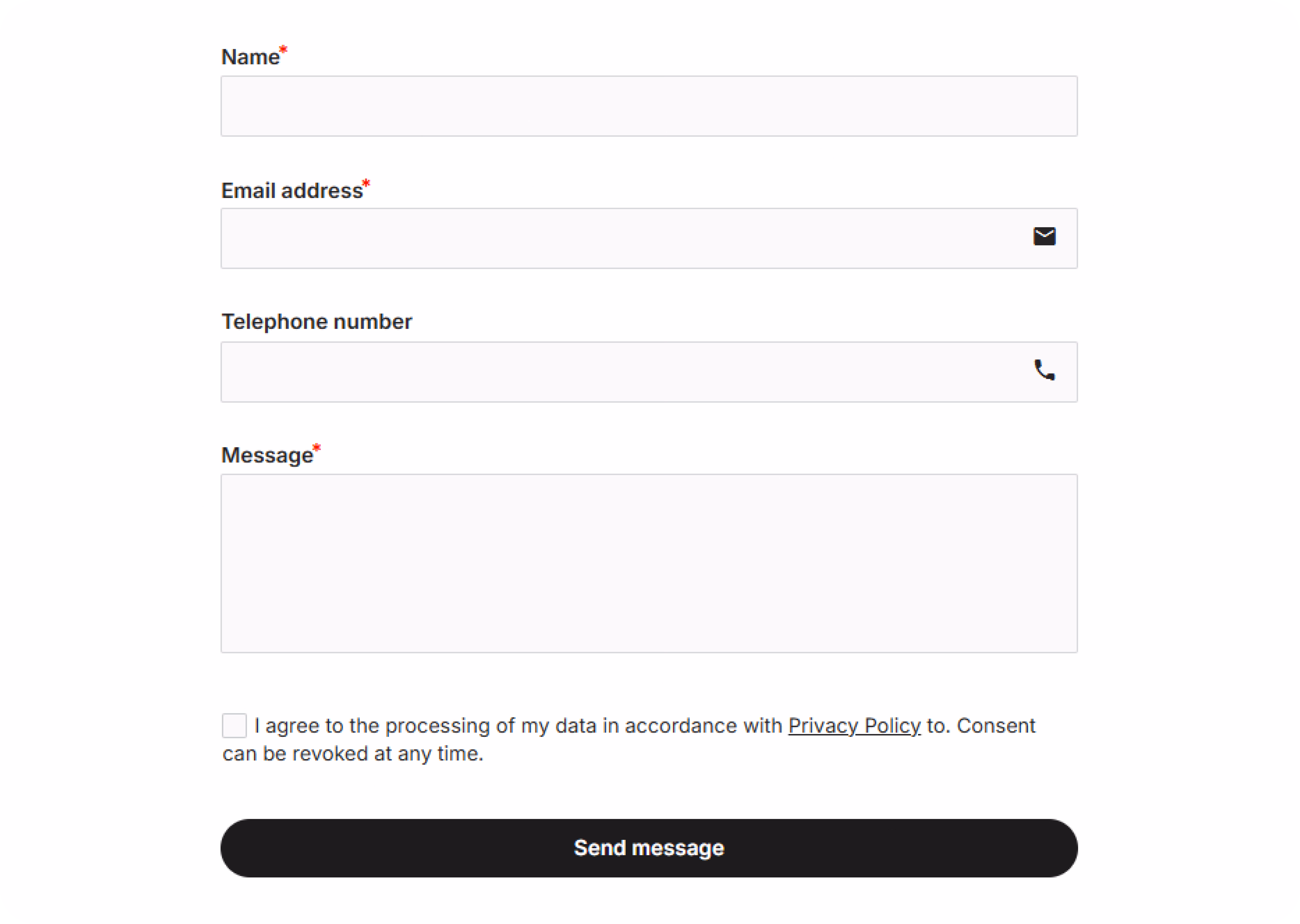
If your landing page form feels like paperwork at the DMV, you’re losing people. HubSpot found that conversion rates drop by almost half when the number of fields increases from three to six. Every extra box feels like a chore, and most visitors won’t make the Effort.
The job of your form is to get someone in the door, not to find out their life story. Stick to the bare minimum you need to start the conversation.
Usually, that’s a name, an email, and maybe one quick qualifier. You can always ask for more later through progressive profiling a simple follow-up that collects small pieces of info over time.
The easier it is to finish, the more leads you’ll capture: less friction, more yeses.
Slow Load Times
A slow landing page is like a store that makes you wait outside in the rain. Most people won’t stick around to see what’s inside. Google reports that reducing a one-second load time to three seconds can increase your bounce rate by 32%. At five seconds, you’ve lost almost everyone.
Speed matters more than you think, especially on mobile. Test your page with Google PageSpeed Insights. Shrink and compress your images, strip out unnecessary code, and ensure your hosting isn’t struggling under pressure.
Every extra second your page takes to load is a second your competitor is welcoming the visitor you just lost.
Not Matching the Page to Your Ad
Click an ad for “50% off shoes” and land on a generic homepage, and what happens?
You close the tab. That’s what your visitors do when your landing page doesn’t match your ad’s promise.
When your ad says one thing and your page delivers something different, trust drops instantly. People feel like they’ve been baited. Studies show that bounce rates increase when the message, tone, or offer is inconsistent from ad to landing page.
The fix: treat your landing page as the next step in the conversation your ad started. Maintain the same headline style, provide details, and consistent visual feel. If the ad is the handshake, the landing page is the welcome, and they need to feel like they belong to the same interaction.
Skipping A/B Testing

One of the easiest ways to leave money on the table is to launch a landing page and never revisit it. I’ve seen teams spend weeks building a page, hit publish, and then hope it’s “good enough” from then on. The problem? You don’t know what’s working until you test it.
Sometimes a small change like rewriting your headline so it speaks to your audience’s most significant pain point, or making your call-to-action button impossible to miss can move your conversion rate by double digits. That’s not a guess.
Companies that run A/B tests regularly see clear, measurable lifts because they’re making decisions based on data, not gut feeling.
The key is to test one thing at a time. Try swapping your hero image, changing the order of sections, or tweaking the copy on your button. The point isn’t to get it “perfect” on the first try, it’s to keep learning what works and continually improve your page, step by step.
No Clear Conversion Goal
If your landing page is trying to get visitors to do five different things, don’t be surprised when they do none of them. Think of it like giving someone driving directions and changing the destination halfway through. People get confused, lose interest, and leave.
Every extra option you give someone splits their attention. The most effective landing pages have one clear goal, whether that’s signing up, booking a call, or making a purchase and every word, image, and button on the page points to that goal.
When you’re unsure what to cut, ask yourself: Does this help the visitor take the desired action? If the answer is no, it’s noise. And noise kills conversions.
How to Decide What to Fix First: ICE Scoring
Spotting problems is the easy part. Deciding what to fix first is where most teams get stuck. Not every mistake is equally costly, and not every fix gives the same return. That’s why I like using ICE scoring, it gives you a simple way to prioritize.
Here’s how it works:
- Impact – How much do you think this change could improve conversions?
- Confidence – How sure you are that it will work.
- Effort – How much time, cost, and resources it’ll take.
Score each one from 1 to 10, then plug it into this formula:
ICE Score = (Impact × Confidence) ÷ Effort
The higher the score, the faster you move it to the top of your to-do list. That way, you’re fixing the things that give you the biggest win for the least Effort first instead of wasting time on changes that barely move the needle.
Conclusion
Every weak headline, slow-loading image, or vague call-to-action silently erodes your results. You’ve paid to get people on your page the last thing you want is to watch them bounce because of mistakes you could have fixed in an afternoon.
The good news?
Most of these problems aren’t complicated to solve. Once you identify where your landing page is losing conversions, you can quickly address those gaps and start seeing the difference in your numbers.
At Neue World, we build landing pages that do the job they’re supposed to pages that make it
clear why someone should act now, remove friction from the process, and keep visitors engaged from start to finish.
Whether it’s refining your copy, running smart A/B tests, or optimizing your site for lightning-fast mobile performance, we focus on changes that directly improve conversions.
You’re already spending money to get people to your site. Don’t let that investment underperform. Get your landing page reviewed, fix what’s holding it back, and turn it into something that works as hard as you do.
FAQs
What’s a reasonable landing page conversion rate?
It depends on your market, audience, and the quality of your traffic. For most businesses, a rate of 2–5% is typical. If your targeting is on point and your offer matches what visitors want, you can see a 10% or more increase.
Should I remove navigation from landing pages?
If you want people to focus on one action, yes. Every link that directs visitors to another location is a distraction. Keep your logo link for brand consistency, but remove menu links that pull attention away from your goal.
How long should a landing page be?
It depends on what you’re selling and how much trust you need to build. A quick, low-risk offer might convert better on a short page. A high-value service typically requires more copy, proofreading, and visuals. Use scroll heatmaps to see if people are reaching your key points before making a decision.
How many CTAs should I use?
One main action. Repeat it in different locations on the page so visitors can see it without having to scroll far. Any secondary CTA should still feed the main goal, for example, “Download Guide” as a warm-up before “Book a Demo.”
When should I redesign vs iterate?
If your page is sound but not converting, start with small changes: swap the headline, try a different hero image, or rewrite your CTA. A complete redesign makes sense when your branding is outdated, your layout is cluttered, or your analytics show people dropping off at.