Positioning a private asset-backed lending platform for high-net-worth clients who don't respond to standard financial interfaces.
Lendbridge allows high-net-worth individuals and businesses to unlock liquidity from their physical assets — real estate, vehicles, and marine assets — without liquidating them. The clientele is sophisticated, the transaction values are significant, and the competitive set is either traditional banking or unregulated lenders.
- → Brand Identity Design
- → Web Design
- → Webflow
- → Design System
- → Illustration

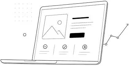
The thinking behind the build
Private lending is a category where visual trust is everything. A client considering using a $2M property as collateral for a loan is reading every design signal on the page; typography weight, colour authority, information hierarchy; and making a subconscious judgement about whether this institution is credible before they read a single line of copy.
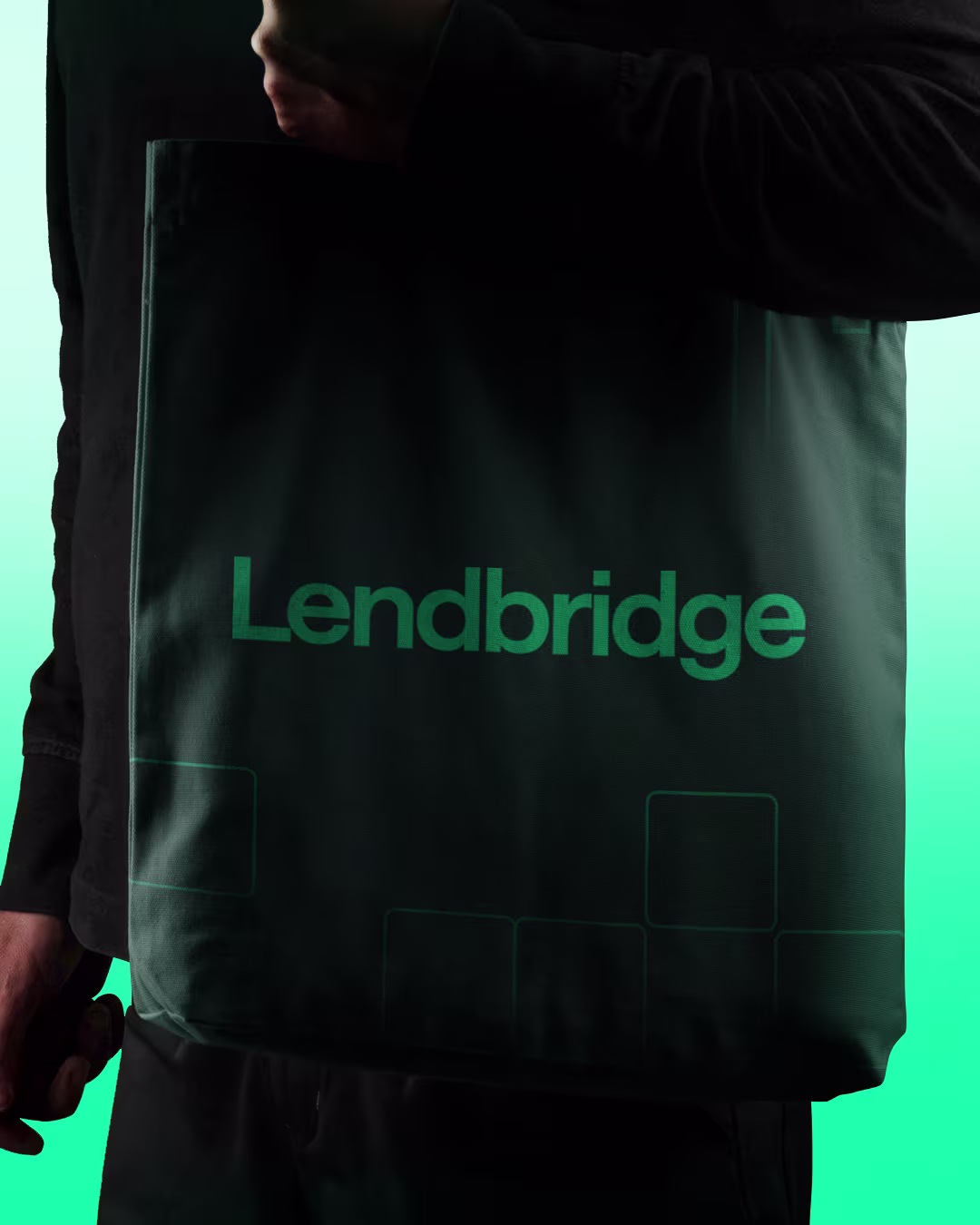
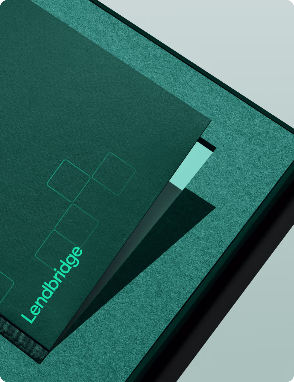
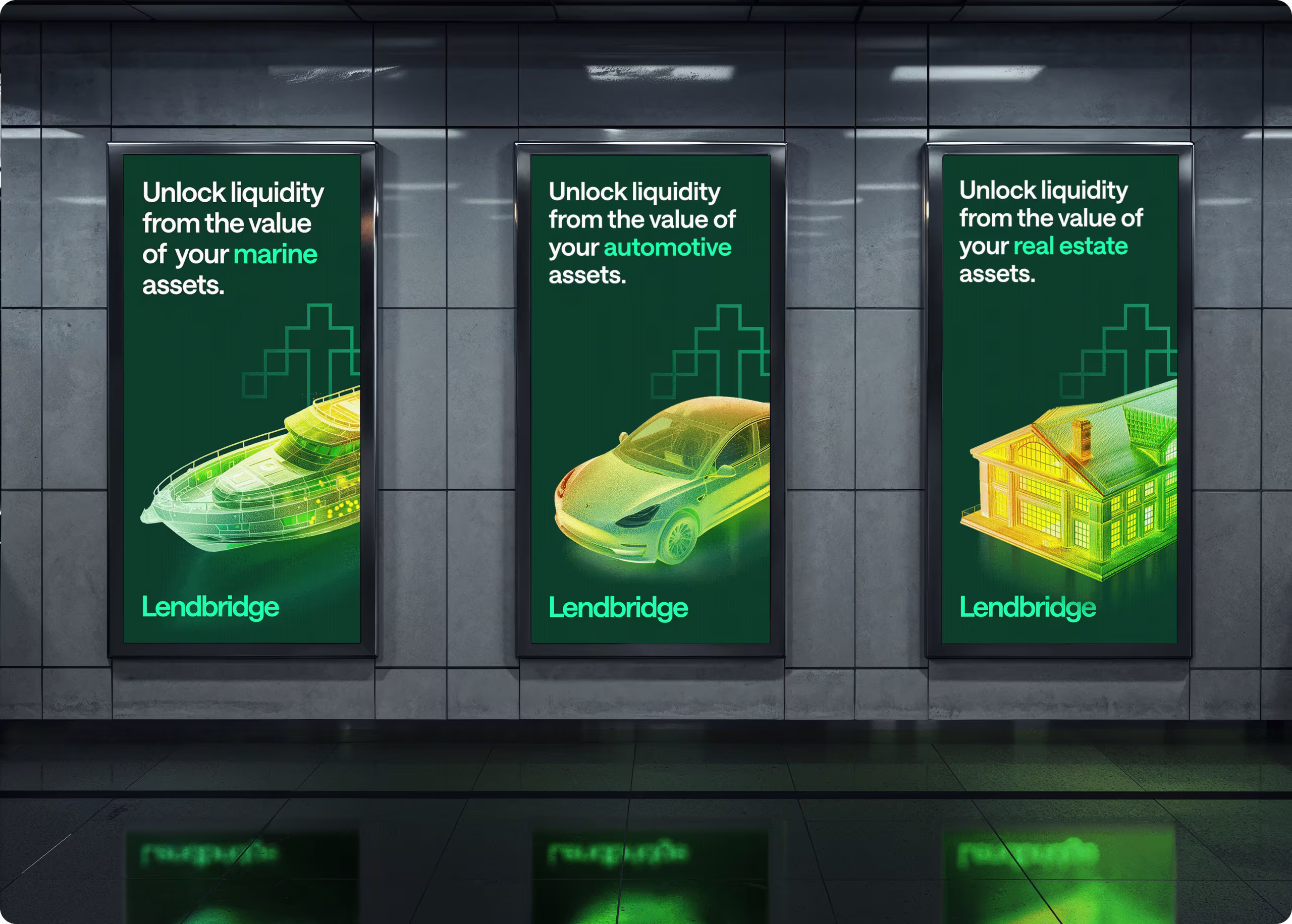
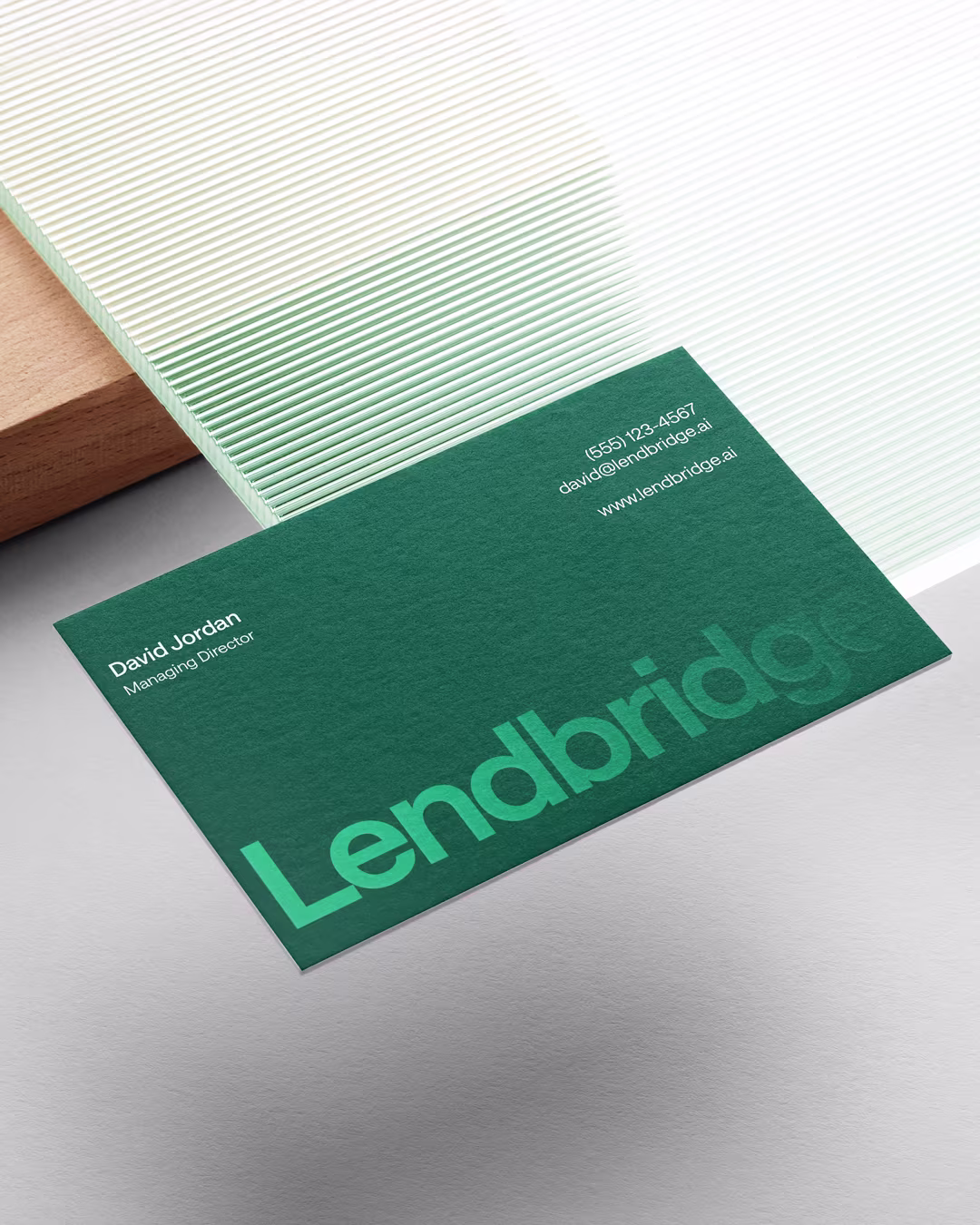
The colour system was the first decision and the most deliberate one. Deep forest green as the dominant brand colour carries associations that are rare in FinTech - wealth, permanence, environmental authority; without the coldness of navy or the aggression of black. The electric mint green accent creates energy and modernity on top of that foundation. Together they work across surfaces: embossed on stationery, reversed on business cards, large-format on OOH, and at scale in the site footer wordmark.
The custom icon system took a direction that very few financial brands would consider: pixel art. Deliberately retro, deliberately precise; each icon is built on a strict grid, creating a visual grammar that communicates the methodical, structured nature of the lending process itself.
The 3D asset visualisations is athermal wireframe renders of a house, a Tesla, a yacht; were the most technically ambitious element. The idea was to make the abstract concept of asset-backed lending immediately tangible. A client doesn't see a loan application; they see their specific asset, rendered with value and precision, waiting to be activated. The green-to-amber heat gradient communicates assessed value in a single visual.

Let’s create something meaningful together. Contact us, and let’s build a brand that’s thoughtful, effective, and beautifully designed.