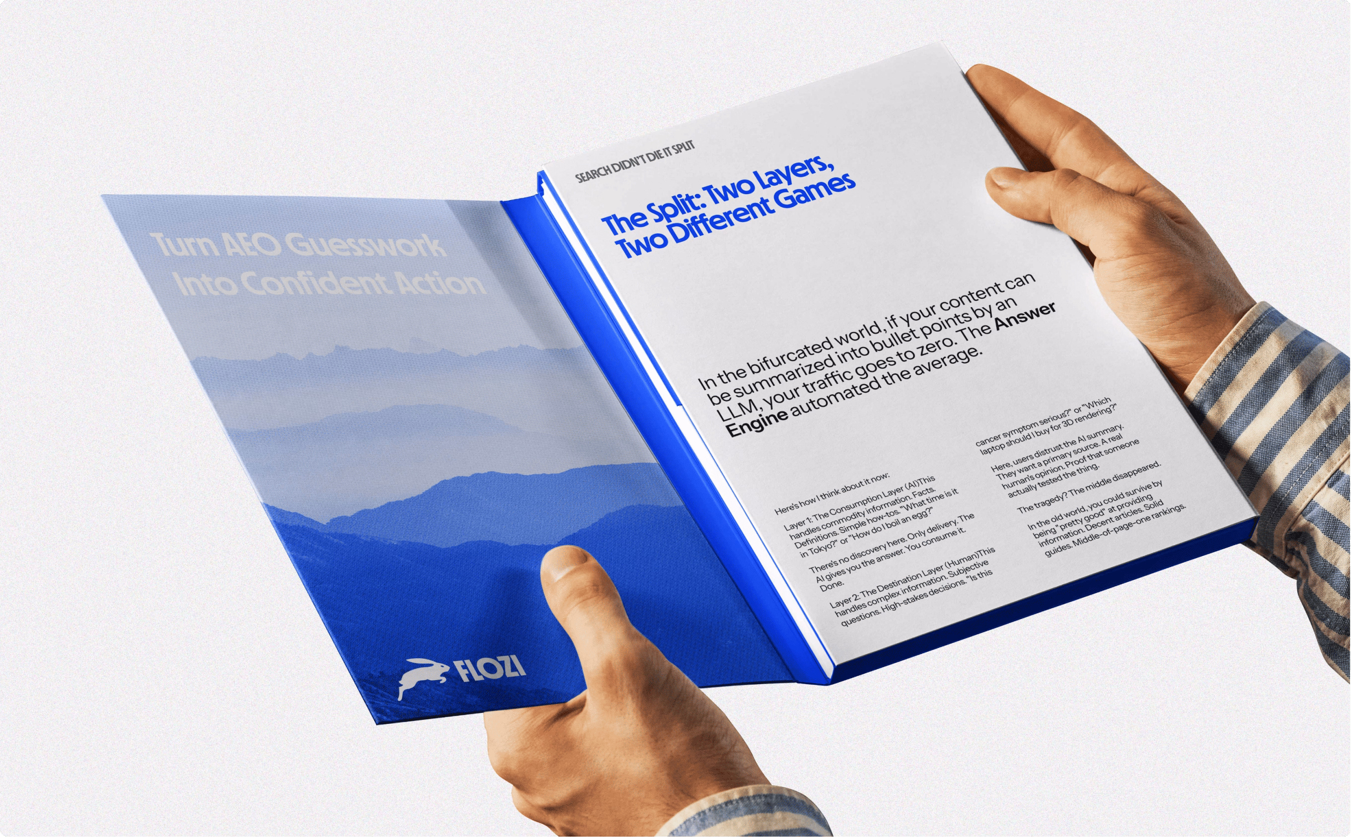
AI systems now decide if your business gets recommended before any human clicks your site. We built Flozi for both audiences → the human who converts, and the machine that surfaces you.
.jpg)
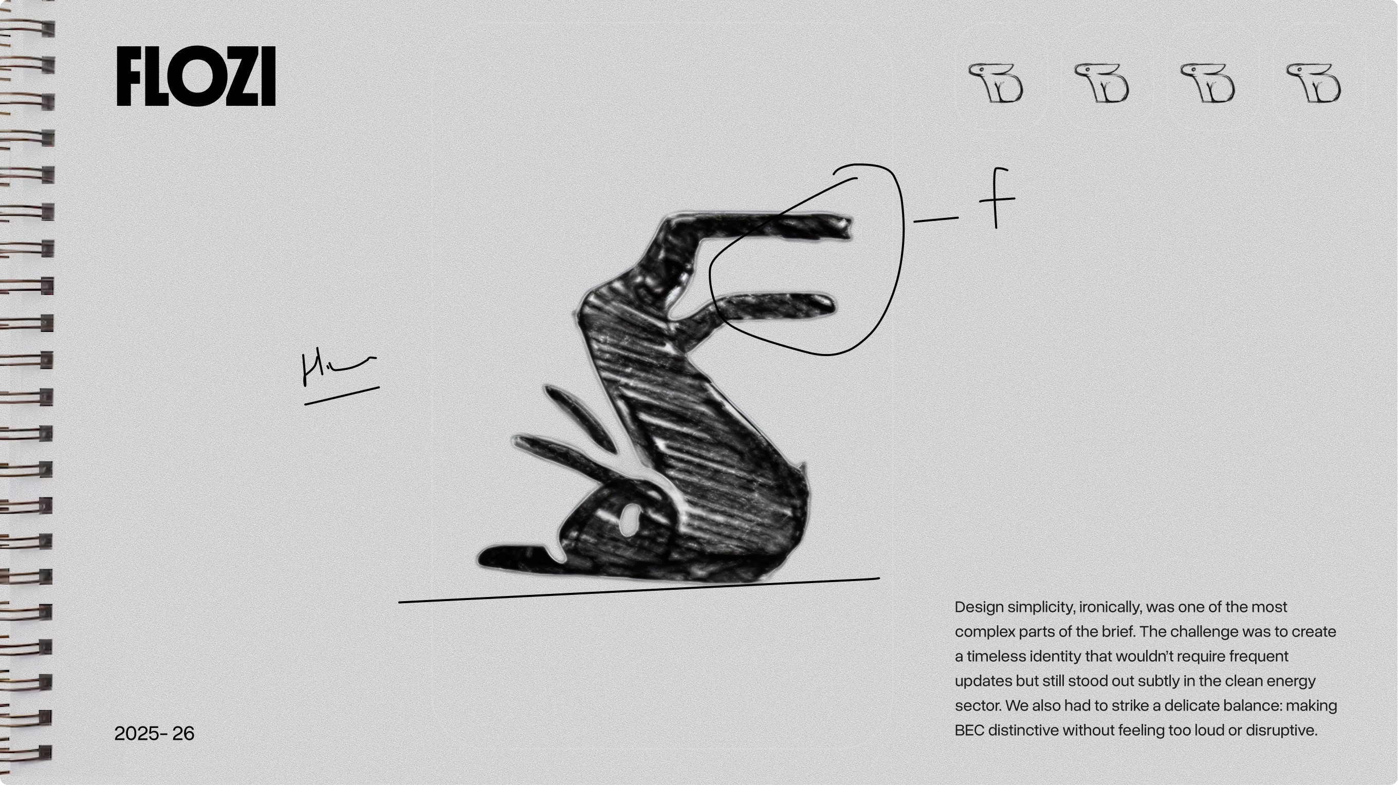
With Flozi, our aim was to build a fresh brand identity design that focusses on a mascot. The purpose of the rabbit was to signify the concept of how fast the industry of AI-Search is moving.
- → Branding
- → Web Design
- → Webflow Development
- → Product Design
- → Graphics
Starting from zero
Flozi didn't come with a brand. It came with an idea. There was no existing identity, no visual reference, no competitor to benchmark against. Just a product direction and a name. For most agencies, that's the hardest kind of brief. For us, it's the most honest one because it forces every decision to be intentional.
The scope covered everything from the ground up: brand identity, logo and mascot design, brand asset system, product UX and dashboard design, marketing website design, and full Webflow development. The kind of brief that either exposes gaps in your process or proves it works. Ours worked.
Getting the identity right
Branding an AI SaaS company is a specific creative problem. You're navigating a space that's visually saturated with dark UIs, glowing accents, and the same three shades of blue. Standing out without looking like you're trying too hard is the real challenge.
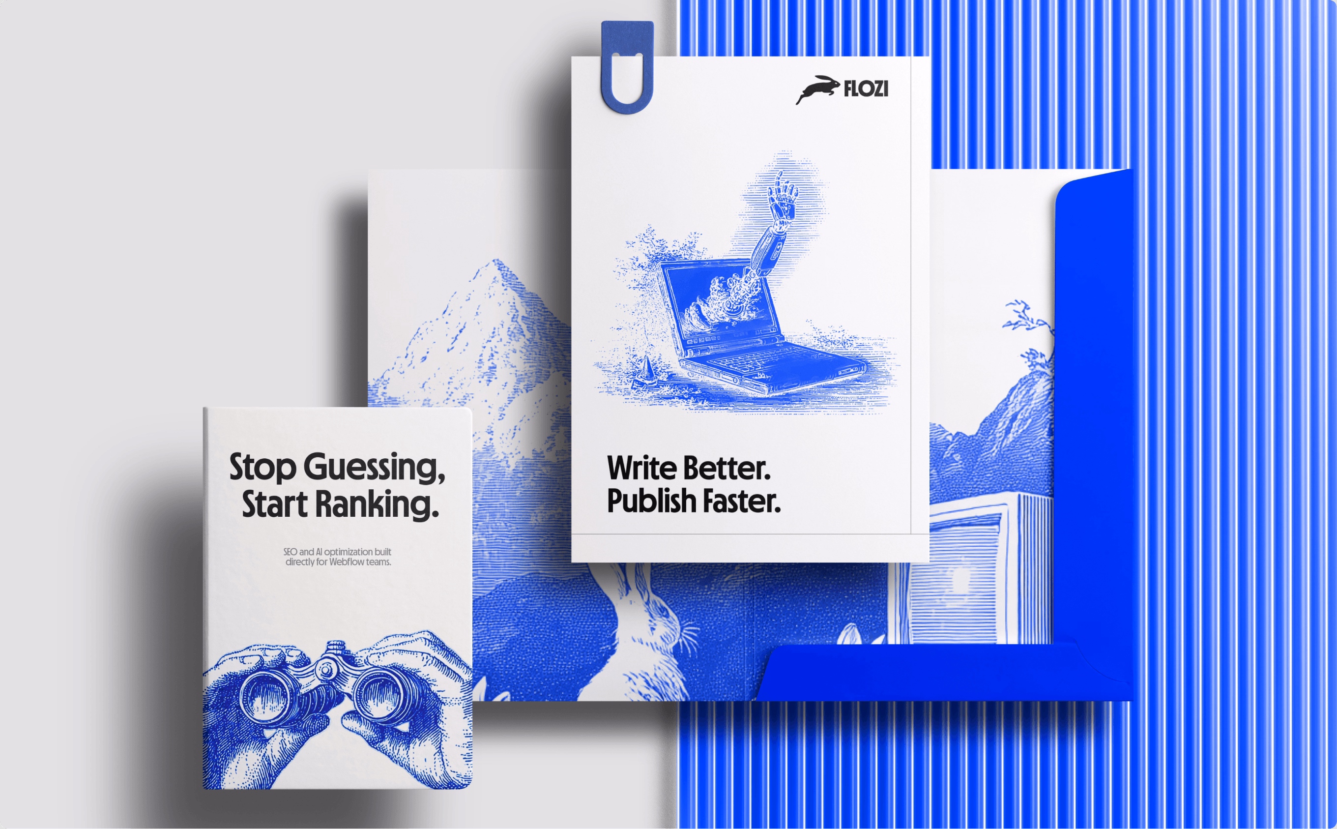
The two things that took the most iterations were the mascot and the primary blue. On the surface those sound like small details. They're not. The mascot is the brand's personality made physical; it has to be simple enough to scale down to a favicon and expressive enough to carry emotional weight. We went through several directions before we found the version that felt right: stripped back, geometric, immediately readable. The kind of simplicity that looks effortless but takes time to reach.
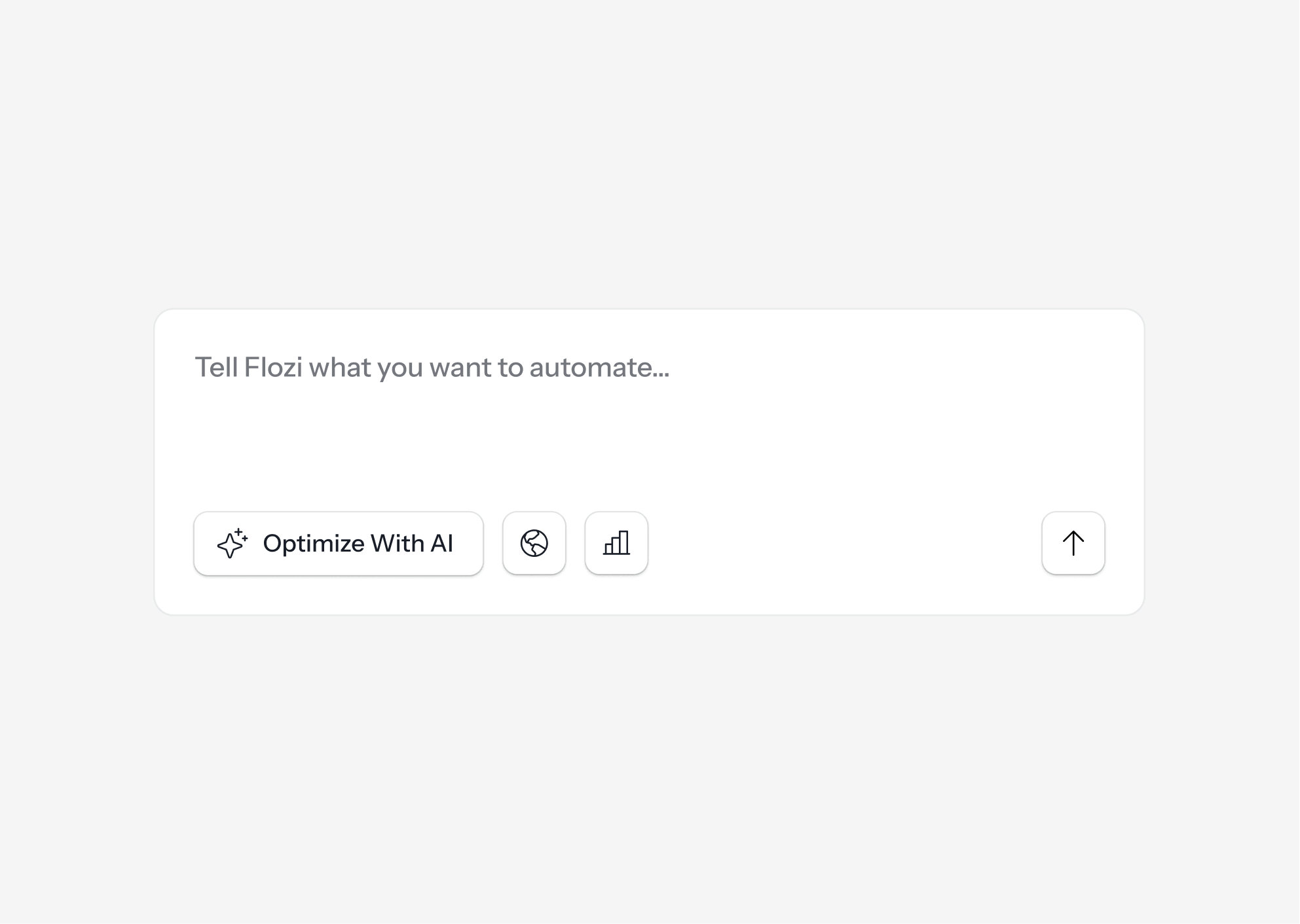
Designing the dashboard
Dashboard design for AI SaaS products has a particular trap: the temptation to show everything. Analytics, recommendations, scores, comparisons, historical data and much. more. Because a dashboard that shows everything communicates nothing.
The design principle we kept returning to was: what does the user need? Everything else is a click away. The dashboard needed to show AI visibility status, what's broken, and what to fix. Not because we oversimplified the product, but because that is the product's core value loop.
We designed the interface around that loop: diagnose, understand, act. Each view earns its place.
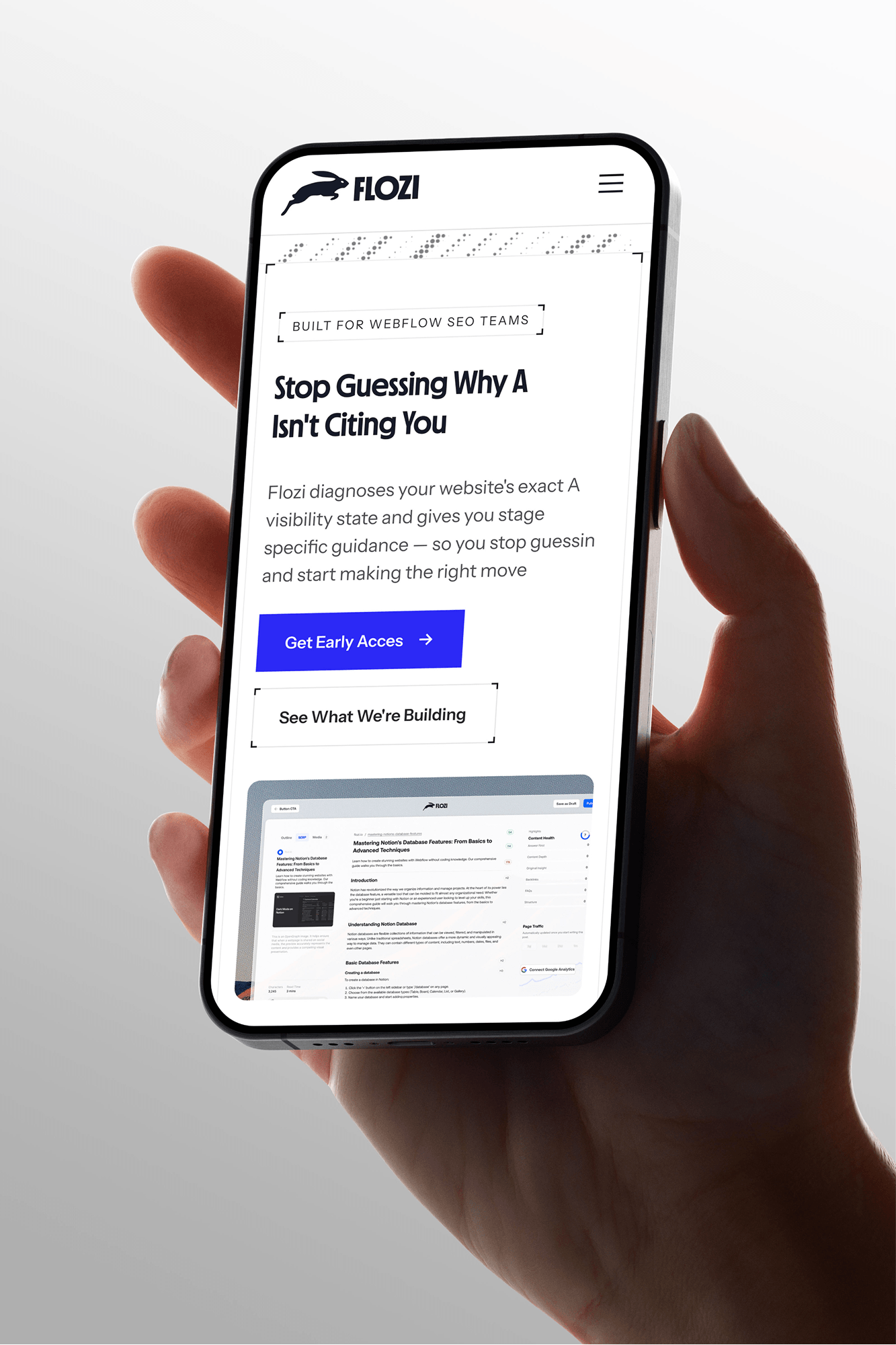
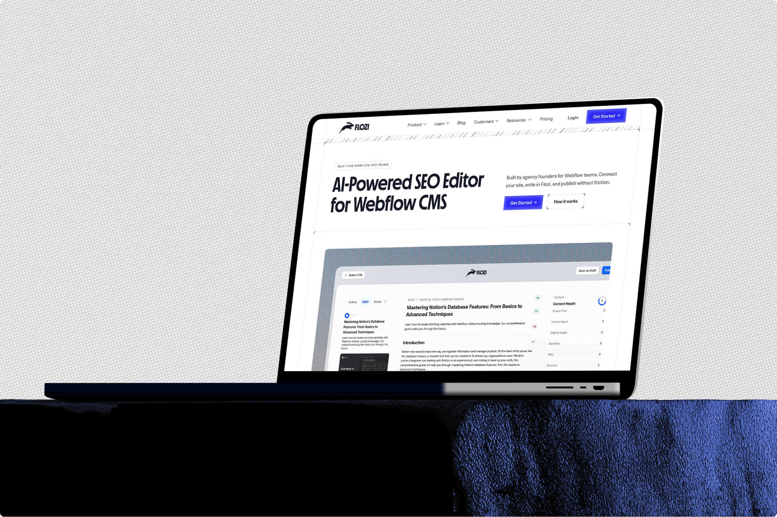
The website had one job
The marketing site for a technical SaaS product lives in a difficult middle ground. Too simple and it undersells the product. Too complex and you lose the decision-maker who landed from a LinkedIn post and has forty seconds to decide whether this is worth their time.
We designed and developed the Flozi website in Webflow because we practise what we sell. The site is structured around a single question a visitor is asking - what is this product about?
Every section answers a layer of that question. The hero lands the problem. The how-it-works section makes the process concrete. The FAQ handles the objections.
From a Webflow development standpoint, we built the CMS architecture to support Flozi's growing content operation - blog, insights and use cases. With the kind of structure that's AEO-ready from day one. Not retrofitted later. Built in.
.avif)
Building your own product is easier
There's a common belief in agencies that your own brand is always the hardest project. You know too much. You second-guess everything. You're simultaneously the client and the creative lead, and those two roles don't get along.
What we found was that the process we've refined across every client engagement, which is to start with strategy, running lean on V1, iterating with intention. We weren't starting from instinct and hoping. We were running our own playbook. And it worked.
That's the thing about a real process: it doesn't need a client to function. It doesn't depend on external pressure or a brief from someone else.
Making sure Flozi gets found by humans and by AI
Shipping a product is one milestone. Getting it discovered is a different problem entirely.
We're currently running Flozi's organic growth strategy — which, fittingly, is the same thing Flozi helps its own users do. That means building content that ranks in traditional search and gets cited by AI systems like ChatGPT, Perplexity, and Google's AI Overviews. The irony isn't lost on us.
The strategy focuses on: content structured for AI retrievability, topic clusters that own the questions Flozi's buyers are asking, and a CMS publishing workflow that runs through Flozi's own editor; dogfooding by design.
If you're building an AI product, start with the brand.
The market for AI tools is crowded and moving fast. The companies that cut through aren't the ones with the most features; they're the ones that are immediately legible. You understand what they do, you trust what they look like, and you remember the name.
That's what good branding for an AI SaaS company actually buys you. Not aesthetics. Clarity.
If you're building something in that space and you need a team that handles everything from identity to product design to Webflow development to organic visibility. That's exactly what we do.
Let’s create something meaningful together. Contact us, and let’s build a brand that’s thoughtful, effective, and beautifully designed.