MarHub didn't have a brand problem. It had a category problem. Ports are perceived as slow, operationally heavy, and visually stuck in the past; and most port technology brands do nothing to challenge that. We fixed that!
How Neue World built a complete brand identity system for MarHub - a port community coordination platform moving from zero identity maturity to a brand that thinks, behaves, and scales. A case study in branding for maritime technology and infrastructure SaaS.
- → Brand Identity Design
- → Brand Assets
- → Brand Collaterals
- → Copywriting
- → Graphics
Starting from zero identity maturity
When MarHub came in, there was no coherent visual expression. Just a name attached to a highly complex platform. There was no mark, no system, no recognisable identity of any kind. Which, as starting points go, is actually the cleanest one. You're not untangling old decisions or managing stakeholder attachment to something that isn't working. You're defining perception from scratch.
The product itself was clear: coordination infrastructure for everything that happens at a port including shipping lines, terminals, customs, cargo, service providers pulled into a single coherent, real-time system. The emotional brief was harder to articulate but just as important: make complexity feel controlled, make movement feel intentional, make stakeholders feel aligned.
A behavioral brief where the distinction shaped everything that followed.
Reframing a challenging category
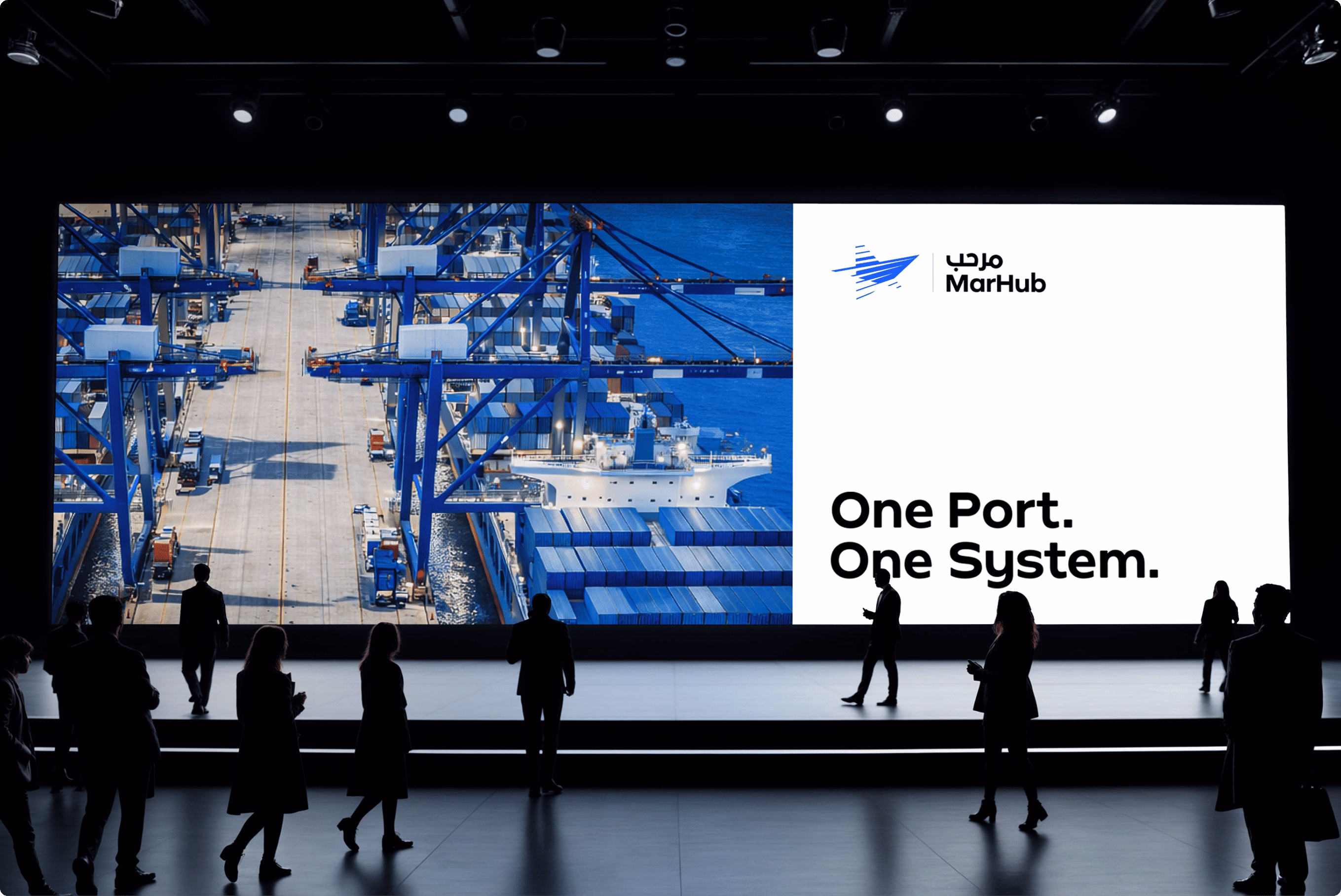
Ports aren't typically associated with precision, speed, or digital sophistication. They're perceived as slow, operationally opaque, and visually outdated. Most port tech brands accept that perception and design within it. MarHub operates completely differently; as a live digital layer turning fragmented, time-sensitive port operations into a coherent, orchestrated system.
The brand needed to close that gap. Not by claiming to be modern, but by feeling modern; structured, dynamic, built for a world where physical infrastructure and digital coordination overlap completely.
That meant the real creative challenge wasn't aesthetic. It was conceptual. What does a platform that organises movement actually look like?
From maritime symbolism to systems thinking
The first instinct was to anchor the brand in maritime iconography. Compass, navigation, constellations, vessels, nautical themes. That direction solved half the brief. It communicated context but it didn't communicate capability.
"What does MarHub do visually?" The answer: it pulls things together, it directs flow, it keeps things moving.
Five distinct conceptual territories were explored each representing a different lens - Motion (Vortex), Orientation (Meridian), Convergence (Nexus), Structure (Pinnacle), Emergence (Horizon). None of them were just logos. The final mark wasn't a selection from those five; it was a synthesis of them. A concept that tied the threads of all five routes into a single form.

A directional form in motion
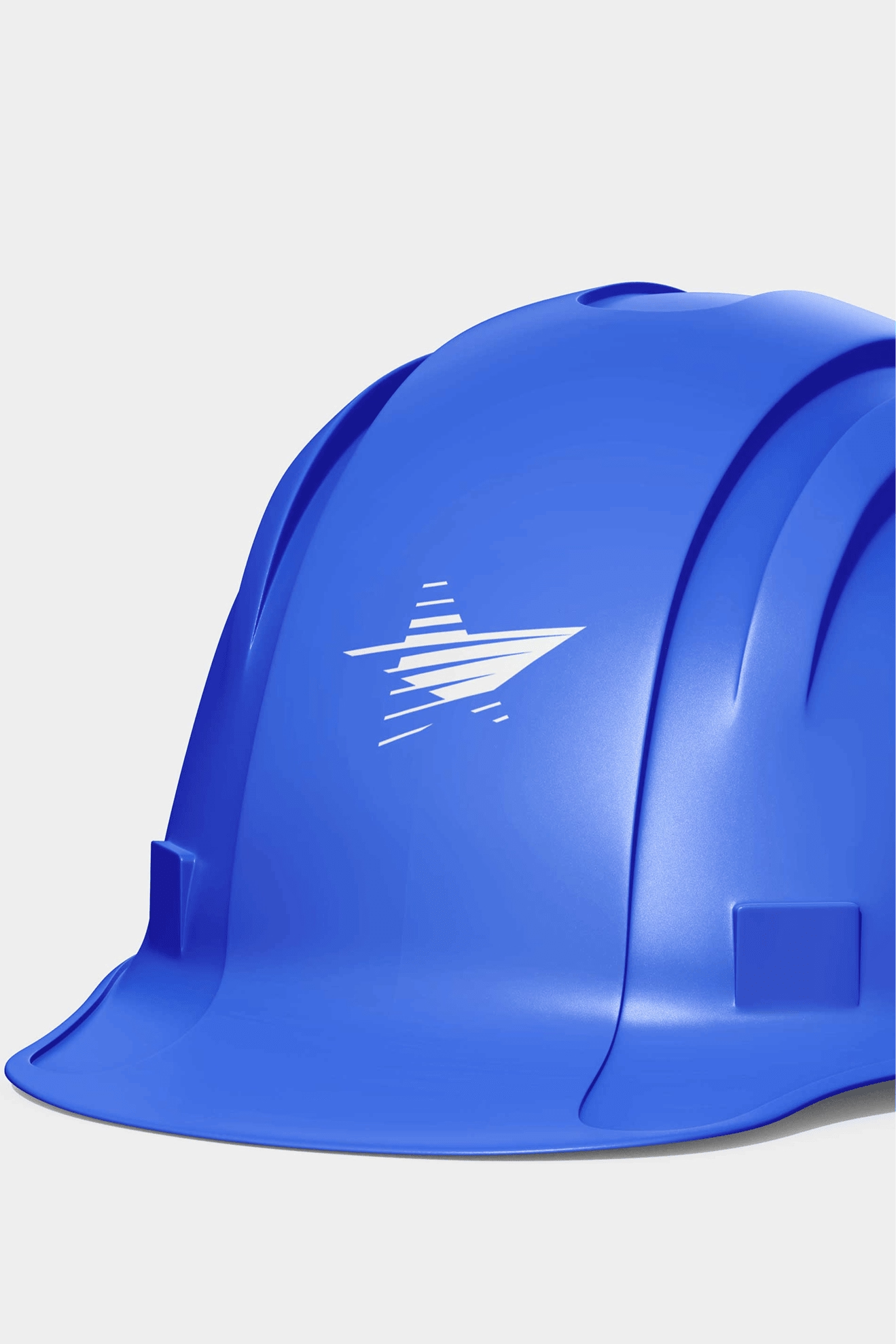
The hardest single element was the mark itself because it had to do three things simultaneously without compromising any of them: feel maritime, feel digital, and feel infrastructural. Most directions solved two. Very few solved all three without feeling generic.
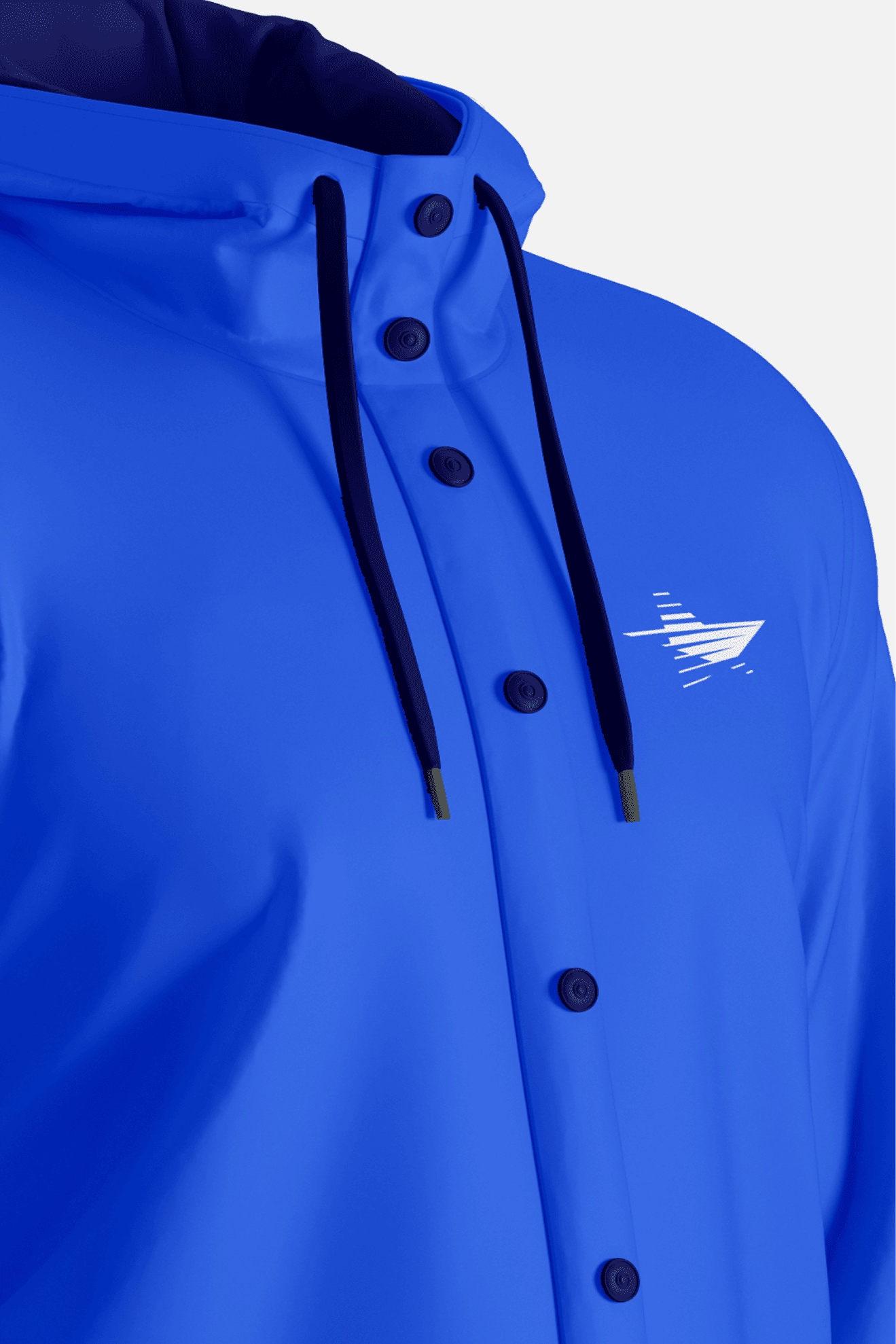
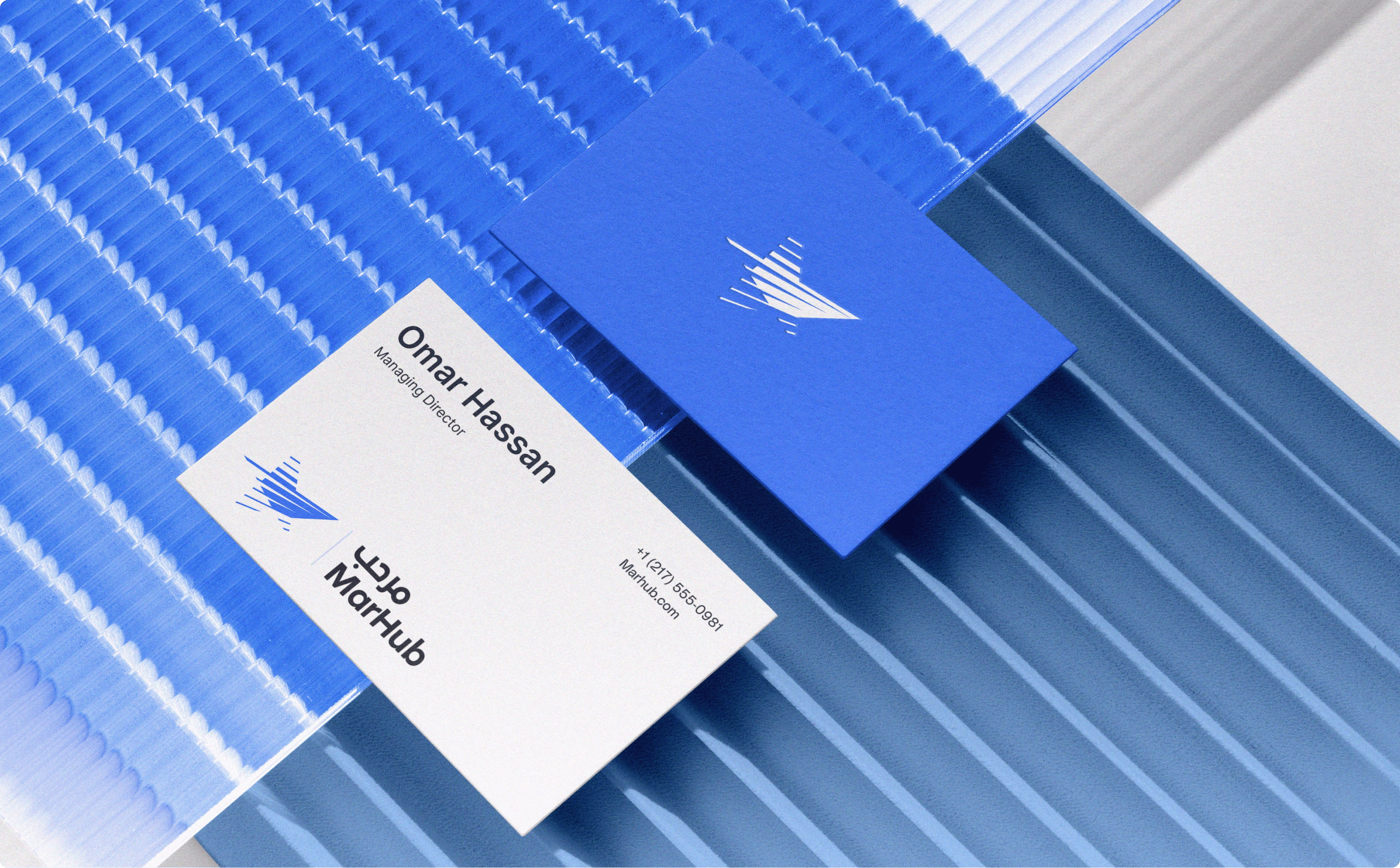
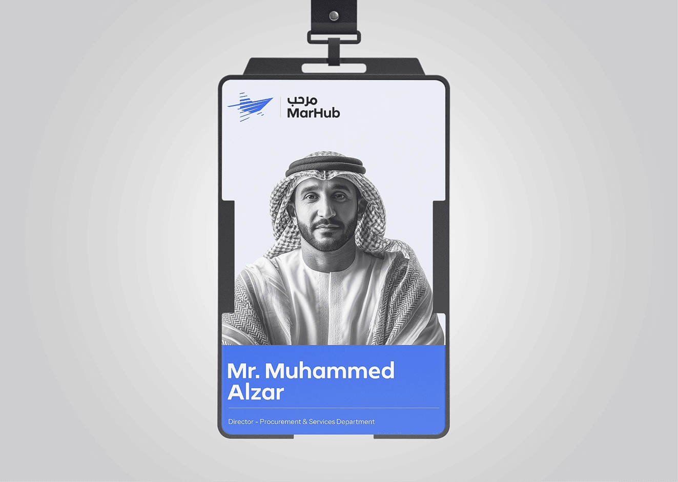
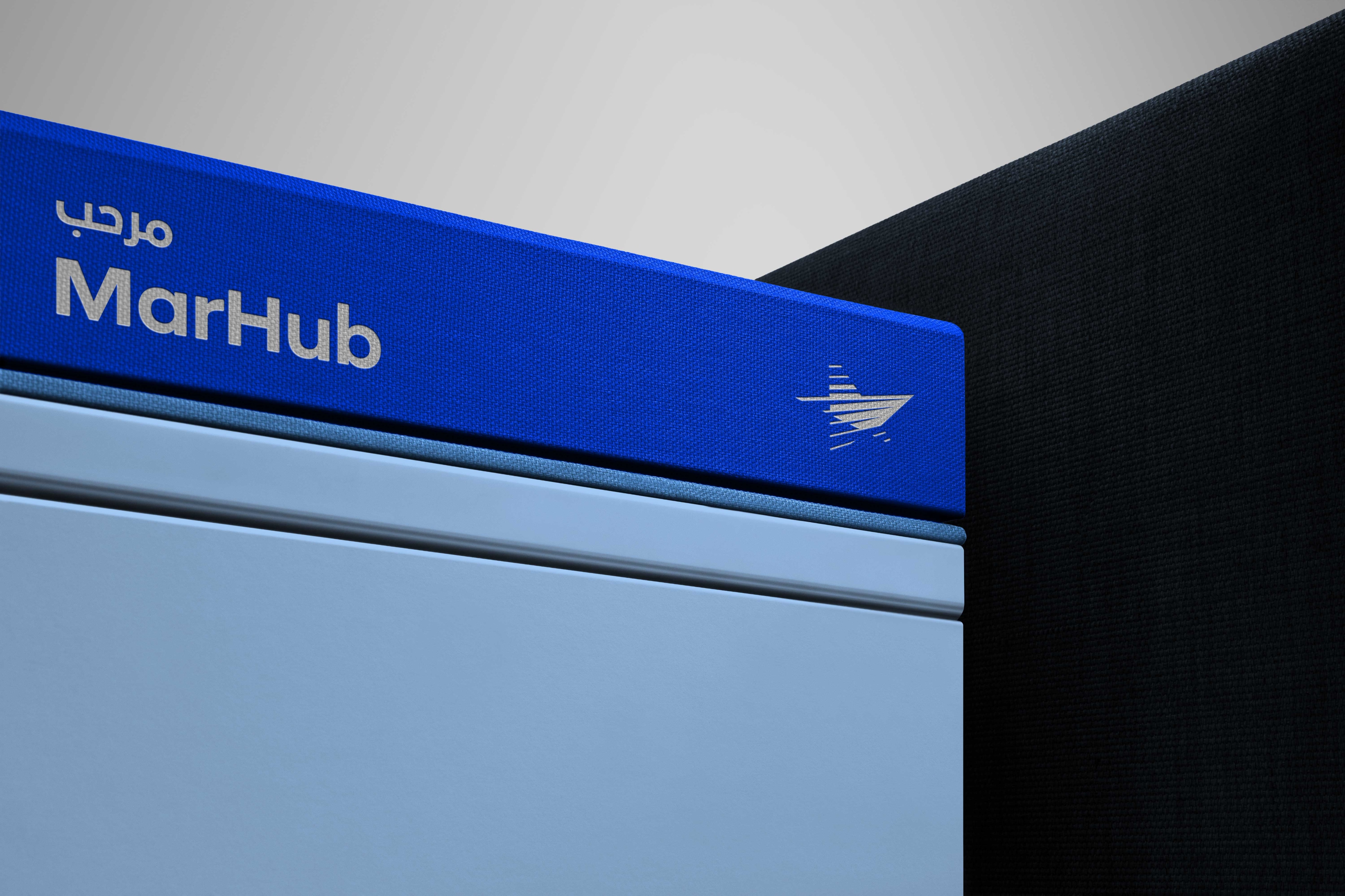
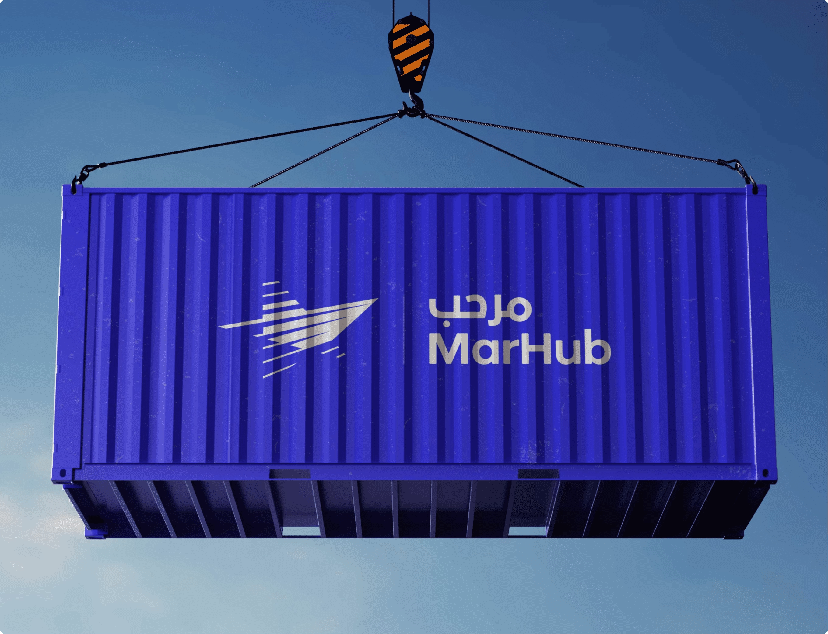
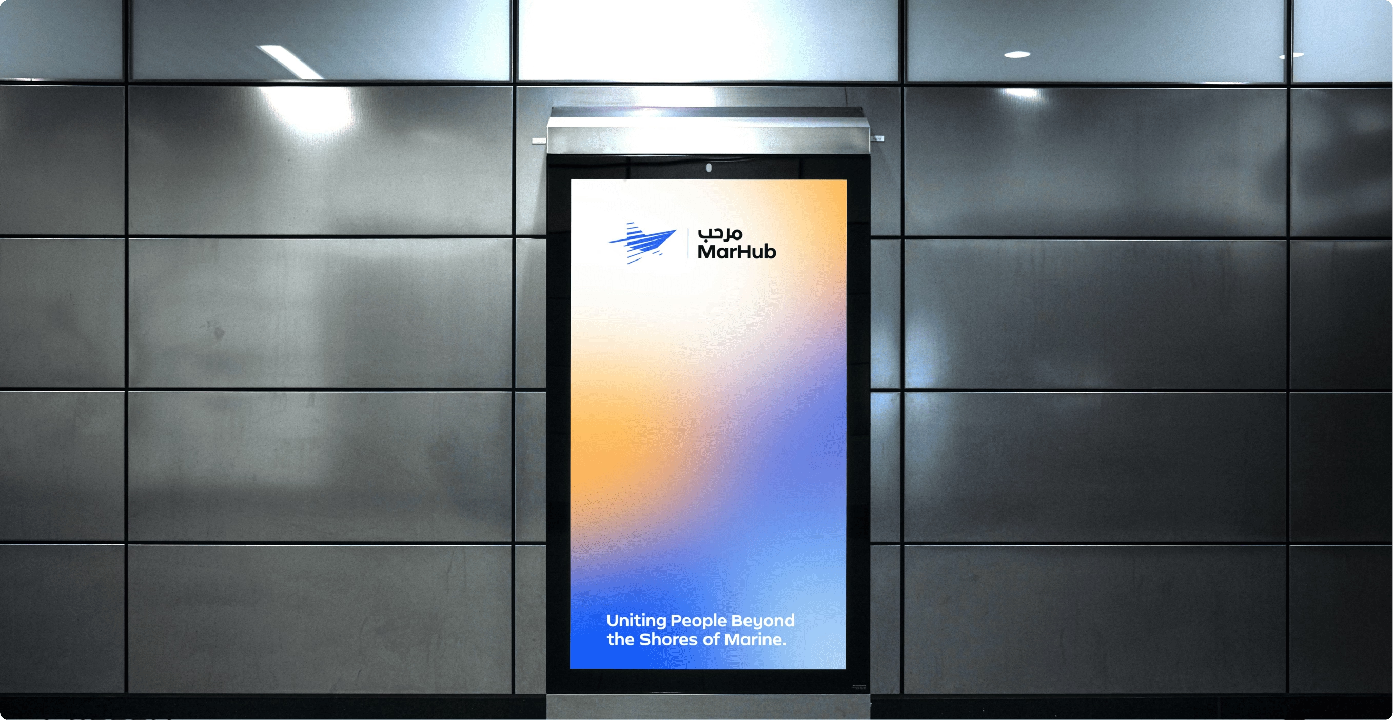
The final mark is a directional form in motion. It combines the logic of a guiding anchor - a North Star reference with forward-leaning geometry that communicates momentum, and a subtle maritime abstraction drawn from ship form. It doesn't describe the system literally. It expresses how the system behaves.
The breakthrough came when the design stopped optimising for recognition and started optimising for behavior. MarHub is a set of forces: guiding direction, continuous motion, coordinated convergence. Once those were unified in one form, everything else resolved.

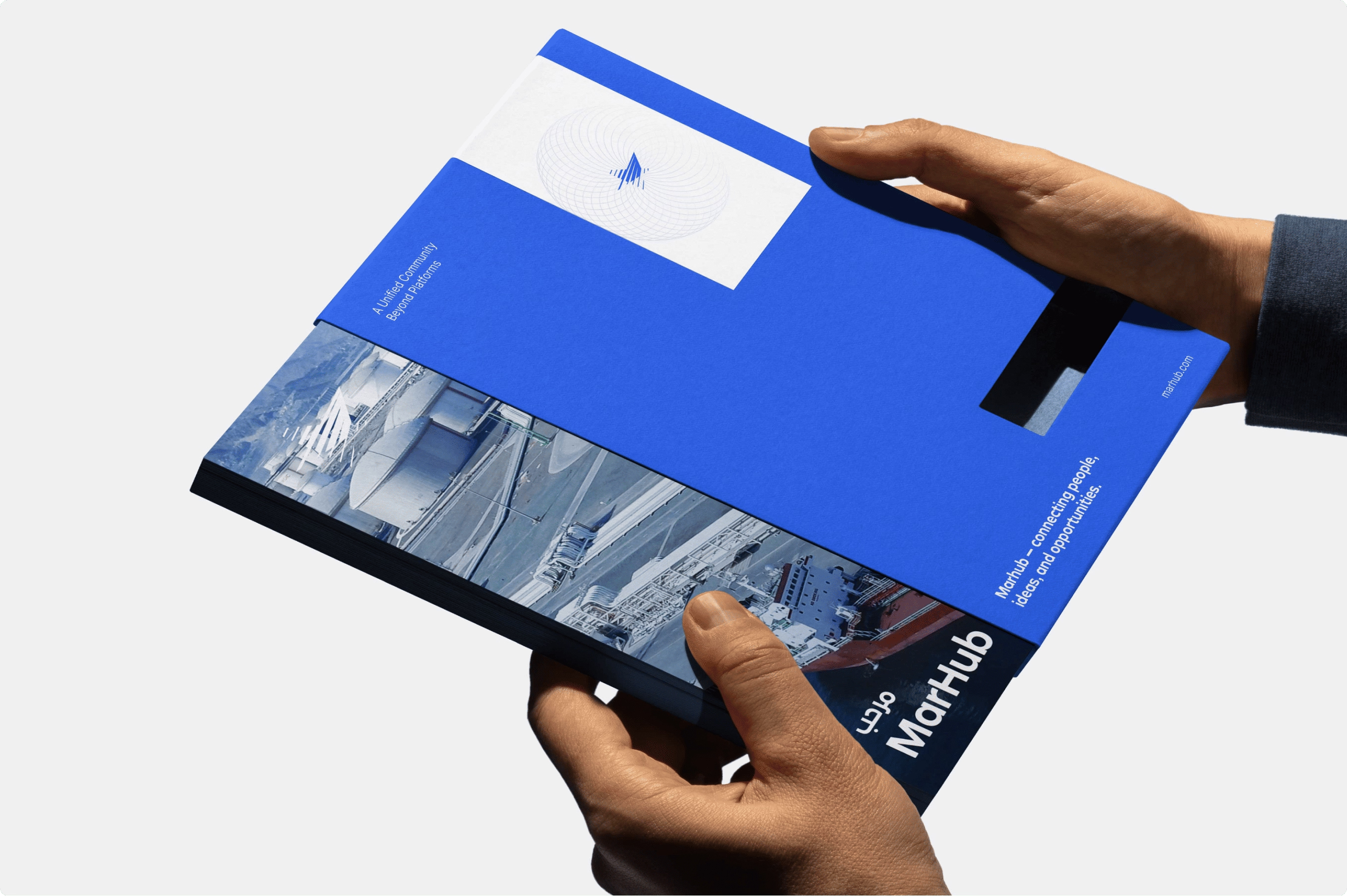
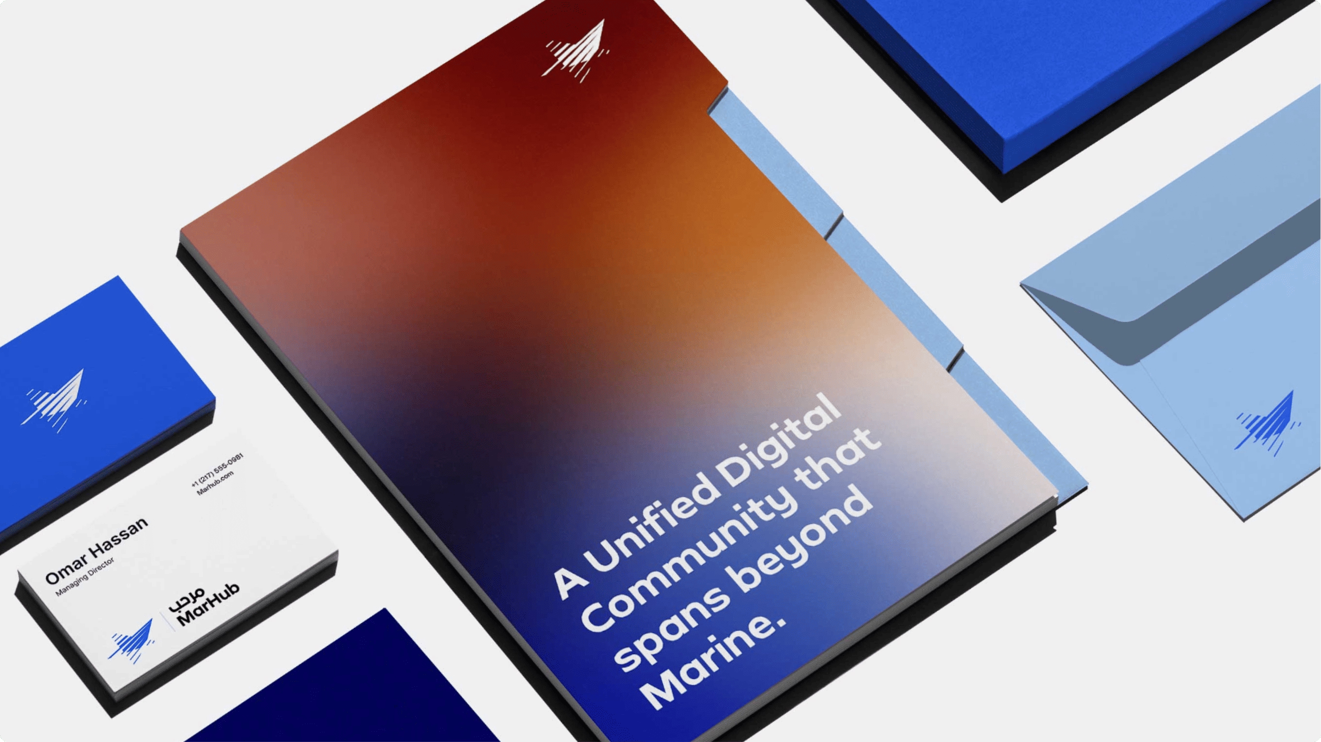
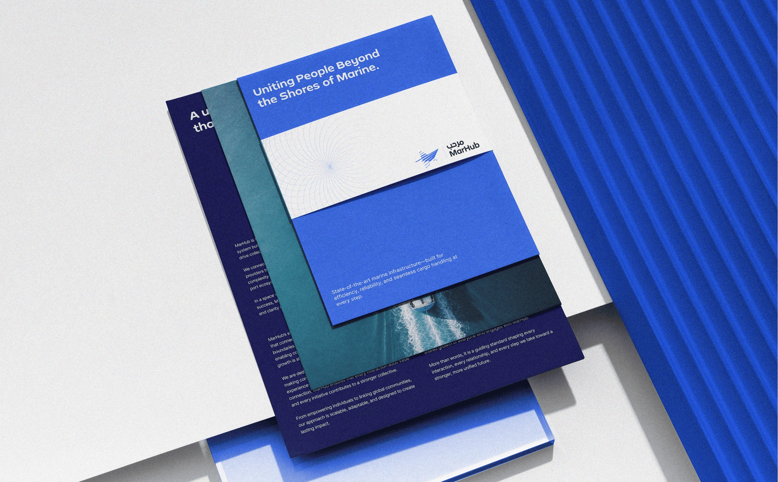
The color palette wasn't built from brand preference it was rooted in the port environment itself. Deep blues pulled from open sea and navigation depth. Dark tones drawn from infrastructure; steel, terminals, night operations. Warm gradients sourced from cargo, industrial surfaces, heat, and catching sun. Together, they map a harbor in motion; the point where physical activity and digital coordination overlap.
Gradients became essential because flat color couldn't carry the sense of transit the brand required. Tides shift, vessels move, data flows. Static color would have flattened the system into just another interface.
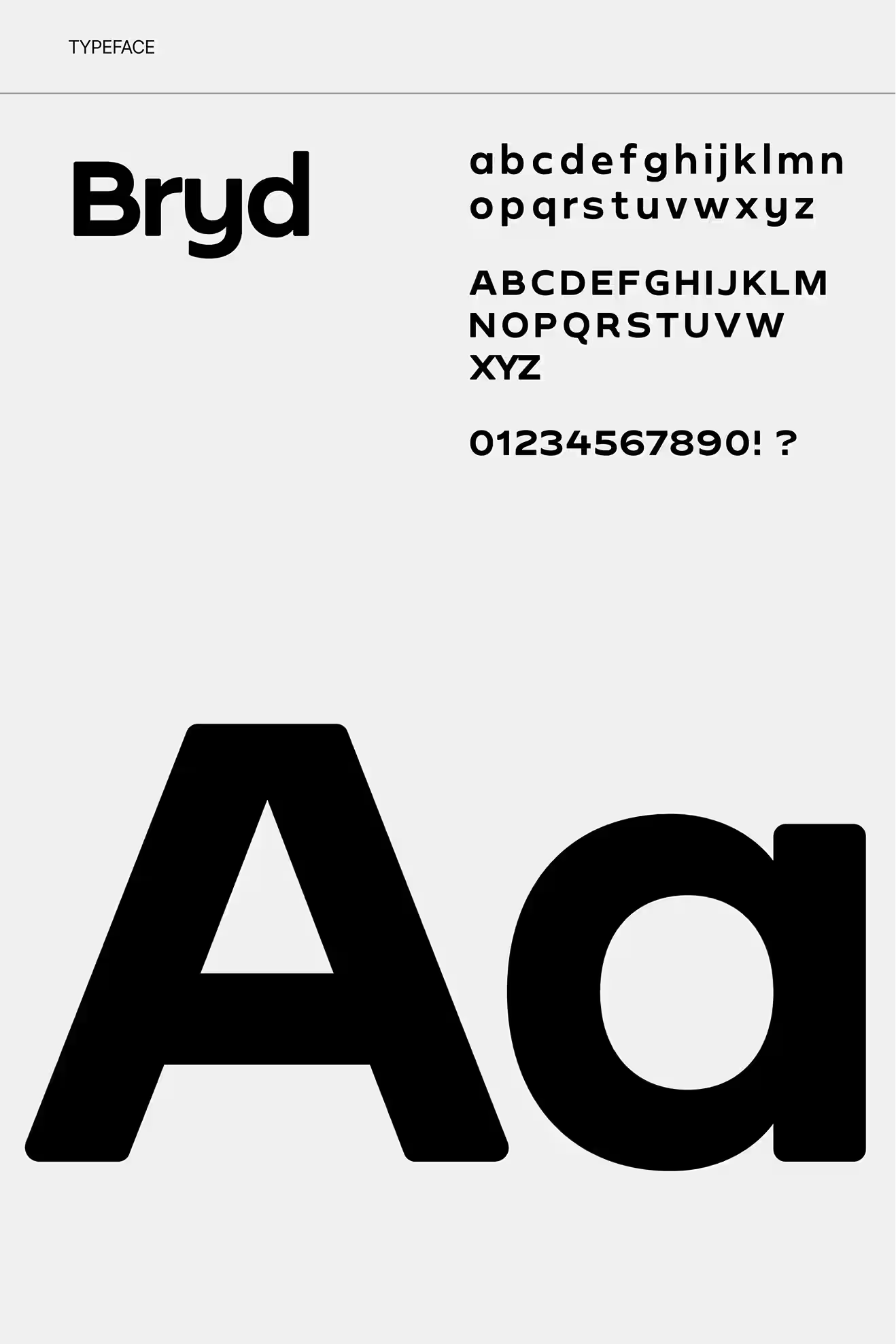
Typography plays a different role. It's discipline. It doesn't carry expression. Clean, modern, highly legible type lets the mark and gradient system do the expressive work while keeping the brand functional across every real-world surface.
.jpg)

The one honest note looking back: push distinctiveness earlier. Some early directions settled too comfortably within known visual tropes. Breaking those sooner would have unlocked stronger differentiation and saved time in the middle of the process. That's a useful tension between the familiar references a client can react to and the genuinely unexpected directions that produce the best work.
What this project demonstrates more broadly is something we believe about branding in general: we don't design brands as surfaces. We design them as systems, structures that reflect how a product thinks, behaves, and scales. MarHub reflects that philosophy directly. Strategic reduction of complexity. Translation of infrastructure into form. Restraint in execution, clarity in intent.
A brand that just looks clean isn't doing enough work. For platforms operating in complex, high-stakes industries; logistics, maritime, infrastructure, enterprise tech the brand needs to communicate capability, not just presence. It needs to behave as confidently as the product does.
That's the kind of brief we're built for. If you're in that space and you need a brand system built properly from the start; we'd like to hear about it.
Let’s create something meaningful together. Contact us, and let’s build a brand that’s thoughtful, effective, and beautifully designed.