ALEEYA. builds homes and offices that are resolved in every detail. The brand and the website had to meet the same standard, and say less, not more.
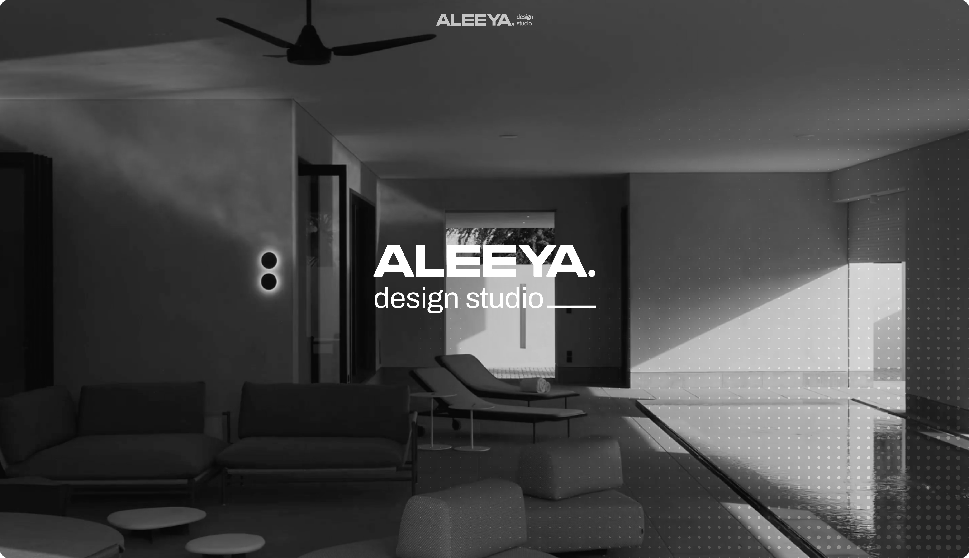
How Neue World built the brand system and Webflow website for ALEEYA. design studio, a women-led architecture and interior practice in Karachi. A case study in branding for architecture studios whose work should do the talking.
- → Brand Identity Design
- → Web Design
- → Webflow Development
- → Animation
- → AI Images & Socials
The Brief
ALEEYA. design studio is an architecture and interior practice founded by Aleeya Khan, a Columbia-educated architect. The studio designs high-end homes, boutique offices and bespoke renovations across Pakistan and the GCC, and its work has been featured in Wallpaper*, AD and ArchDaily.
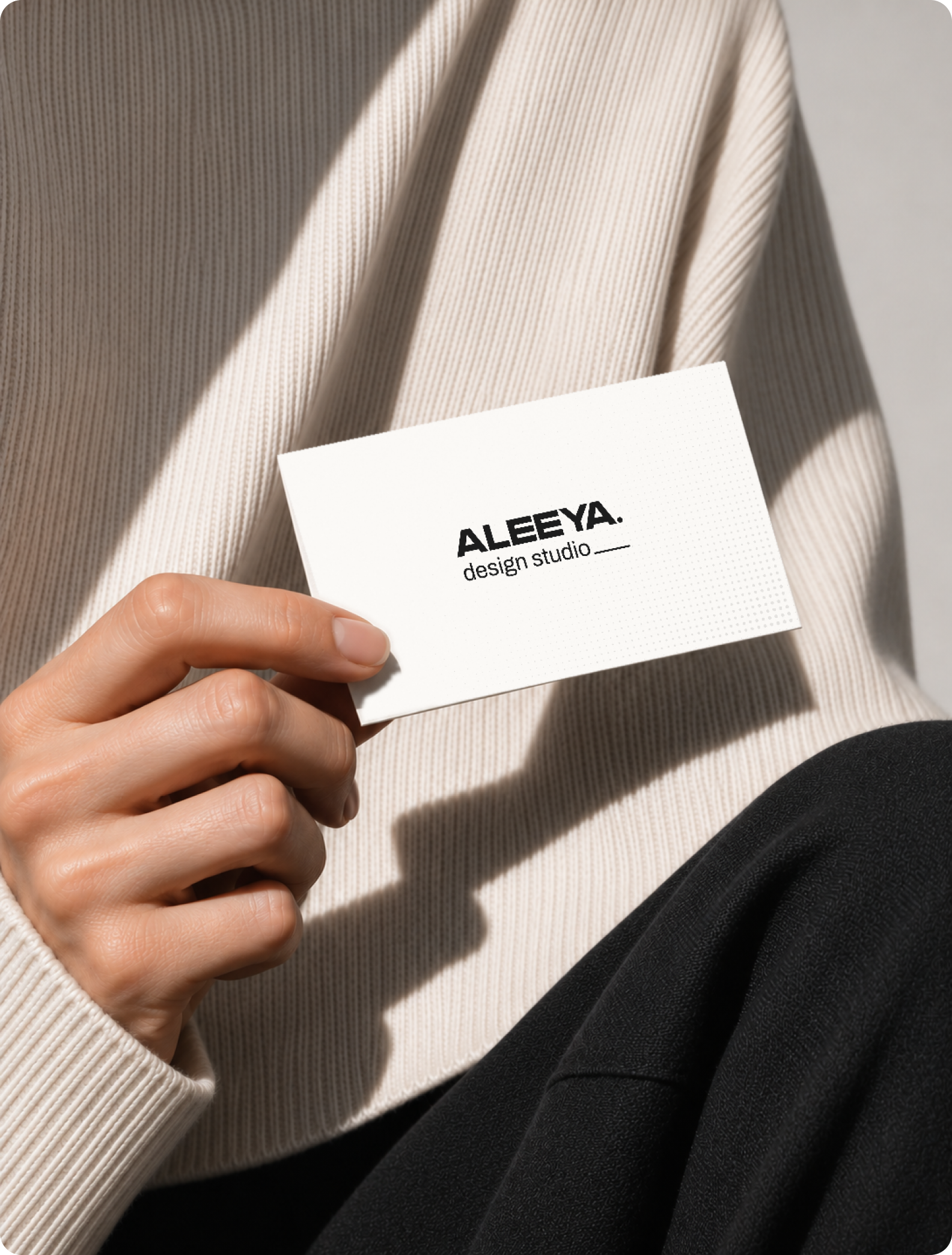
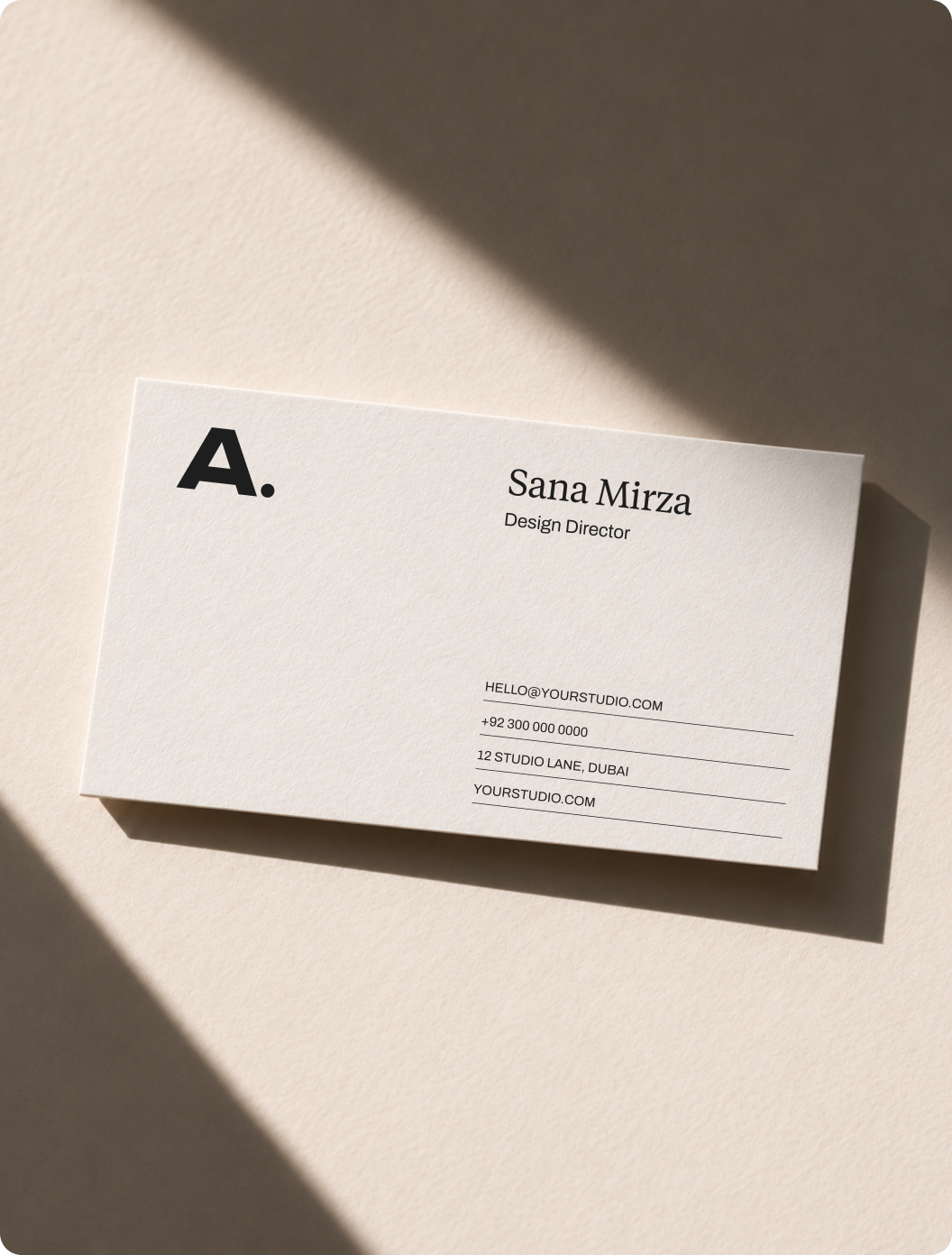
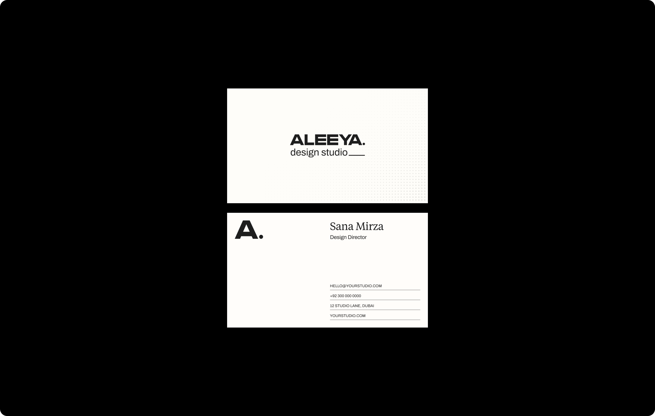
The brief covered everything a studio needs to present itself: the identity, the logo system, colour, typography, iconography, stationery, social, and a website the team could run themselves. One system, from a business card to a project page.
For a practice whose buildings are quiet and exact, anything louder would have been the wrong answer.
Restraint is the brief.
Architecture studios are judged on judgement: every material, every proportion, every junction. A brand that over-reaches undoes that before the first project is seen.
So the starting point wasn’t what to add. It was what the studio’s own work already does: light treated as a material, textures chosen to age well, nature brought inside as structure.
The identity had to work the same way. Nothing decorative, nothing that dates, nothing between a visitor and the photographs.
The problem with architecture brands
Most studios fall into one of two traps. Either the brand competes with the work, or it disappears into the same thin sans-serif and grey that every other practice uses.
We didn’t want either. We wanted a mark with a point of view that still steps back.
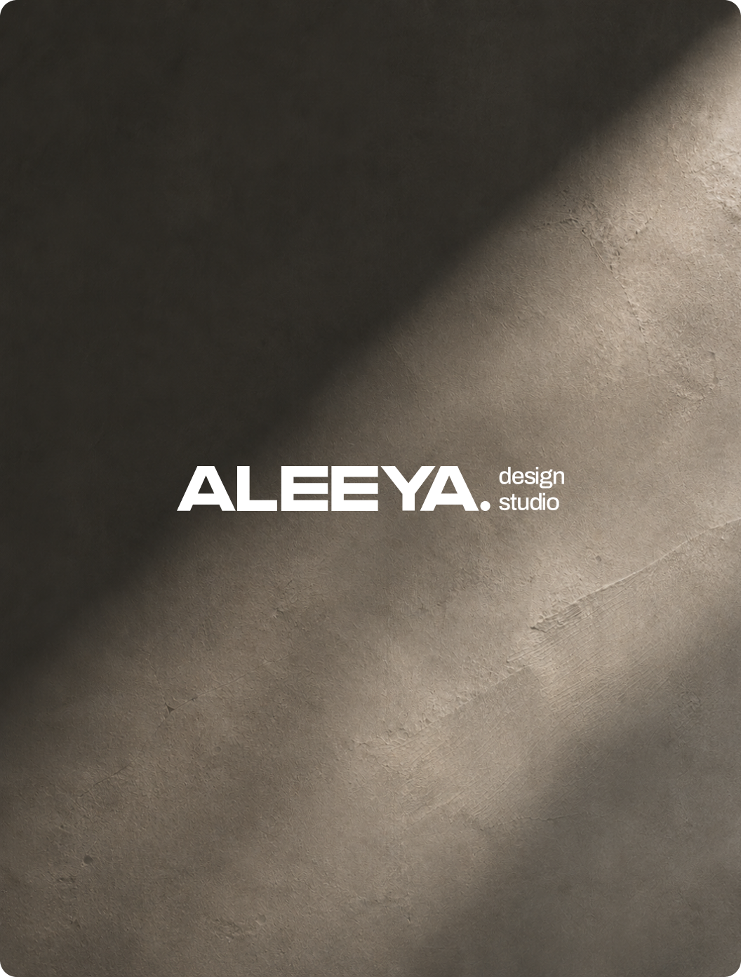
The answer was already in the name. ALEEYA. carries its own full stop, and we made that period the identity’s single gesture: a mark of something finished and resolved.
One mark. Five lockups.
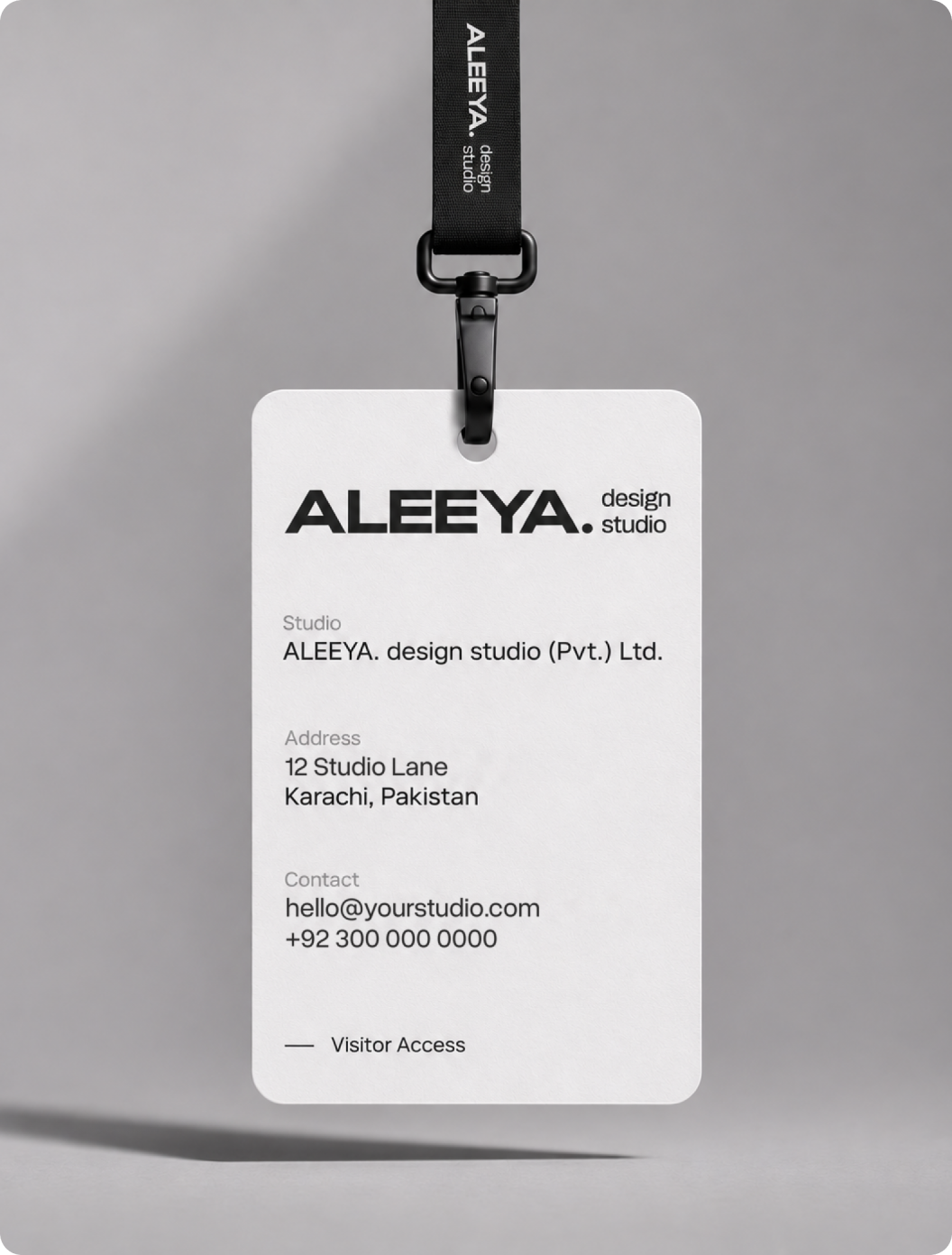
A system is only as good as how it behaves at the edges: a favicon, a site board, an embossed notebook, an Instagram avatar.
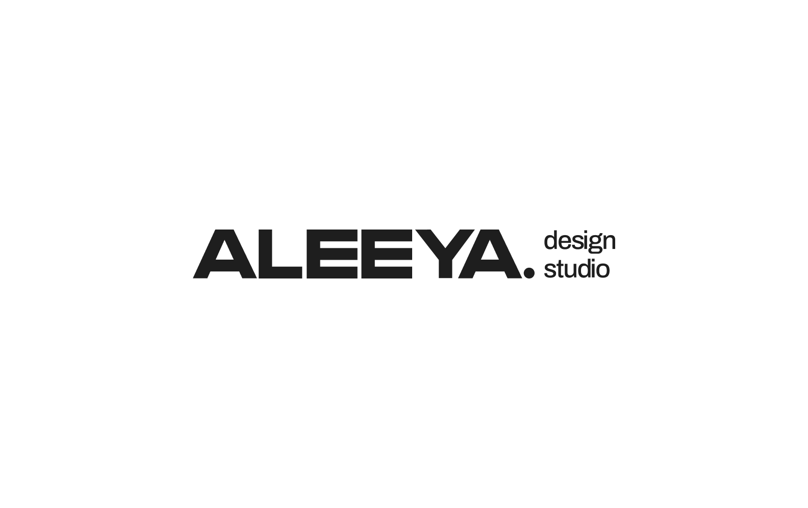
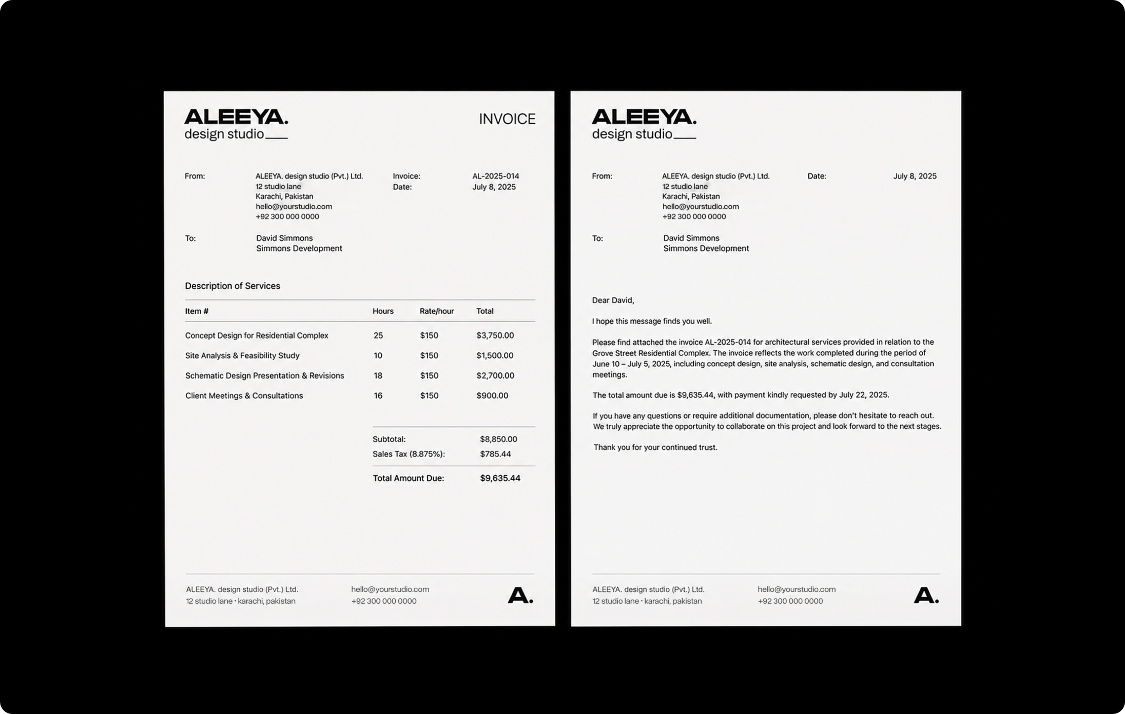
Primary: the wordmark alone, wherever the studio is already introduced. Horizontal and vertical: the wordmark with ‘design studio’, for signage, documents and first introductions.
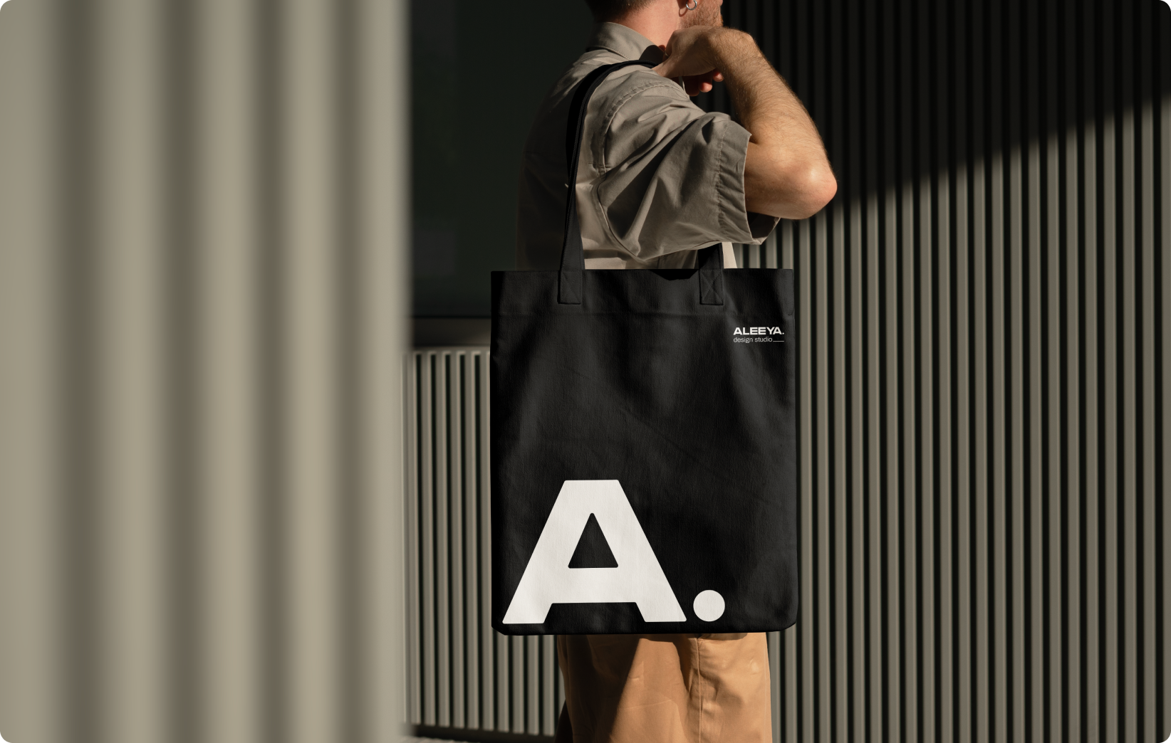
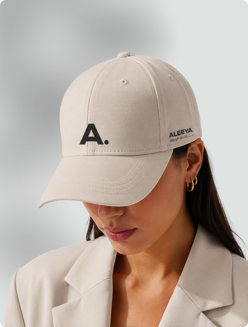
Monogram: A. on its own, for small and embossed applications. Stacked: three lines for square and vertical formats.
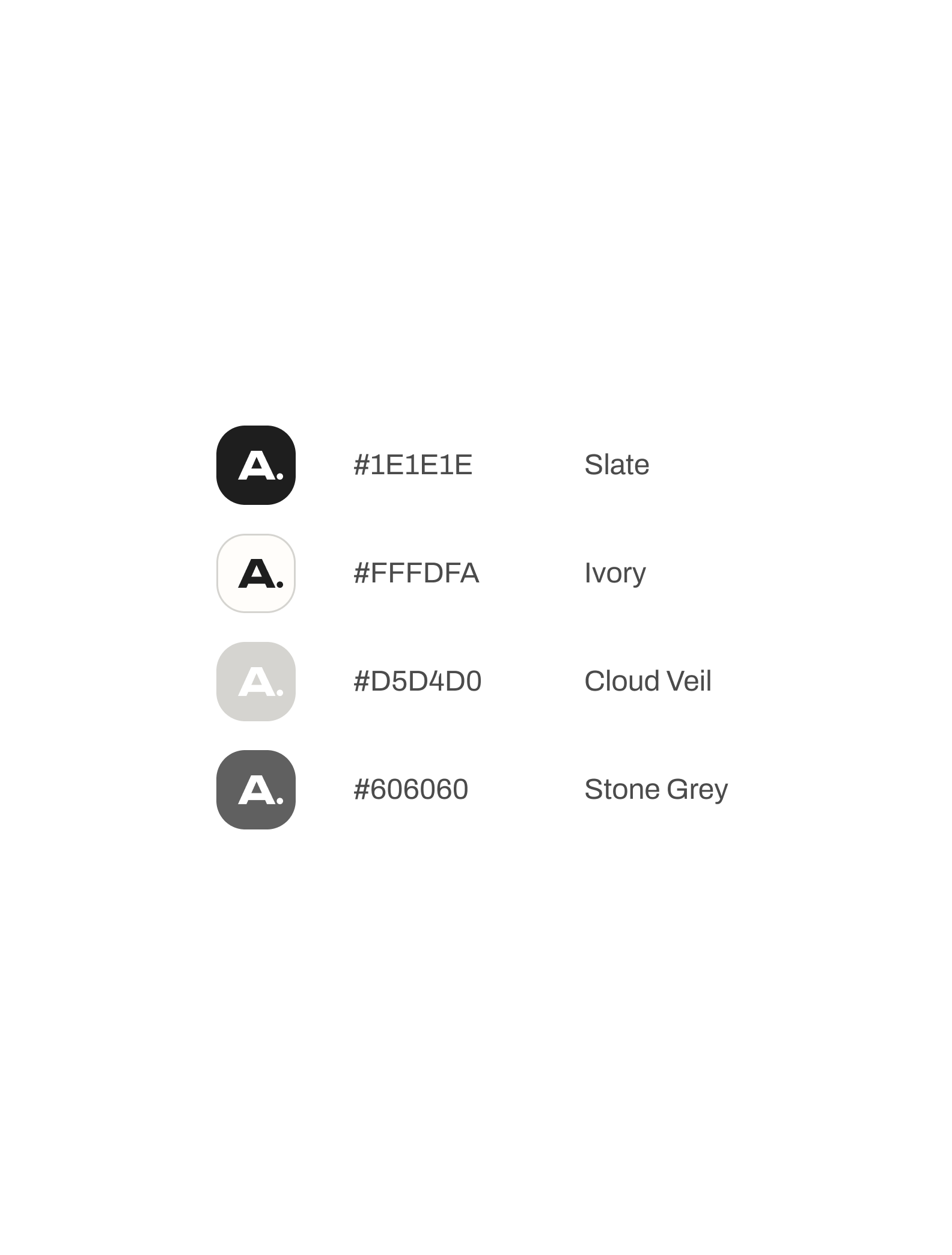
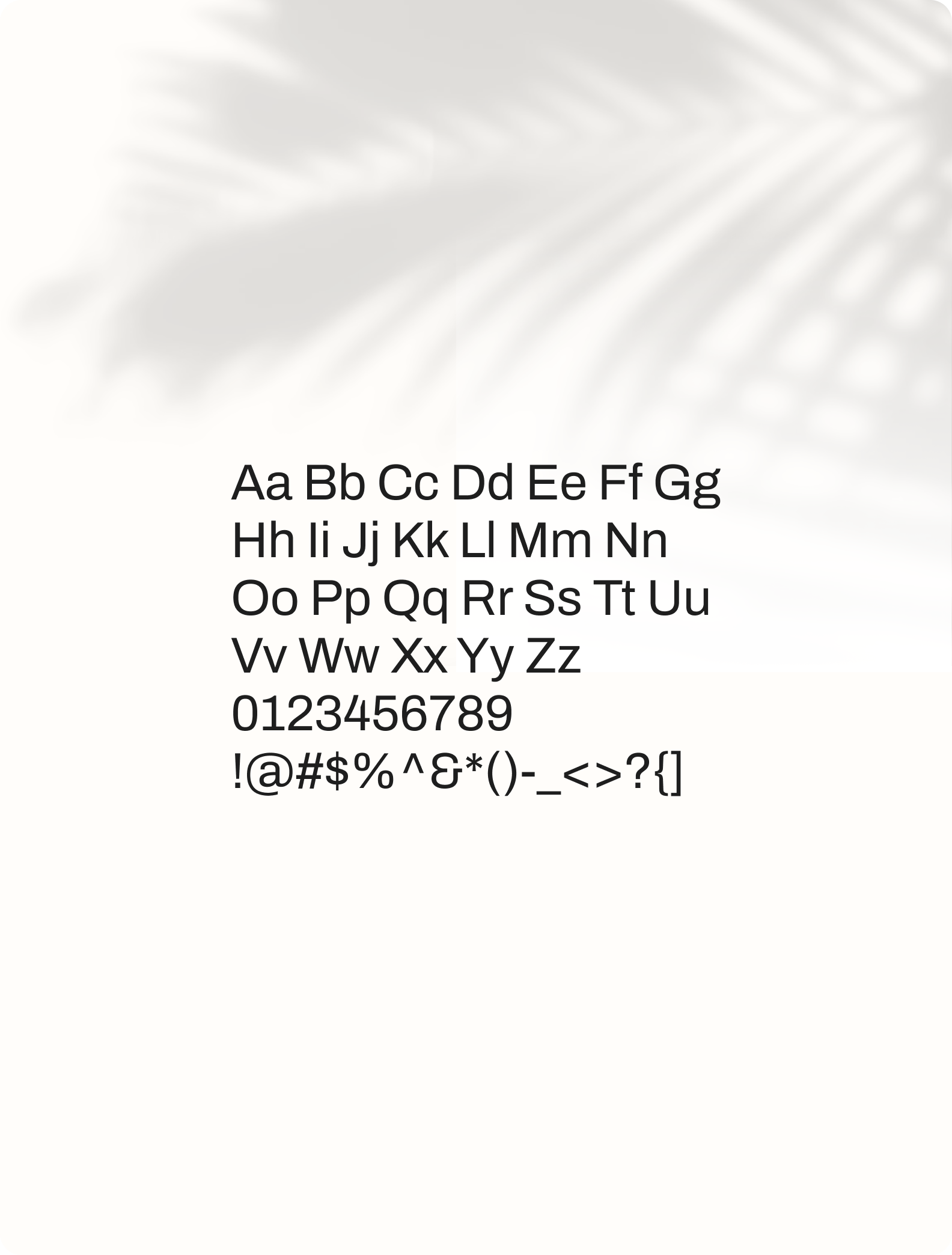
Underneath it all: Tiempos Text for headlines, Archivo for everything else, on a palette of Ivory and Slate with four quiet neutrals.

The Restraint
The temptation on an architecture website is to animate, to overlay, to explain. We pulled back everywhere.
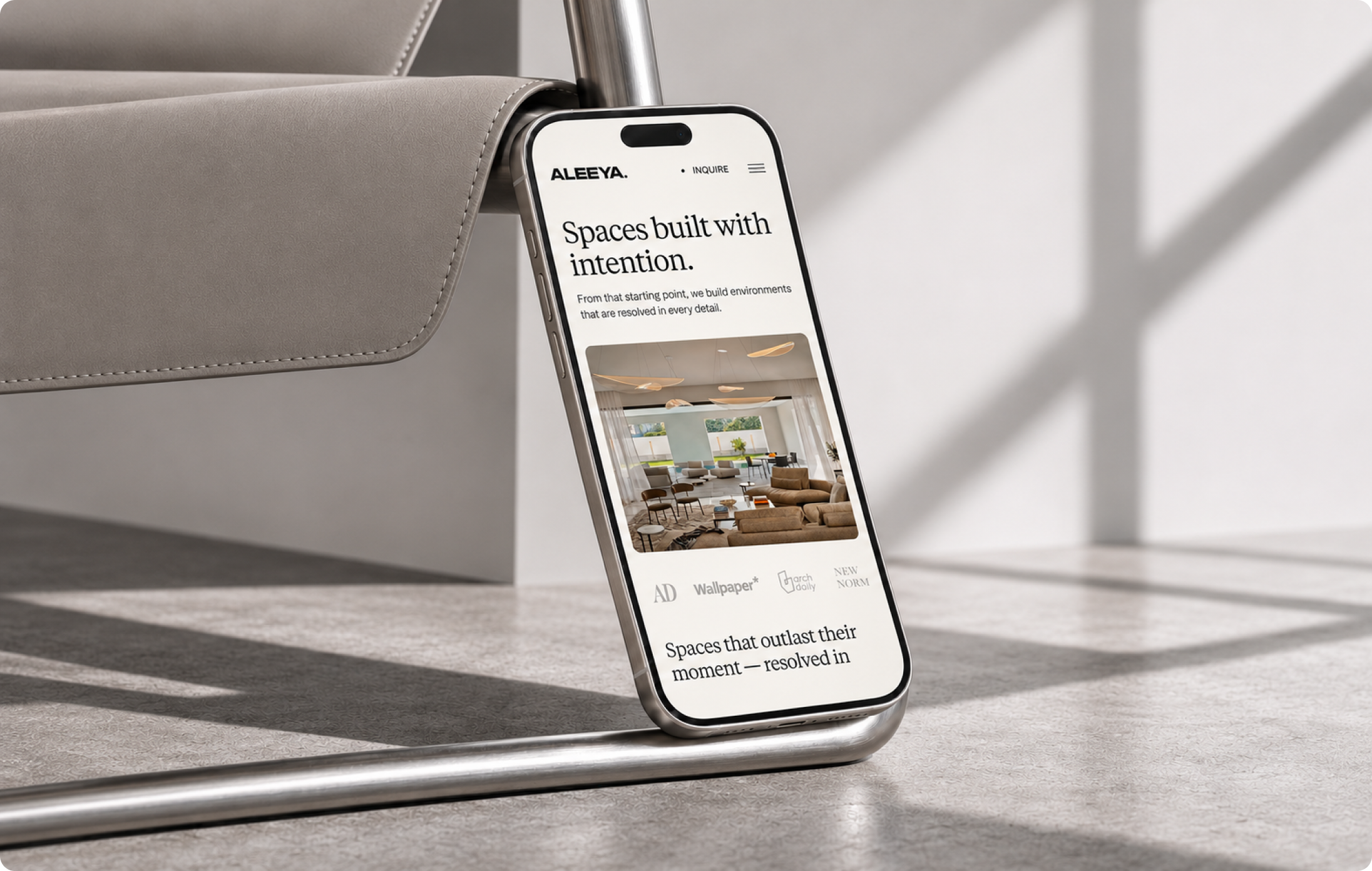
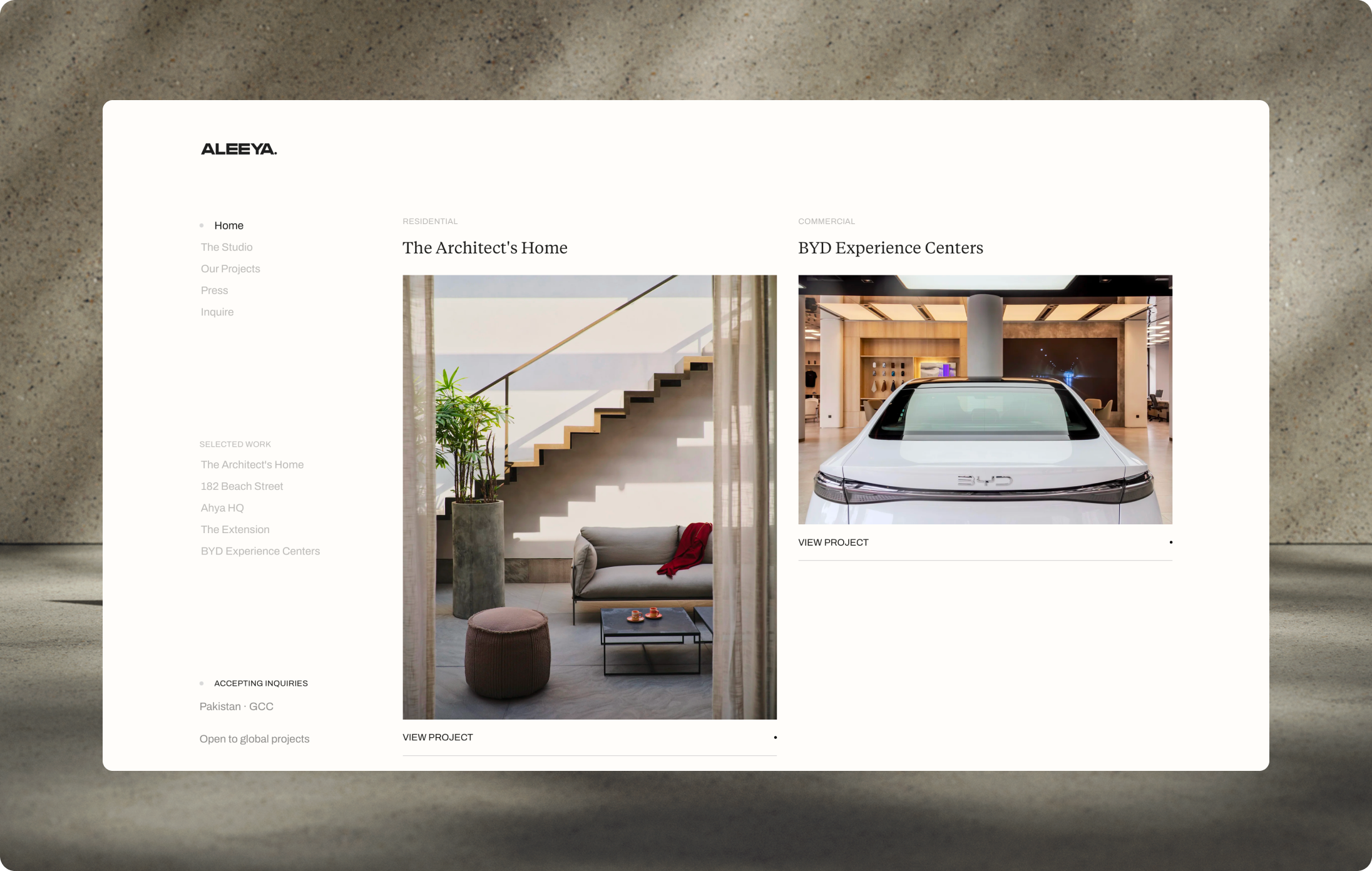
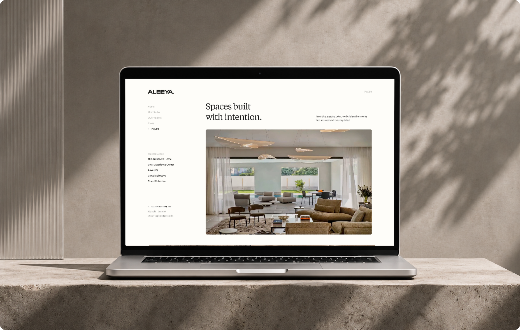
The site opens on one line, Spaces built with intention, set in Tiempos on ivory. Navigation sits quietly on the left, with every project a click away through a Selected Work menu. Project pages read like a monograph: the facts in one line, then the photographs, large and uninterrupted.
Built in Webflow, so the studio adds projects, press and team members itself. The structure does the communicating, so the surface doesn’t have to.
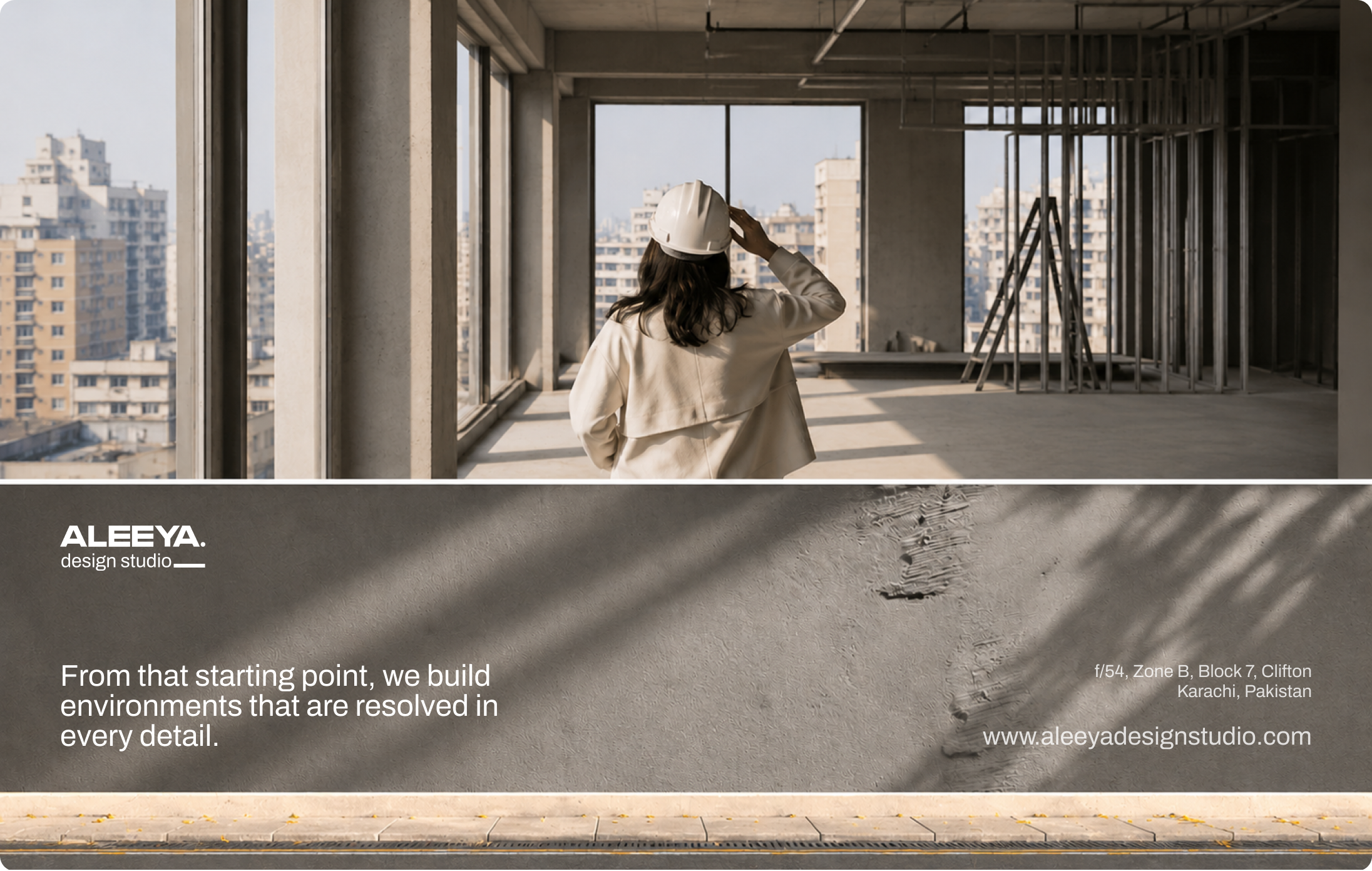
If your work should do the talking, the brand’s job is to not interrupt.
An architecture practice’s brand is the first proof of its judgement. If the identity is louder than the buildings, the buildings lose.
We build brand systems and websites for studios where craft is the product: architecture, interiors, design. If that’s you, that’s exactly the kind of brief we want.




Let’s create something meaningful together. Contact us, and let’s build a brand that’s thoughtful, effective, and beautifully designed.