When building a product, what should come first?
And how much do you need for version one?
I know these are deep questions in the minds of most founders. But what happens when you've got a few features in mind, a rough deadline, maybe a designer, perhaps a developer?
These questions aren't small. They decide whether your product launches or lingers in limbo.
Minimum Viable Product (MVP) is how you validate your core idea, test demand, and gather honest feedback without wasting time, energy, or money on features no one needs.
Whether you're a technical founder already deep in code or a non-technical founder managing product decisions, the first version of your product can't just "look ready", it has to prove something. About the market. About the user. About the problem.
This blog explores MVP design practices that help you prioritize what matters, avoid common early-stage pitfalls, and gain product-market insight more quickly. These are the same principles we apply at Neue World, and if you're looking to build the right product the first time, start here.
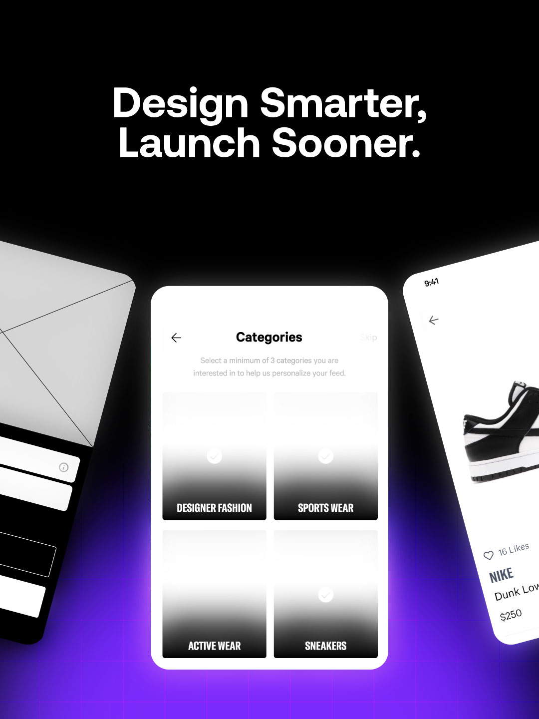
What an MVP Is and What It’s Not
Minimum Viable Product is one of the most misused terms in startup culture. For some, it means launching a buggy prototype with the promise of future upgrades. For others, it's a full-blown product built over nine months with no real users in mind. Both are wrong and dangerous.
Let's go back to the original point. Eric Ries defined an MVP as "that version of a new product which allows a team to collect the maximum amount of validated learning about customers with the least effort."
It's not about launching fast for the sake of speed. It's about reducing waste. It's about learning what works before investing more time, budget, and reputation in a product that no one wants.
Your MVP should help you answer a painful, early question: "Are we building something people will pay for, use consistently, and tell others about?"
That means it must do three things well:
- Solve a specific problem for a targeted audience. If you're building for everyone, you're creating for no one. User research, market research, and early adopter interviews should narrow your scope.
- Focus only on core features. You don't need every button, filter, and dashboard. You need only the pieces that prove your product vision can deliver value even in its rawest state.
- Enable fast feedback loops. Launching is not the end goal. Learning is. You should have real users, even if just ten people, who use it and tell you what's broken, confusing, or unnecessary.
The moment you call a bloated app an MVP, you've missed the point. And if you design something too lean that no one understands or trusts, you also lose. Balance is key.
The MVP is a strategic test of product-market fit, not a stripped-down product just for investor decks. It's where product development, customer feedback, business model assumptions, and user experience all intersect.
And if you're building it without any security measures, basic usability testing, or thinking through how users will adopt it, it won't validate anything.
Best MVP Practices for Startups
Most MVPs fail not because of poor code or a lack of funding, but because the product solves nothing of real value. You can build a beautiful interface, but if the core problem isn't clear or urgent, users leave, and you waste months of product development.
Start with Problem–Solution Clarity
You're not building features. You're solving one critical user pain. That's your starting point and your north star.
Ask this: "What is the one job this user wakes up trying to solve every day?"
This is where user research, target audience clarity, and early customer feedback play a crucial role. You don't need 20 interviews. Start with five actual users, not friends or advisors. Real potential users. You'll start hearing the exact words and frustrations on repeat.
From there, your design should focus on highlighting just one core feature. Strip everything else out. The more concentrated your MVP is, the easier it is to measure whether it's working.
A bloated MVP confuses users. A focused MVP tests product–market fit.
Prioritize User Experience Over Aesthetics
Your MVP's user interface should be simple, fast, and purposeful. At this stage, you're not chasing brand polish you're chasing usability testing data and honest feedback from early adopters. If they can't complete the core task in under 30 seconds, you've overdesigned or underthought the flow.
Utilize real-time analytics and screen recordings to analyze how users interact with your product.
Are they dropping off at the onboarding?
Are they ignoring your key CTA? Design should be in service of one thing: removing friction between the user and the core value.
A good MVP design does three things:
- Reduces cognitive load
- Speeds up the path to the first value
- Feels intuitive without a guide
If your early users are confused, it's not them. It's your design.
Wireframes and Prototypes First
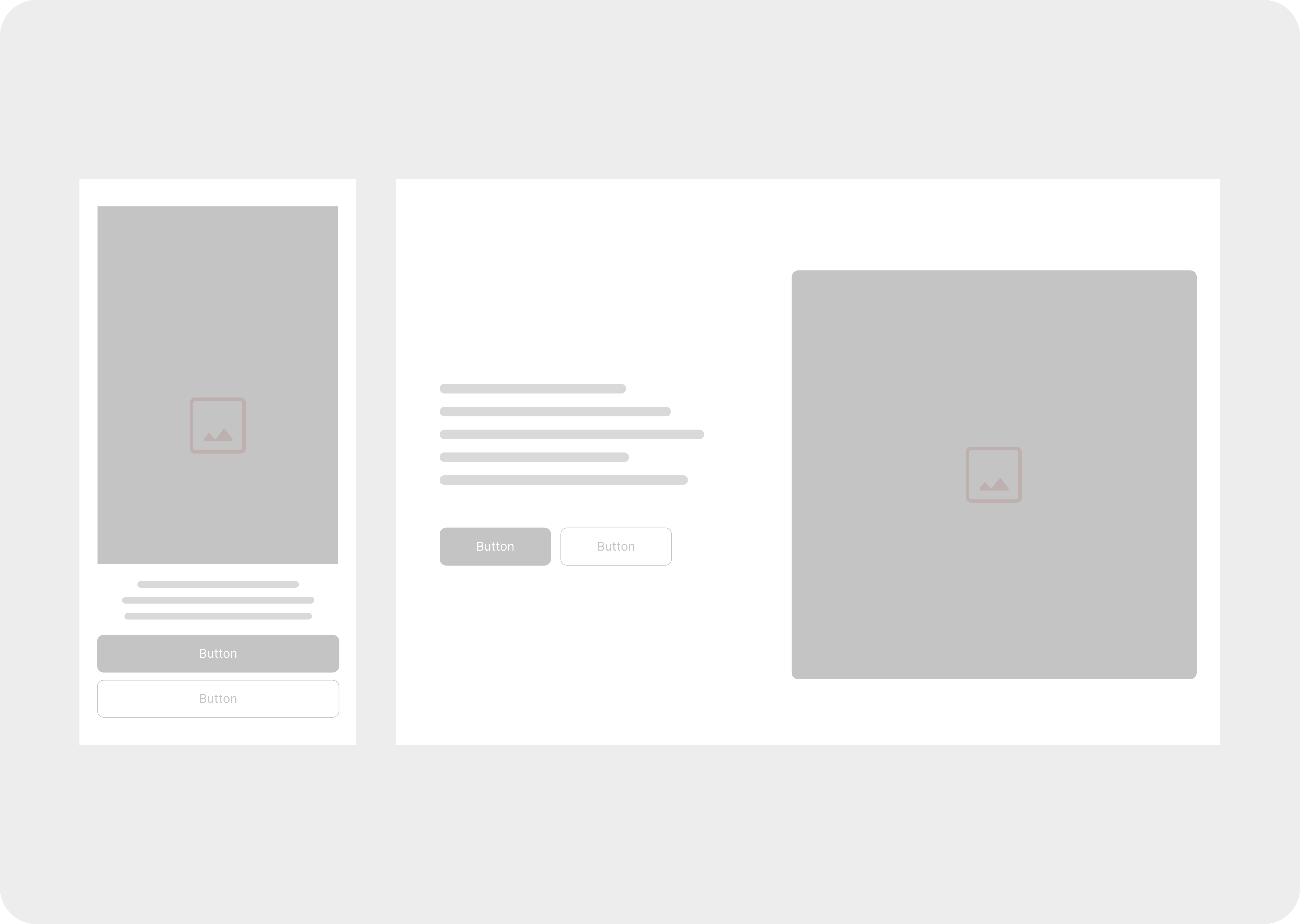
You don’t start with UI. You start with structure.
Low-fidelity wireframes force clarity. They strip away the noise and reveal the flow. You’ll see quickly if your user journey makes sense or needs a rethink before you waste time pushing pixels or writing code.
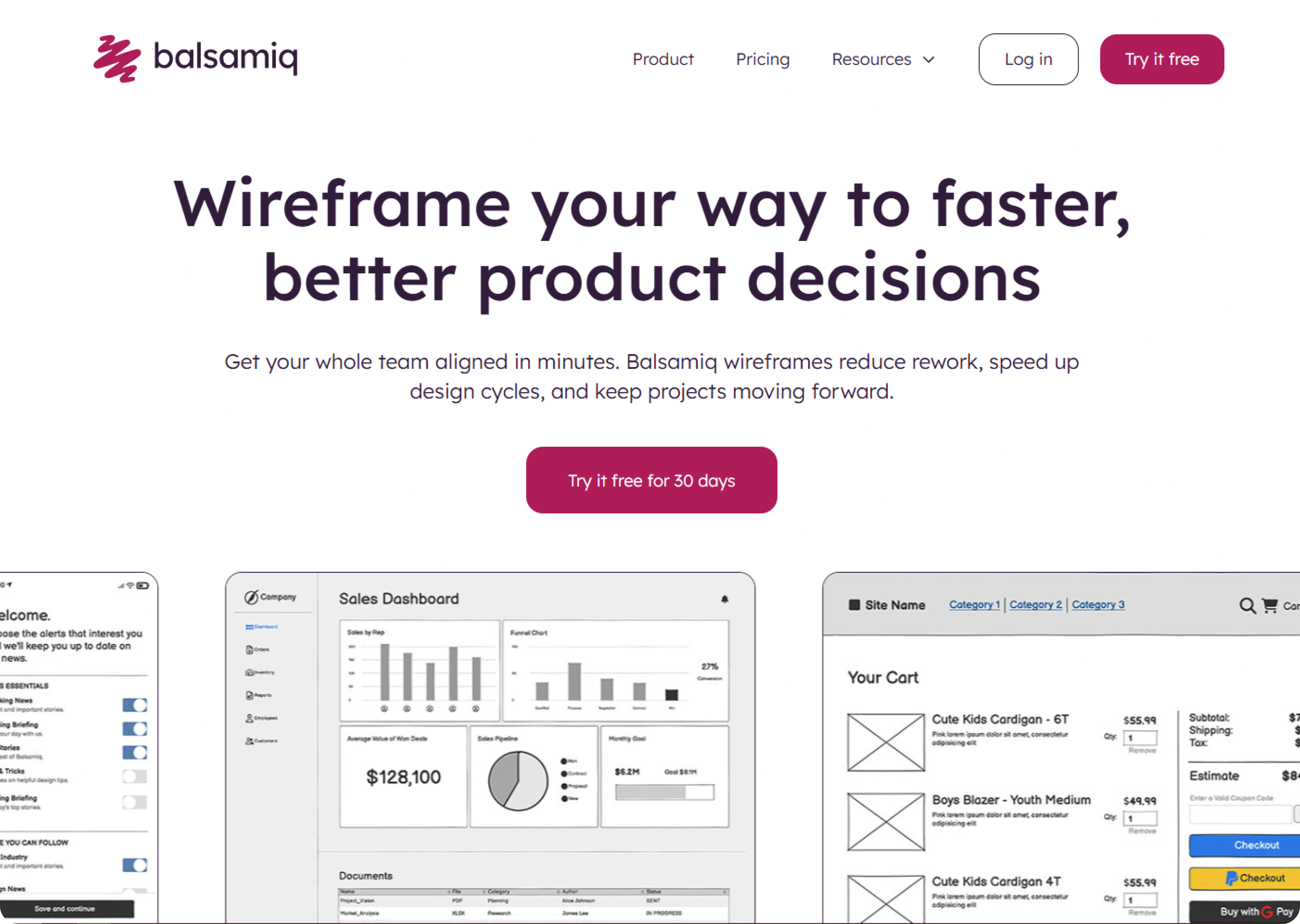
Start with pen and paper or use tools like Balsamiq. Then move to Figma or Adobe XD to build
clickable prototypes. These aren’t just mockups, they’re decision-making tools. You’ll test assumptions, share flows with your team, and spot UX gaps early.
Clickable prototypes save you from six-week dev cycles. They let you run five-minute user tests that reveal whether your idea works in practice. A startup that skips wireframes is betting on hope. A startup that prototypes early bets on speed and clarity.
Embrace a Lean Design Process
The earlier the design gets into the loop, the fewer dead ends you hit later.Design isn’t something you hand off after the specs are complete. It’s a thinking tool that belongs at every sprint planning session. Bring your designer in when the problem is still being defined, not when it’s already scoped.
You’ll solve UX issues at the whiteboard instead of burning dev hours later.Your MVP team should resemble a triangle, comprising design, product, and engineering. Every side must shape decisions from day one. That cross-functional rhythm, problem → sketch → prototype → feedback — creates the loop you need to learn fast.
Speed doesn’t mean rushing. It means removing waste. Short feedback loops, constant iteration, and live user input. That’s lean design. That’s how startups win.
Test with Real Users Early
The best MVPs don’t ship silently. They test loud and fast.
You don’t need a full analytics stack to learn. What you need are five real users interacting with your product, either on Zoom, via screen sharing, or in person. Watch where they get stuck. Watch what they ignore. Ask what they expected but didn’t see. That’s your signal.
Usability testing at the MVP stage is not about numbers; it’s about patterns. You’re not chasing conversion rates yet. You’re chasing insight. What people do, not what they say, reveals whether your product vision makes sense.
Use tools like Google Forms to collect fast feedback. And always follow up with one-on-one
conversations. At this stage, qualitative beats quantitative every time.
Common MVP Design Mistakes to Avoid
Founders often fall into the same traps. These mistakes don’t just slow you down, they kill the feedback loop that drives real product development.
- Too many features. Your MVP is not a showcase. It’s a test. Focus on one must-have use case. If a feature doesn’t tie back to that, cut it.
- Bad mobile experience. If your users scroll, tap, or check in on mobile design for it. Don’t assume a desktop-first layout will “scale down.”
- No onboarding. First impressions matter. If your MVP lacks a guide, an empty state, and clear cues, users tend to bounce. You don’t need a full tour; just enough to get oriented.
Avoid these, and your MVP becomes a real learning engine. That’s what you need to reach product-market fit, not perfection, just momentum.
Examples of Well-Designed MVPs
The world’s most successful startups built MVPs that solved one problem clearly and validated demand before spending months or millions. These stories show how lean design works in practice:
Slack
- The MVP: Slack was not originally intended to be a standalone product. It evolved from an internal communication tool developed by Tiny Speck, a company founded by Stewart Butterfield (co-founder of Flickr), while they were building a massive multiplayer online role-playing game called "Glitch." When Glitch failed, the team realized their internal chat tool was incredibly effective and valuable.
- Why it was well-designed:
- Solved a real problem organically: It addressed the communication chaos within their own distributed team, demonstrating its utility in a real-world, high-pressure environment.
- Focus on core features: The early version prioritized searchable logs of conversations, organized channels, and easy file sharing – solving key pain points that email and traditional chat tools didn't.
- Iterated internally first: They used it extensively themselves, refining it based on their own needs before offering it to others. This ensured a high level of usability and polish for the initial external release.
- Strong word-of-mouth: Early beta testers (friends at other startups) became evangelists because the product genuinely improved their workflow.
- Initial Funding/Investment:
- Tiny Speck (the parent company that developed Slack internally) had previously raised $17.5 million for the game "Glitch."
- When they pivoted to Slack, they utilized existing resources and expertise.
- Slack raised a $43 million Series C round in April 2014, shortly after its public launch in February 2014, reflecting the rapid traction gained from its MVP.
- Details you need to know: Slack is a classic example of a "Pivot MVP" – where an existing internal tool or failed project becomes the basis for a successful new venture. Its strength was its obsessive focus on user experience and solving the acute problem of fragmented team communication.
Paystack (Africa - Nigeria)
The MVP: Paystack's initial MVP was a developer-focused API and a simple checkout form that allowed Nigerian businesses to accept online payments. They focused on solving the fundamental problem of online payment collection in a fragmented and complex market.
- Why it was well-designed: Addressed a critical market gap: Online payments were complicated and unreliable for Nigerian businesses. Paystack provided a reliable and easy-to-integrate solution.
- Developer-first approach: By building robust APIs and clear documentation, they empowered developers to integrate payment functionality into their applications quickly and efficiently. This minimized their own UI/UX efforts for the MVP.
- Focused on core transaction success: Their initial focus was on ensuring high transaction success rates, building trust and reliability in a challenging environment.
- Iterated quickly with early adopters: They worked closely with a small group of businesses, gathering feedback and refining the product.
- Initial Funding/Investment: Paystack was part of Y Combinator's Winter 2016 batch, receiving seed funding (typically around $120,000 for YC companies).
- They subsequently raised a $1.3 million seed round in 2016 from investors like Tencent and Comcast Ventures. Ultimately, Stripe acquired them for over $200 million in 2020.
- Key details to note: Paystack's MVP highlighted the power of a "developer-first" approach in emerging markets. By solving a fundamental infrastructure problem with a simple, reliable tool, they quickly gained traction among digital businesses.
Tesla
- The MVP: The Tesla Roadster (launched in 2008). This was a high-performance, expensive electric sports car.
- Why it was well-designed: Proof of concept: Its primary purpose was to prove that electric vehicles could be desirable, high-performance, and have a decent range, dispelling the notion that EVs were golf carts.
- Targeted early adopters: It appealed to affluent environmentalists and tech enthusiasts who were willing to pay a premium for cutting-edge technology and make a statement.
- Generated excitement and brand identity: The Roadster created significant buzz and established Tesla as a serious player in the automotive industry, not just a niche EV maker.
- Funded future development: As Elon Musk famously outlined, the plan was to use profits from the expensive Roadster to fund the development of the more affordable Model S, and so on.
- Initial Funding/Investment: Co-founders Martin Eberhard and Marc Tarpenning founded Tesla in 2003.
- Elon Musk led their Series A funding round in February 2004, investing $6.5 million out of a total of $7.5 million. He became Chairman.
- By January 2009, before the Roadster's full production ramp-up, Tesla had raised $187 million in private funding, with Musk contributing $70 million of his own money.
- Details you need to know: Tesla's MVP strategy was a "Phased MVP" or "High-End to Mass Market MVP." They started at the top of the market (high price, low volume) to establish credibility and finance their long-term vision of making electric vehicles accessible to the masses. The Roadster was a critical stepping stone, validating the technology and creating a brand halo.
- The MVP: Initially, Instagram was born from a much larger app called Burbn. Burbn was a feature-heavy location-based check-in app with elements of gamification, photo sharing, and planning. After analyzing user data, the founders (Kevin Systrom and Mike Krieger) realized that users were primarily engaging with only one feature: photo sharing and applying filters. They decided to strip away almost everything else. The Instagram MVP was launched with core functionality, including photo sharing, filters, and commenting/liking.
- Why it was well-designed: Radical simplification: They identified the single most engaging feature and focused exclusively on making it perfect, rather than building a bloated app.
- Immediate gratification: Filters made ordinary smartphone photos look professional, providing instant satisfaction to users.
- Mobile-first and iOS-only: By focusing on a single platform, they optimized the experience and accelerated development for their initial target audience.
- Visual appeal: In a world dominated by text, Instagram offered a beautiful, minimalist visual experience.
- Initial Funding/Investment: Burbn (the precursor) initially raised $500,000 in seed funding from Baseline Ventures and Andreessen Horowitz in October 2010 (just before the pivot).
- Instagram launched in October 2010. Within a few months, its explosive growth led to a $7 million Series A round in February 2011 from Benchmark Capital, valuing the company at around $25 million.
- Key details to note: Instagram is an excellent example of both a "Pivot MVP" and a "Single-Feature MVP." It demonstrates the power of user feedback and data analysis in identifying what truly resonates with users and then having the courage to discard everything else to focus on that core value proposition. Its quick launch and rapid viral adoption were crucial to its early success.
Airbnb
- The MVP: A basic website where the founders, struggling to pay rent, listed air mattresses in their apartment for attendees of a local design conference, offering breakfast (hence "Air Bed & Breakfast").
- Why it was well-designed: Directly solved a real, immediate problem: Provided affordable accommodation for conference attendees when hotels were fully booked.
- Immediate feedback loop: The founders were the hosts, experiencing the entire user journey (booking, hosting, interacting with guests) firsthand. This provided invaluable insights.
- Hyper-local focus: Starting in one city for a specific event minimized scope and allowed for close observation and rapid learning.
- Initial Funding/Investment: Self-funded initially out of necessity, essentially leveraging their own living space.
- Reportedly, they famously funded early operations by selling themed breakfast cereals ("Obama O's" and "Cap'n McCain's") for $40 a box, raising around $30,000.
- Their first significant seed funding was around $20,000 from Y Combinator in 2009.
- Details you need to know: This is a prime example of a "Concierge MVP" where the founders themselves manually delivered the service. It proved the core concept that people are willing to stay in strangers' homes and that there is a demand for unique, affordable accommodations.
Conclusion
These examples illustrate that a well-designed MVP isn't about building a bad product quickly, but instead building the right product quickly – one that delivers core value, validates key assumptions, and gathers crucial user feedback to guide future development.
Building an MVP isn't about shortcuts or launching half-done work. It's about disciplined focus. You're not designing for everyone; you're designing for your earliest users who can validate your product vision.
The goal of MVP design is clarity: clear problems, clear features, clear experience. If users can't figure it out in 30 seconds, it's not minimal or viable. And if it doesn't solve a core need, it's just product clutter.
At Neue World, we help startups cut through the noise. We work closely with founders, designers, and developers to build MVPs that real people want to use and investors want to back.
If you're serious about avoiding wasted time, budget, and energy, now's the time to rethink how your MVP gets designed.
Let's help you get it right the first time.