Building a brand identity for Dubai's most ambitious real estate platform with 5,000+ brokers, 1,000+ companies, over 1 Billion AED in project value
Estative connects developers, brokers, and investors across the UAE and beyond. The design challenge was producing an identity that could credibly represent a tech-first marketplace to institutional developers and major brokers simultaneously — two audiences with very different expectations of what a credible brand looks like.
- → Brand Identity Design
- → Logo & Wordmark
- → Custom Graphics
- → Brand Assets
- → Collateral Designs



The design thinking
Real estate tech in Dubai sits at an intersection that most brand systems get wrong. Platform companies default to the language of Silicon Valley with gradients, sans-serif optimism, motion-heavy digital interfaces. Traditional real estate brands go the other way with classical serifs, photography of interiors, muted luxury palettes. Neither approach works for a company like Estative, which is simultaneously a tech platform and a credible institutional counterpart for developers moving billion-dirham projects.
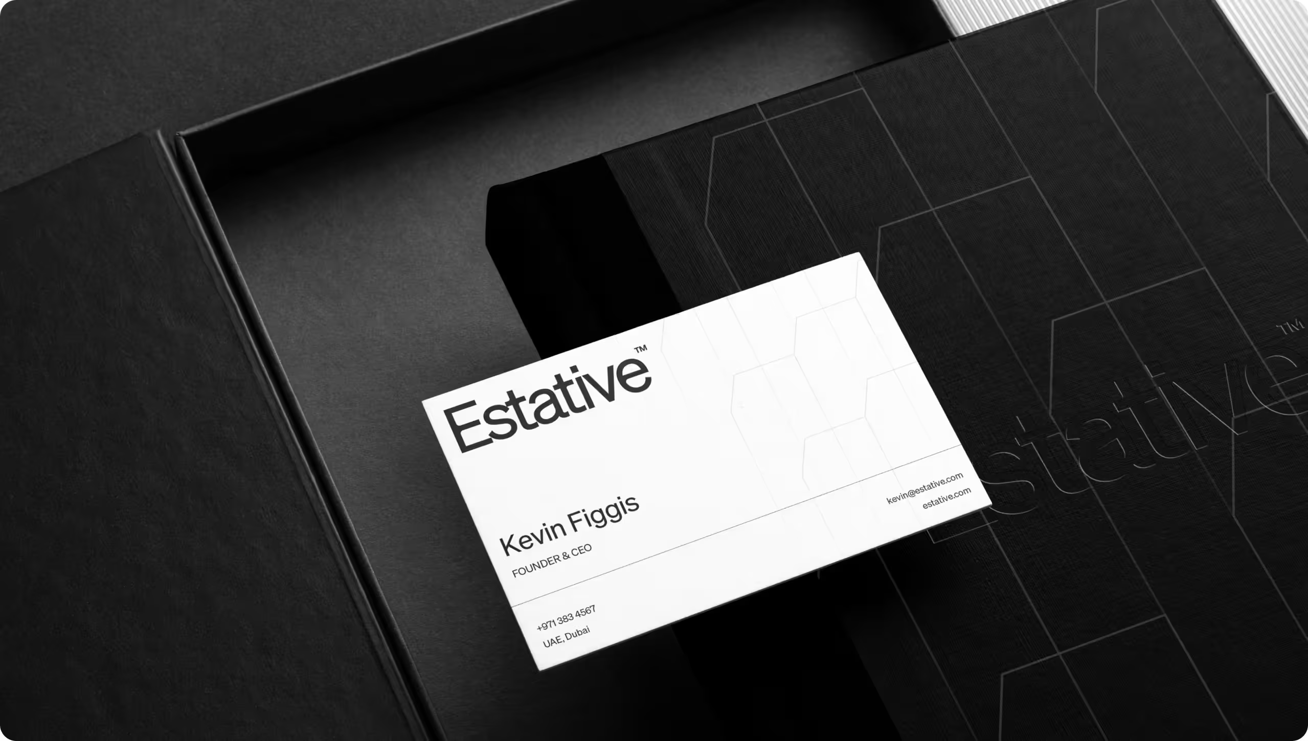
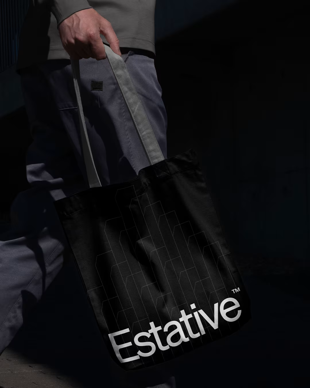
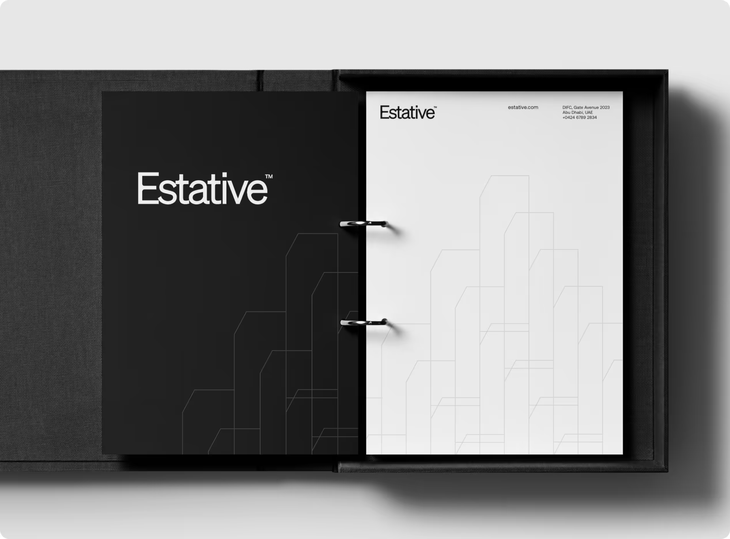
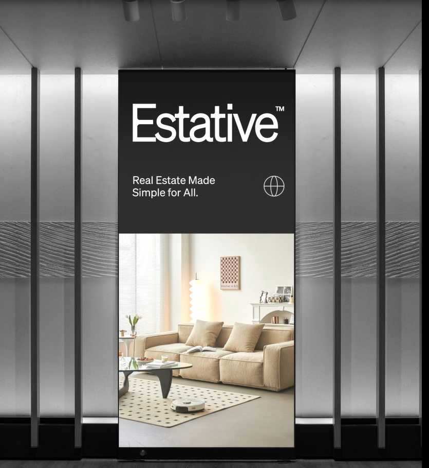
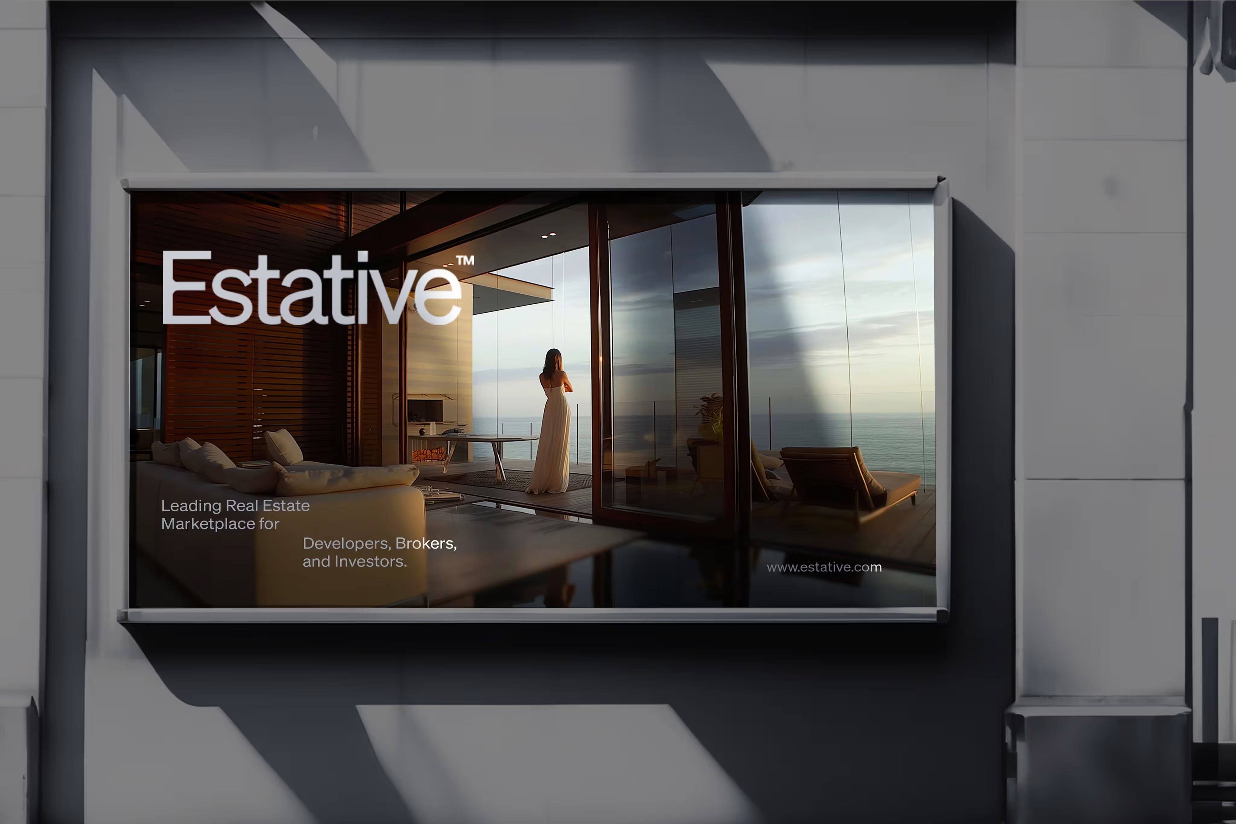
The identity solution was architectural rather than digital. The primary graphic system is built from wireframe building outlines with structural, precise, modular. These aren't illustrations of specific buildings; they're the abstracted geometry of urban density, which is both what Estative's data represents and what its clients build. The system scales from a single line element on a business card to a full-surface pattern on a brand book cover without losing resolution or meaning. That scalability was the brief: one visual language, every surface, no dilution.
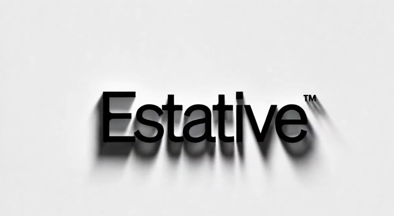
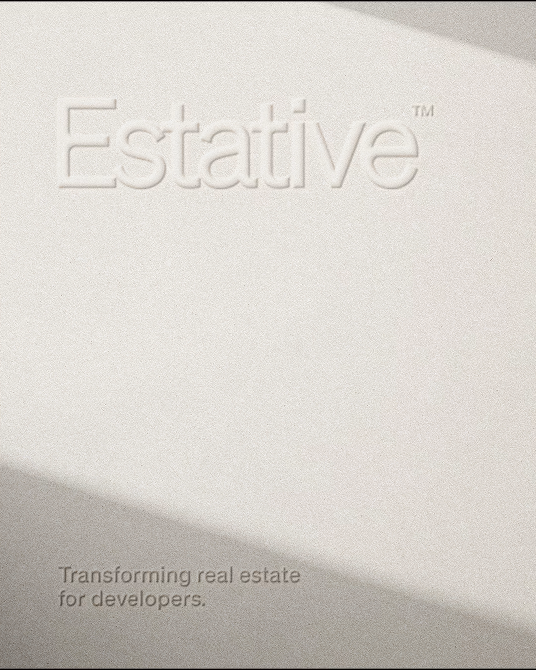
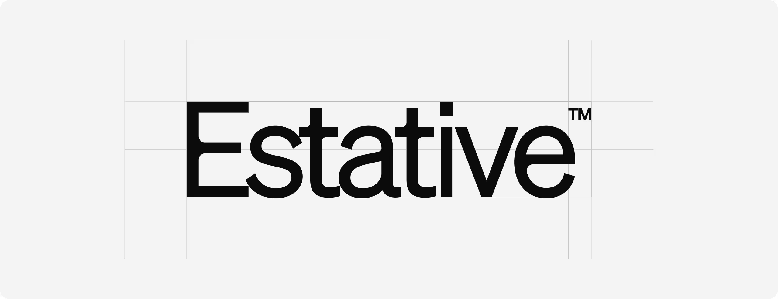
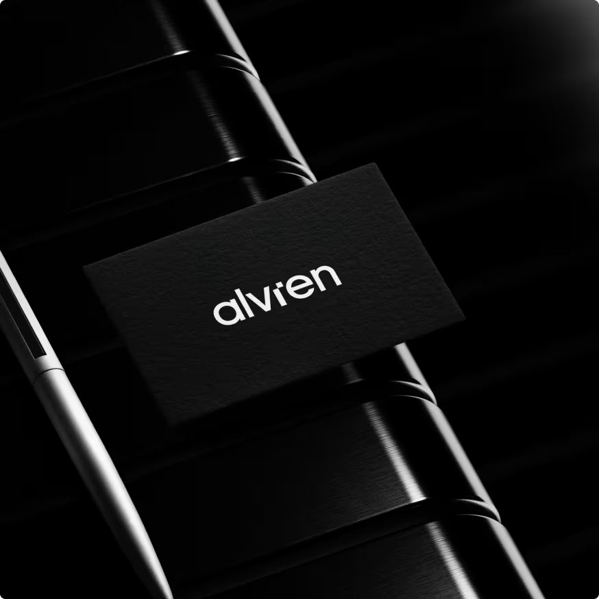
The wordmark is set in a geometric typeface with deliberate weight substantial enough to sit at the DIFC Gate Avenue address without looking like a startup, clean enough to work reversed on a black cover or embossed into white stock. The trademark symbol is treated as a design element, not a legal footnote. At the sizes these assets appear in print, every decision about spacing and weight is visible. We made all of them intentionally.





Let’s create something meaningful together. Contact us, and let’s build a brand that’s thoughtful, effective, and beautifully designed.